How to animate a Radial-Gradient or Linear Gradient with CSS?

Asked

Viewed 397 times

4

I’m trying to make an animation with CSS that would be a "sun" passing through an image.

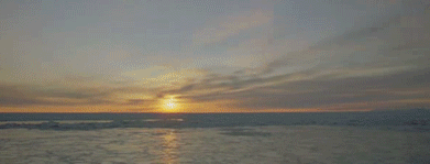
The idea was to have something next of that result:

inserir a descrição da imagem aqui

But in my code the "sun" is jumping from one side to the other and is not animated in the right way. How do I animate with CSS this readial-gradient ( or linear-gradiente ) in the right way?

I tried to use the @keyframes and change properties

Of: radial-gradient(circle at 100% 50%...

To: radial-gradient(circle at 0% 50%...

But it didn’t work out as you can see below

    
.box {
    width: 300px;
    height: 150px;
    background-image: radial-gradient(circle at 100% 50%, rgba(255, 155, 61, 0.473), transparent 25%), url(https://unsplash.it/300/150?image=986);
    background-size: cover;
    background-repeat: no-repeat;
    animation: bg 3s linear infinite, none;
}
@keyframes bg {
    to {
    background-image: radial-gradient(circle at 0% 50%, rgba(255, 155, 61, 0.473), transparent 25%), url(https://unsplash.it/300/150?image=986);
    }
}
<div class="box"></div>

2 answers

3

I came up with a solution using background-size and background-position.

The idea is that you have a background that is more than 100% the size of container. For that just you put values like background-size:200% or 300%, after that like the background-position you put bg to one side or the other.

inserir a descrição da imagem aqui

See the code to better understand:

.box {
  width: 300px;
  height: 150px;
  background-image: radial-gradient(circle, rgba(255, 166, 0, 0.7), transparent 25%), url(https://unsplash.it/300/150?image=986);
  background-size: 200% 100%, cover;
  background-position: 100% 50%, center;
  background-repeat: no-repeat;
  animation: bg 3s linear infinite, none;
}
@keyframes bg {
  to {
    background-position: 0% 50%;
  }
}
<div class="box"></div>

3


With the @keyframe you can say to animation, when performing such action using percentage values. That would be the phases of animation and that values you define.

Following more or less what you need:

    
.box {
    width: 300px;
    height: 150px;
    background-image: radial-gradient(circle at 100% 50%, rgba(255, 155, 61, 0.473), transparent 25%), url(https://unsplash.it/300/150?image=986);
    background-size: cover;
    background-repeat: no-repeat;
    animation: bg 3s linear infinite, none;
}
@keyframes bg {
    0%{
       background-image: radial-gradient(circle at 0% 50%, rgba(255, 155, 61, 0.473), transparent 25%), url(https://unsplash.it/300/150?image=986);
    }
    15%{
       background-image: radial-gradient(circle at 30% 50%, rgba(255, 155, 61, 0.473), transparent 25%), url(https://unsplash.it/300/150?image=986);
    }
    30%{
       background-image: radial-gradient(circle at 30% 50%, rgba(255, 155, 61, 0.473), transparent 25%), url(https://unsplash.it/300/150?image=986);
    }
    50%{
       background-image: radial-gradient(circle at 50% 60%, rgba(255, 155, 61, 0.473), transparent 25%), url(https://unsplash.it/300/150?image=986);
    }
    75%{
       background-image: radial-gradient(circle at 75% 60%, rgba(255, 155, 61, 0.473), transparent 25%), url(https://unsplash.it/300/150?image=986);
    }
    90%{
       background-image: radial-gradient(circle at 90% 50%, rgba(255, 155, 61, 0.473), transparent 25%), url(https://unsplash.it/300/150?image=986);
    }
}
<div class="box"></div>

As I had commented, I was able to find examples similar to the below, working the bottom and gradient separately:

.box {
    width: 300px;
    height: 150px;
    background-image: url(https://unsplash.it/300/150?image=986);
    position: relative;
}

.sol{
    width: 100%;
    height: 100px;
    background-image: radial-gradient(circle, rgba(255, 155, 61, 0.473), transparent 25%);
    background-position: 110px 0px;
    position: absolute;
    background-repeat: none;
    -webkit-animation: sol 5s ease infinite; 
}

@-webkit-keyframes sol {
  from{
    background-position: 110px 0px;
  }
  to{
    background-position: -110px 0px;
  }
}
<div class="box"><div class="sol"></div></div>

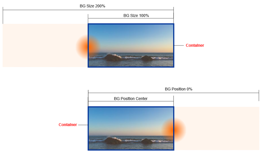
  • Ara is interesting, but then I would need almost 99 steps to get the animation flowing.... I know you could refine more etc, I even understood the concept that you applied, but not to look like they were "missing frames" I should have something like 1%, 3%, 5%, 7% up to 100% I believe there must be a more optimized way to treat this... But I appreciate the contribution!

  • I did a search here and I didn’t find anything that made it work or why it doesn’t work using from and to the keyframes. I found similar examples that treated the circle and the image as separate elements! Using position: relative / Absolute, changing background-size.

  • So, I believe that bg-size along with bg-position is the way! Should not need to separate no, although if using a pseudo element in the container should make it easier even, although it is not the option I wanted...

Browser other questions tagged

You are not signed in. Login or sign up in order to post.