Hover effect on child element with CSS

Asked

Viewed 558 times

2

I have the following code, which is the menu of my application:

    <div class="mainmenu-area" data-spy="affix" data-offset-top="100">
        <div class="container">
            <!--Logo-->
            <div class="navbar-header">
                <button type="button" class="navbar-toggle" data-toggle="collapse" data-target="#primary-menu">
                    <span class="icon-bar"></span>
                    <span class="icon-bar"></span>
                    <span class="icon-bar"></span>
                </button>
                <a href="#" class="navbar-brand">
                    <img class="logo" src="">
                </a>
            </div>
            <!--Logo/-->
            <nav class="collapse navbar-collapse" id="primary-menu">
                <ul class="nav navbar-nav navbar-right">
                    <li class="active"><a href="#home-page">Início</a></li>
                    <li><a href="#service-page">Facilidades</a></li>
                    <li><a href="#feature-page">Recursos</a></li>
                    <li><a href="#price-page">Planos</a></li>
                    <!-- Isto poderá ser utilizado mais adiante <li><a href="#team-page">Team</a></li> -->
                    <li><a href="#faq-page">FAQ</a></li>
                    <li><a href="{{route('login')}}" class="login"><span class="un">Área Restrita </span><span class="ti-lock"></span></a></li>
                </ul>
            </nav>
        </div>
    </div>

In it I have a <span> in the last element <li> to which I applied the following CSS:

.un {
  display: inline-block;
}

.un:after {
  content: '';
  width: 0px;
  height: 1px;
  display: block;
  background: #ffffff;
  transition: 400ms;
}

.un:hover:after {
  width: 100%;
}

My question is: is there any way I can make this class style un is fired when I do the Hover in the parent element only using CSS?

The way I did it works when I hover over the <a>, but for layout reasons I would like the effect to be triggered when I move the mouse over the parent element.

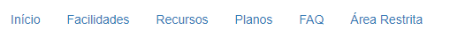
Below is the result I have at the moment:

  • Which parent element would be?

  • @Sam the <li> then you’d have to climb 2 levels right?

  • Ah yes, I understand now.

  • 1

    Alvaro I will take this opportunity to give you a hint, has this screen graffiti program that can give you a hand, is very light (2MB) and works very well, is what I used to make the image of the answer https://www.screentogif.com/? l=pt_br

2 answers

2

Yes friend is just you put to "activate" the effect when pass on your <a> with class .login

inserir a descrição da imagem aqui

.login:hover .un:after {
    width: 100%;
}

See the code. Show it in full screen as it is with Bootstrap will not appear on narrow screens

.un {
	display: inline-block;
}

.un:after {
	content: '';
	width: 0px;
	height: 1px;
	display: block;
	background: #ff0000;
	transition: 400ms;
}

.login:hover .un:after {
	width: 100%;
}
<link rel="stylesheet" type="text/css" media="screen" href="https://maxcdn.bootstrapcdn.com/bootstrap/3.3.7/css/bootstrap.min.css" />

<div class="mainmenu-area" data-spy="affix" data-offset-top="100">
<div class="container">
	<!--Logo-->
	<div class="navbar-header">
		<button type="button" class="navbar-toggle" data-toggle="collapse" data-target="#primary-menu">
			<span class="icon-bar"></span>
			<span class="icon-bar"></span>
			<span class="icon-bar"></span>
		</button>
		<a href="#" class="navbar-brand">
			<img class="logo" src="">
		</a>
	</div>
	<!--Logo/-->
	<nav class="collapse navbar-collapse" id="primary-menu">
		<ul class="nav navbar-nav navbar-right">
			<li class="active"><a href="#home-page">Início</a></li>
			<li><a href="#service-page">Facilidades</a></li>
			<li><a href="#feature-page">Recursos</a></li>
			<li><a href="#price-page">Planos</a></li>
			<!-- Isto poderá ser utilizado mais adiante <li><a href="#team-page">Team</a></li> -->
			<li><a href="#faq-page">FAQ</a></li>
			<li><a href="{{route('login')}}" class="login"><span class="un">Área Restrita </span><span class="ti-lock"></span></a></li>
		</ul>
	</nav>
</div>

  • what I wanted to do was when I passed the mouse over the <li>, but it was just changing my class to the element that I wanted it to work perfectly

  • @Alvaroalves a tá what I understood is that you wanted active in <a>. And since he already had class .login I just put the :Hover on the father to "activate" the son. But I’m glad you’ve decided! [] s

1


Can put the class .un in <li> and use the :after in the <a> without having to use <span class="un"> around the link. One node less in the DOM and thinner code. : D

Your li instead of being like this:

<li>
   <a href="{{route('login')}}" class="login">
      <span class="un">Área Restrita</span>
      <span class="ti-lock"></span>
   </a>
</li>

will stay like this:

<li class="un">
   <a href="{{route('login')}}" class="login">
      Área Restrita
      <span class="ti-lock"></span>
   </a>
</li>

body{
   background-color: black !important;
}

li{
  background-color: red;
}

.login{
   display: inline-block;
}

.un a:after {
  content: '';
  width: 0px;
  height: 1px;
  display: block;
  background: #ffffff;
  transition: 400ms;
}

.un:hover a:after {
  width: 100%;
}
<script src="https://cdnjs.cloudflare.com/ajax/libs/jquery/3.3.1/jquery.min.js"></script>
<script src="https://maxcdn.bootstrapcdn.com/bootstrap/4.1.0/js/bootstrap.min.js"></script>
<link rel="stylesheet" type="text/css" href="https://maxcdn.bootstrapcdn.com/bootstrap/4.1.0/css/bootstrap.min.css">

<div class="mainmenu-area" data-spy="affix" data-offset-top="100">
        <div class="container">
            <!--Logo-->
            <div class="navbar-header">
                <button type="button" class="navbar-toggle" data-toggle="collapse" data-target="#primary-menu">
                    <span class="icon-bar"></span>
                    <span class="icon-bar"></span>
                    <span class="icon-bar"></span>
                </button>
                <a href="#" class="navbar-brand">
                    <img class="logo" src="">
                </a>
            </div>
            <!--Logo/-->
            <nav class="collapse navbar-collapse" id="primary-menu">
                <ul class="nav navbar-nav navbar-right">
                    <li class="active"><a href="#home-page">Início</a></li>
                    <li><a href="#service-page">Facilidades</a></li>
                    <li><a href="#feature-page">Recursos</a></li>
                    <li><a href="#price-page">Planos</a></li>
                    <!-- Isto poderá ser utilizado mais adiante <li><a href="#team-page">Team</a></li> -->
                    <li><a href="#faq-page">FAQ</a></li>
                    <li class="un"><a href="{{route('login')}}" class="login">Área Restrita </span><span class="ti-lock"></a></li>
                </ul>
            </nav>
        </div>
    </div>

  • That’s exactly what I did :D, thanks @sam for the reply

Browser other questions tagged

You are not signed in. Login or sign up in order to post.