0
Good afternoon,
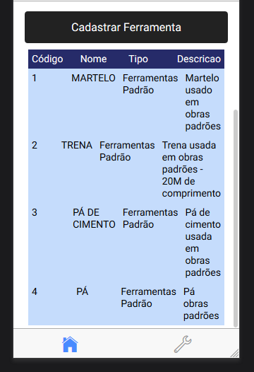
I have the following GRID with IONIC, it’s like this:
<ion-grid>
    <ion-row class="cell-2">
      <ion-col>
        Código
      </ion-col>
      <ion-col>
        Nome
      </ion-col>
      <ion-col>
        Tipo
      </ion-col>
      <ion-col>
        Descricao
      </ion-col>
    </ion-row>
    <ion-row *ngFor="let item of dados" class="cell-1">
      <ion-col>
        {{item.CODIGO}}
      </ion-col>
      <ion-col>
        {{item.NOME}}
      </ion-col>
      <ion-col>
        {{item.TIPO}}
      </ion-col>
      <ion-col>
        {{item.DESCRICAO}}
      </ion-col>
    </ion-row>
  </ion-grid>
However, at the time of viewing it on the mobile phone it is this way:
My CSS is like this:
page-cadastrar-ferramenta {

      .cell-1 {
        background-color: #C5DCFC;

      }

      .cell-2 {
        background-color: #262B69;
        color: white;
      }
}
Can help me make GRID responsive for mobile devices?
My action that returns the data is as follows:
 listar(){

    let data = {
      "token" : ""
  };

    this.http.get('http://www.ferramentasapi.sa-east-1.elasticbeanstalk.com/api/ferramentas', data, {})
    .then(data => {

      console.log(JSON.parse(data.data).rows); // data received by server
      this.dados = JSON.parse(data.data).rows;

    })
    .catch(error => {


    });
  }