Collapse bootstrap 4 does not work mobile

Asked

Viewed 121 times

1

I’m having trouble with a bootstrap 4 in mobile mode.

It opens normally but does not close, I’ve spent a lot of time trying to solve and more still researching! Please help me...

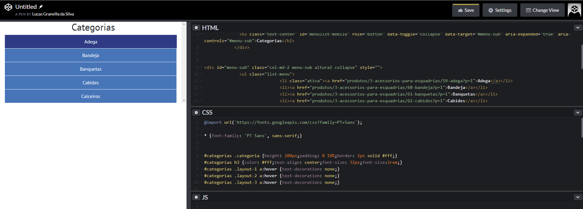
Please check in the correct resolution as in the image.

inserir a descrição da imagem aqui

Link: https://codepen.io/lucas-granvilla-da-silva/pen/aQPPJB

  • Friend edit your question with the code, only the image does not help much. And you also forgot to put the link... Another thing I noticed, what with the Btn you have to click to open the menu??

  • :I forgot to paste the code, sorry!

  • The button to open is the title

2 answers

2


Your problem is simple, your btn of "menu" is with position:Absolute, so it is "hidden" by the contents of opens when you click.

Just add a z-index in that btn from the menu you solve the problem

Behold:

@import url('https://fonts.googleapis.com/css?family=PT+Sans');

* {
  font-family: 'PT Sans', sans-serif;
}


#categorias .categoria {
  height: 200px;
  padding: 0 10%;
  border: 2px solid #fff;
}

#categorias h3 {
  color: #fff;
  text-align: center;
  font-size: 32px;
  font-size: 2rem;
}

#categorias .layout-1 a:hover {
  text-decoration: none;
}

#categorias .layout-2 a:hover {
  text-decoration: none;
}

#categorias .layout-3 a:hover {
  text-decoration: none;
}

.menu-sub {
  overflow-y: scroll;
  max-width: 0px;
  transition: all 1s ease-in-out;
}

.menu-sub ul {
  padding: 0;
  margin-bottom: 0;
}

.menu-sub ul li {
  list-style: none;
  padding: 10px 0;
  margin: 1px;
  background: #4775b8;
  text-align: center;
  position: relative;
  transition: all 0.2s linear;
}

.menu-sub ul li:hover {
  background: #2e3b84;
}

.menu-sub ul li.ativa {
  background: #2e3b84;
  border: 25px solid #fff;
  padding: 0;
  border-bottom-color: transparent;
  border-top-color: transparent;
  border-left-color: transparent;
  border-bottom-color: transparent;
  margin-right: 0;
  height: 0;
}

.menu-sub ul li.ativa a {
  position: relative;
  top: -13px;
}

.menu-sub ul li a {
  color: #fff;
}

.menu-sub ul li a:hover {
  color: #fff;
  text-decoration: none;
}

.cart-mobile {
  display: none;
}

@media screen and (min-height: 0px) and (max-width: 767px) {

  .list-produtos {
    margin-top: 30px;
    max-width: 100%;
  }

  .list-menu {
    margin-top: 45px;
  }

  .menu-desktop {
    display: none;
  }

  .menu-sub {
    max-width: none;
  }

  .menu-sub ul li.ativa {
    border: none;
    padding: 10px 0;
    height: auto;
  }

  .menu-sub ul li.ativa a {
    position: static;
  }

  .max-100 {
    max-width: 100% !important;
  }
}
.menubar-mobile {
  z-index: 10;
}
<link rel="stylesheet" type="text/css" media="screen" href="https://maxcdn.bootstrapcdn.com/bootstrap/4.0.0/css/bootstrap.min.css" />
	<link rel="stylesheet" type="text/css" media="screen" href="https://maxcdn.bootstrapcdn.com/font-awesome/4.7.0/css/font-awesome.min.css" />

	<script src="https://code.jquery.com/jquery-3.2.1.min.js"></script>
	<script src="https://cdnjs.cloudflare.com/ajax/libs/popper.js/1.12.9/umd/popper.min.js"></script>
	<script src="https://maxcdn.bootstrapcdn.com/bootstrap/4.0.0/js/bootstrap.min.js"></script>
	<script src="https://maxcdn.bootstrapcdn.com/bootstrap/4.0.0-beta.3/js/bootstrap.bundle.min.js"></script>


	<div class="col-12 menubar-mobile position-absolute" id="menulist-mobile">
		<h2 class="text-center" id="menulist-mobile" role="button" data-toggle="collapse" data-target="#menu-sub"
		 aria-expanded="true" aria-controls="#menu-sub">Categorias</h2>
	</div>


	<div id="menu-sub" class="col-md-2 menu-sub altura2 collapse" style="">
		<ul class="list-menu">
			<li class="ativa"><a href="produtos/3-acessorios-para-esquadrias/59-adega?p=1">Adega</a></li>
			<li><a href="produtos/3-acessorios-para-esquadrias/60-bandeja?p=1">Bandeja</a></li>
			<li><a href="produtos/3-acessorios-para-esquadrias/61-banquetas?p=1">Banquetas</a></li>
			<li><a href="produtos/3-acessorios-para-esquadrias/62-cabides?p=1">Cabides</a></li>
			<li><a href="produtos/3-acessorios-para-esquadrias/63-calceiros?p=1">Calceiros</a></li>
		</ul>
	</div>

  • 1

    love this site! how could I have missed something so simple.

  • @Lucas will give you a valuable tip, which you can use in both Chrome and Firefox. Whenever you have this kind of problem, go to the browser’s Devtools. Or right-click on the problem element and have "Inspect" ai vc enable and disable CSS in real time, and move until you find the problem. Devtools is powerful and should be used! There is even tutorial teaching how to work with it, worth a search of your art. Good luck there

  • 1

    I use it, but I did several tests, compared it with the documentation on the bootstrap, I thought it was something from the server and I tested it in the codepen and saw that it was in the code. I tested only with the css needed to see if it was some other property, but not so. So I said I don’t know how I didn’t test this. Thank goodness I have you. I have to start using this site more, very little use.

  • @Lucas has a lot of wild people here, even high-level professionals, who are willing to help. Use whenever you need it without rss moderation, just be careful to always ask complete and objective questions. []s

2

Without entering the merit of the code, the problem is that in mobile mode the menu div is staying over the text that controls it.

Add z-index: 1 in div#menulist-mobile within @media:

#menulist-mobile{
   z-index: 1;
}

This will make the div that houses the <h2> stay above the menu div.

  • thanks for the reply friend! the boy there answered before so I gave him the answer!

  • Falô colleague! Good luck!

Browser other questions tagged

You are not signed in. Login or sign up in order to post.