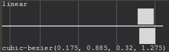
TL;DR
The four parameters define the two control points of the Bézier curve, P1(x1, y1) and P2(x2, y2), to grade 3.
cubic-bezier(x1, y1, x2, y2)
The Curve of Bézier
The Bézier curve is a form of interpolation between a set of points and is understood by interpolation an approximation, or average, that seeks to reproduce the same behavior presented by the interpolated points. For example, if you have two aligned points, you can trace a line segment between them, estimating that all the intermediate points have the same behavior as the two points that originated the line segment; this estimate is what we call interpolation. In a more lay language, it would be like saying that if you left point A and arrived at point C, you probably passed point B, since B is between A and C.
Mathematically, the Bézier curve is represented by:
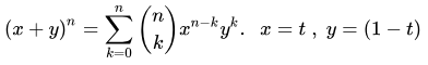
Where:
- (x, y) is the point of the curve in a bi-dimensional plane;
- n is the order of the curve;
- k the sum control index;
- t a parameter used to traverse the curve;
A Bézier curve of order n interpolates between n+1 points.
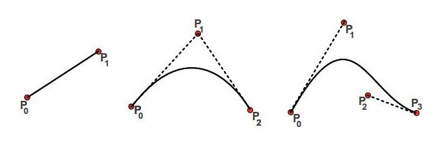
Source: examples of linear, quadratic and cubic Bézier curves.
The Curve of Cubic Bézier
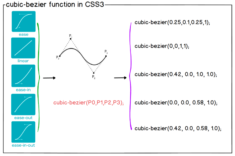
The function cubic-bezier, as expected, it uses the particular case of the Bézier curve for n = 3, thus having 4 control points - points that generate interpolated and generate the curve. The starting point, P0, will always be the origin, (0, 0), already the end point, P3, shall always be point (1, 1), leaving only P points1 and P2, which are precisely defined in the function parameters.
If you simplify the equation with the known parameters, you will have:

Knowing the P points0(0, 0) and P3(1, 1), as well as points P1 and P2 which are defined by the parameters, we are able to plot the graph interpolating the points.
How to calculate P1 and P2 from the chart I wish to mount?
The points P0 and P3 are known, so we just need to determine who is P1 and P2 to define the parameters of the equation.
One of the ways to do this is to put together a system of equations. Remembering that each point is composed of two dimensions, we will have the challenge of determining the value of four variables. Knowing the values of B(t) where you want the curve to go, you can solve the system for these variables.
The Jefferson Quesado has already done a response dealing with linear system solutions which can be used as a basis.
The other alternative, which is usually more viable in the vast majority of cases is trial and error. Understanding that point P1 influences the beginning of the animation and the P point2 influences the end of it, you can already position them as you wish and adjust as you need.
Tools
Obviously you don’t need to make the trial and error in the hand. There are already tools that help you in creating a cubic Bézier Curve.
Other more exist.
Examples
Ease In
The animation ease-in is known to start slowly and be faster at the end.
#animations:hover .box {
  width: 100%;
}

.box {
  width: 0;
  height: 20px;
  background-color: red;
  transition: width 2s;
}

.box.ease-in {
  transition-timing-function: ease-in;
}

.box.cubic-bezier {
  transition-timing-function: cubic-bezier(0.4, 0.0, 0.2, 1);
}

section > section {
  margin-bottom: 20px;
}
<section id="animations">
  <header>
    <h1>Ease In</h1>
  </header>
  <section>
    <strong>Animação ease-in do navegador</strong>
    <pre>transition-timing-function: ease-in</pre>
    <div class="space">
      <div class="box ease-in"></div>
    </div>
  </section>

  <section>
    <strong>Animação ease-in definida pelo Google Material</strong>
    <pre>transition-timing-function: cubic-bezier(0.4, 0.0, 0.2, 1);</pre>
    <div class="space">
      <div class="box cubic-bezier"></div>
    </div>
  </section>
</section>
Ease Out
The animation ease-out is known to start quickly and be slower at the end.
#animations:hover .box {
  width: 100%;
}

.box {
  width: 0;
  height: 20px;
  background-color: red;
  transition: width 2s;
}

.box.ease-out {
  transition-timing-function: ease-out;
}

.box.cubic-bezier {
  transition-timing-function: cubic-bezier(0.0, 0.0, 0.2, 1);
}

section > section {
  margin-bottom: 20px;
}
<section id="animations">
  <header>
    <h1>Ease Out</h1>
  </header>
  <section>
    <strong>Animação ease-out do navegador</strong>
    <pre>transition-timing-function: ease-out</pre>
    <div class="space">
      <div class="box ease-out"></div>
    </div>
  </section>

  <section>
    <strong>Animação ease-out definida pelo Google Material</strong>
    <pre>transition-timing-function: cubic-bezier(0.0, 0.0, 0.2, 1);</pre>
    <div class="space">
      <div class="box cubic-bezier"></div>
    </div>
  </section>
</section>