2
My Category submenu, overflows the page when resized. How do I make the submenu go left when this happens?
The problem
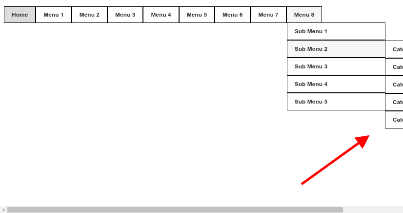
As soon as I want it to happen, the submenu was thrown to the left because it was overflowing the page
#primary_nav_wrap
{
	margin-top:15px
}

#primary_nav_wrap ul
{
	list-style:none;
	position:relative;
	float:left;
	margin:0;
	padding:0
}

#primary_nav_wrap ul a
{
	display:block;
	color:#333;
	text-decoration:none;
	font-weight:700;
	font-size:12px;
	line-height:32px;
	padding:0 15px;
	font-family:"HelveticaNeue","Helvetica Neue",Helvetica,Arial,sans-serif
}

#primary_nav_wrap ul li
{
	position:relative;
	float:left;
	margin:0;
	padding:0;
  border: 1px solid black;
}

#primary_nav_wrap ul li.current-menu-item
{
	background:#ddd
}

#primary_nav_wrap ul li:hover
{
	background:#f6f6f6
}

#primary_nav_wrap ul ul
{
	display:none;
	position:absolute;
	top:100%;
	left:0;
	background:#fff;
	padding:0
}

#primary_nav_wrap ul ul li
{
	float:none;
	width:200px
}

#primary_nav_wrap ul ul a
{
	line-height:120%;
	padding:10px 15px
}

#primary_nav_wrap ul ul ul
{
	top:0;
	left:100%
}

#primary_nav_wrap ul li:hover > ul
{
	display:block
}
<nav id="primary_nav_wrap">
<ul>
<li class="current-menu-item"><a href="#">Home</a></li>
<li><a href="#">Menu 1</a>
<ul>
<li><a href="#">Sub Menu 1</a></li>
<li><a href="#">Sub Menu 2</a></li>
<li><a href="#">Sub Menu 3</a></li>
<li><a href="#">Sub Menu 4</a>
<ul>
<li><a href="#">Deep Menu 1</a>
<ul>
<li><a href="#">Sub Deep 1</a></li>
<li><a href="#">Sub Deep 2</a></li>
<li><a href="#">Sub Deep 3</a></li>
<li><a href="#">Sub Deep 4</a></li>
</ul>
</li>
<li><a href="#">Deep Menu 2</a></li>
</ul>
</li>
<li><a href="#">Sub Menu 5</a></li>
</ul>
</li>
<li><a href="#">Menu 2</a>
<ul>
<li><a href="#">Sub Menu 1</a></li>
<li><a href="#">Sub Menu 2</a></li>
<li><a href="#">Sub Menu 3</a></li>
</ul>
</li>
<li><a href="#">Menu 3</a>
<ul>
<li class="dir"><a href="#">Sub Menu 1</a></li>
<li class="dir"><a href="#">Sub Menu 2</a>
<ul>
<li><a href="#">Category 1</a></li>
<li><a href="#">Category 2</a></li>
<li><a href="#">Category 3</a></li>
<li><a href="#">Category 4</a></li>
<li><a href="#">Category 5</a></li>
</ul>
</li>
<li><a href="#">Sub Menu 3</a></li>
<li><a href="#">Sub Menu 4</a></li>
<li><a href="#">Sub Menu 5</a></li>
</ul>
</li>
<li><a href="#">Menu 4</a></li>
<li><a href="#">Menu 5</a></li>
<li><a href="#">Menu 6</a></li>
<li><a href="#">Menu 7</a></li>
<li><a href="#">Menu 8</a>
<ul>
<li class="dir"><a href="#">Sub Menu 1</a></li>
<li class="dir"><a href="#">Sub Menu 2</a>
<ul>
<li><a href="#">Category 1</a></li>
<li><a href="#">Category 2</a></li>
<li><a href="#">Category 3</a></li>
<li><a href="#">Category 4</a></li>
<li><a href="#">Category 5</a></li>
</ul>
</li>
<li><a href="#">Sub Menu 3</a></li>
<li><a href="#">Sub Menu 4</a></li>
<li><a href="#">Sub Menu 5</a></li>
</ul>
</li>
</ul>
</nav>I searched for the js getBoundingClientRect() function to get the coordinates but I don’t know exactly how to implement this, I also tried this plugin https://github.com/gijsroge/offscreen.js/ but it didn’t work either.
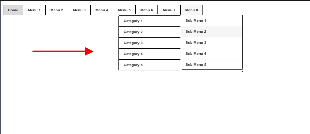
Cara only has a problem when resized the screen all submenus are thrown to the left. Look at the menu 3 sub menu 2. It has to be played only to the left that submenu that overflowed?
– Marcelo T. Cortes
@Marcelot.Cortes had not noticed that he had another rss sub-menu. Well in this case my tip is you create a class and put this class only in the sub-menu that you want to get inside the page. in that case an Ex. would be
@media screen and (max-width:1022px) {
 #primary_nav_wrap ul ul ul.interno { left: -101% }}In that wayULwith class.internogoes inside when the screen is less than 1022px. If UL does not have the class.internoit continues as before. Qq thing speaks there– hugocsl
The problem is that the menus here at the company are dynamically generated with php https://pastebin.com/5nMYqgpS look at line 42 in pastbin. I put this generic menu in my question thinking that the solution would apply in my company menu and worked but with this problem. Then it is no use to put a class because it will apply to all generated uls. I spent a long time trying a js solution using Element.getBoundingClientRect() picking up the coordinates of the submenus ul but did not succeed kk
– Marcelo T. Cortes
I think a solution with javascript would be more effective and would apply in all cases, through the ul coordinates. If ul overflow the page play this to the left and keep the other normal.
– Marcelo T. Cortes
@Marcelot.Cortes com CSS vc will not achieve this fully automated dynamics, but what you can do is use the pseudo class
:nth-child()to define by CSS individually how it will behave each part of the menu understands. It is not yet a 100% option, but it is a way to define by CSS how each child of the menu looks. If you want, you can leave the question still unchecked as Answer Accepted, no problem, it’s fine ;)– hugocsl
This helped me https://stackoverflow.com/questions/11512032/detect-if-dropdown-navigation-would-go-off-screen-and-reposition-it ;) and now I have a js and css haha fit!
– Marcelo T. Cortes
@Marcelot.Cortes good d+ then rss! Good that solved tmj
– hugocsl