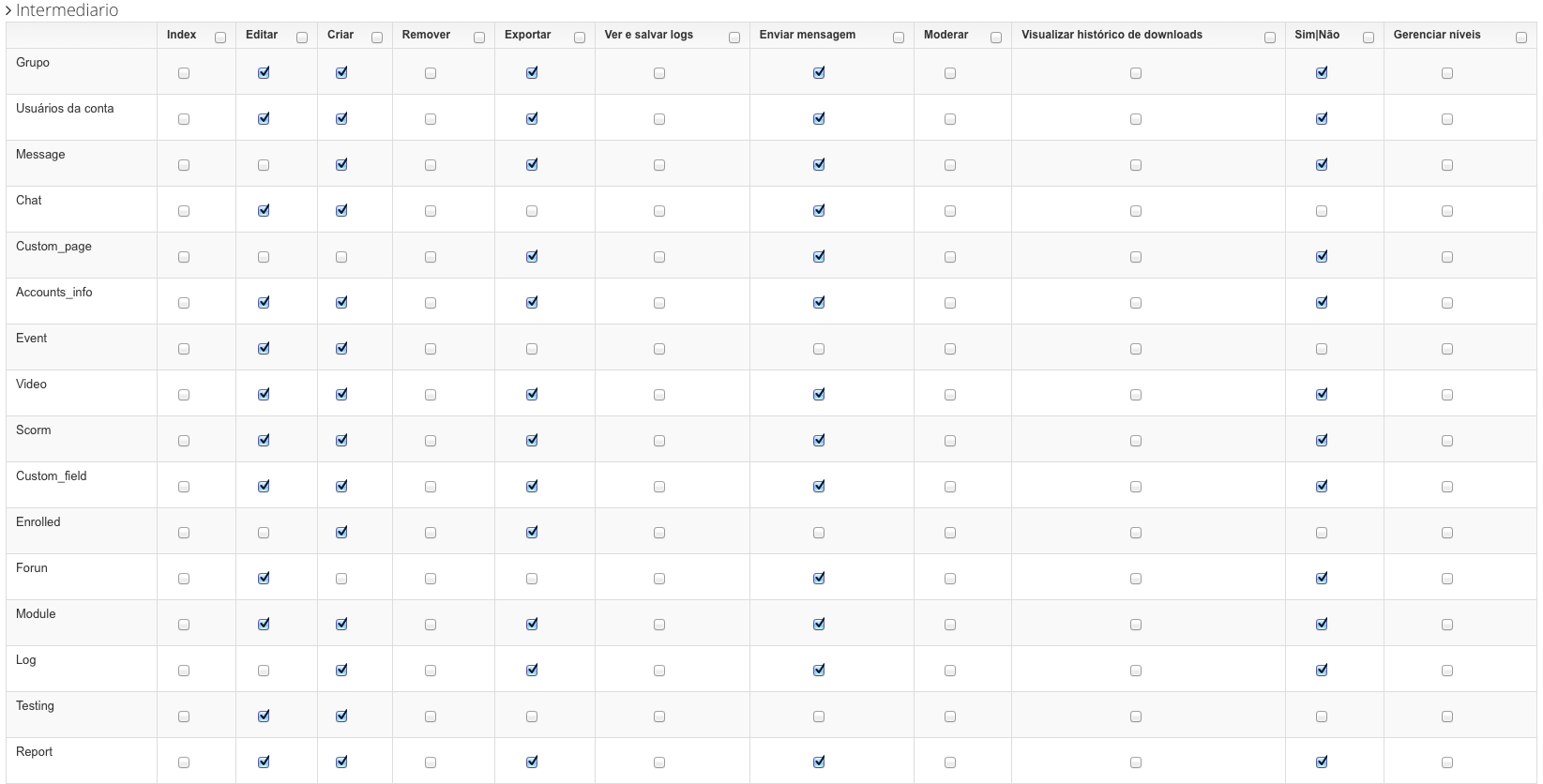
The concept of "responsive" when we talk about tabular data, and in a way when we talk about any elements, has limitations that relate to usability.
In the particular case of your table, some techniques can be used to adapt it to smaller devices, but from a certain point, the scrollbars perform a crucial task to maintain the table reading and usability.
Note: Since you are using Bootstrap, the example below makes use of some auxiliary CSS classes present in the Framework (English).
Applied solutions:
- On screen of very reduced width, we use icon instead of text;
- The text size is reduced or increased depending on the screen size;
- Making use of auxiliary classes present in Bootstrap, the text or the icon depending on the width of the screen;
- When the icon is in use, the text is present as the title of it to allow the user a correct identification of the icon;
- Table with minimum width to ensure the reading and usability of it. Scroll bars are used below this width to complement navigation.
HTML
With class visible-xs, we have been able to ensure that a certain element only appears on very small mobile screens or smaller screens.
With class hidden-xs, we can ensure that the text is hidden when the icon is visible.
<span class="glyphicon glyphicon-pencil visible-xs" title="Editar"></span>
<span class="hidden-xs">Editar</span>
<input type="checkbox"/>
CSS
Making use of media queries (English), we can manipulate the CSS properties of each element so that they adapt to the screen size.
In this case we are manipulating the size of the text up to a certain point. After this, as explained above, it ceases to appear and an icon is shown that represents it:
/* Landscape phones and smaller */
@media (max-width: 480px) {
    table.cf thead th{
        font-size:0.6em;
    }
}

/* Landscape phones and portrait tablets */
@media (max-width: 767px) {
    table.cf thead th{
        font-size:0.6em;
    }
}

/* Portrait tablets and small desktops */
@media (min-width: 768px) and (max-width: 991px) {
    table.cf thead th{
        font-size:0.6em;
    }
}

/* Portrait tablets and medium desktops */
@media (min-width: 992px) and (max-width: 1199px) {
    table.cf thead th{
        font-size:0.8em;
    }
}

/* Large desktops and laptops */
@media (min-width: 1200px) {

}
Upshot
With this practical example the table can be read on a device 360px wide to the widest of the screens:
Example working on Jsfiddle
Note: The title "edit" appears because the mouse is above the icon "Edit".

Below 360 pixels, the suggestion is to use scroll bars where the table gets a fixed width of 360px and displacement bars provide auxiliary navigation.
The most I can think of is to hide the header of the columns as the width decreases, until they run out of header, and the columns in the minimum width to fit the checkbox. Even so, it has a minimum limit of width of the whole table...
– bfavaretto
Exactly @bfavaretto and also think it would be a bit confusing for the user.
– Jefferson Alison
Another thing that could be done would be a sub-table
– KaduAmaral
What do you mean @Kaduamaral? Have an example?
– Jefferson Alison
There is a plugin called Footable
– KaduAmaral
Got it @Kaduamaral, I’m using a similar one, the Datatables that does the same thing as this Footable. But I want to do something that is as visible as possible, I don’t want to hide as in the example.
– Jefferson Alison
Hmm, so you can do like an overflow, like the Twitter Bootstrap. You can simulate this table in Jsfiddle so we can work on it?
– KaduAmaral
You could change the layout, leaving for example [Group] and leave the checkbox below the [Group], type a title, so you can have something Responsive
– Rod
I don’t quite understand what @Rod meant, there’s some example?
– Jefferson Alison
@Kaduamaral, I added the link to Fiddle in the question.
– Jefferson Alison
What I had suggested was this Jsfiddel
– KaduAmaral
When I was facing the same problem (in my case there was nothing fixed, even the possible functionalities were dynamic) I thought it was better to use a
accordion. Eachpanelrepresented a group, it was simple to make it responsive. Not wanting to leave the scope of your question...– Cold
So @Kaduamaral, this is my first option if I don’t find anything better. I had already thought of something like this.
– Jefferson Alison
I got it @Cold, but I don’t think it would be good for me :/
– Jefferson Alison
I don’t know how your system is, but I could also put a single page to change the permissions of a group instead of a table.
– KaduAmaral
Yes, I thought of something more or less like this. But instead of a page, open a Lightbox.
– Jefferson Alison