How to use a border image (or character) via CSS?

Asked

Viewed 190 times

2

I have a tag <p> with text inside which I would like to use the key characters [ ] as an edge for this text.

Code:

.indicacoes {
font-family: 'AmaticBold';
font-size: 40px;
margin-top: 30px;
text-align: center; }
<div class="container">
        <div class="texto-principal">
            <p id="borderimg" class="indicacoes">texto de teste! <br>
                TEXTO TEXTO TEXTO TEXTO. <br>
                TEXTO TEXTO TEXTO.</p>
        </div>
</div>

The goal is to stay as in the attached image: Imagem de exemplo

  • 2

    Will the text there always have a maximum of 3 lines? It can be with SVG?

2 answers

0

As you say this response from the OS you can draw the keys without using any pseudo element in pure CSS.

Footsteps:

  • Create an element like <div or span and use inline-block so that the size is dependent on the content;
  • Apply the edges on the right and left;
  • Use linear-gradient() to create 4 background images with specific height and width and draw in each corner of the box with background-position. The estate height of background-size must be equal to the thickness of the left edge.

div.chaves {
  background-image: linear-gradient(#000000, #000000),
                    linear-gradient(#000000, #000000),
                    linear-gradient(#000000, #000000),
                    linear-gradient(#000000, #000000);
  border: solid #000000;

  background-repeat: no-repeat;
  /* O segundo valor deve ser igual à largura das bordas */
  background-size: 8px 4px;
  border-width: 0 4px;
  background-position: top left, top right, bottom left, bottom right;
  display: flex;
  align-items: center;
  justify-content: center;
}
<div style="display: flex; justify-content: center; padding-top: 50px;">
  <div style="width: 40%;">
    <div class="chaves">
      <p id="borderimg" class="indicacoes">
        texto de teste! <br> TEXTO TEXTO TEXTO TEXTO. <br> TEXTO TEXTO TEXTO.
      </p>
    </div>
  </div>
</div>

  • 1

    Thanks for the reply. She was very helpful!

0


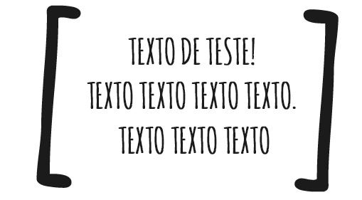
I made a model using pseudo-element even, because this way I can better control the contour and curvatures. I know it wasn’t exactly the same, but sometimes it suits you...

I didn’t need to touch anything in your HTML, just in the box where the text is inside I create a ::before and ::after Those "keys" [ ] will always have the height of the content, so no matter if it has a lot or little text, the "keys" will always fit with the content.

The trick here was to build a rectangle on each side of the text box and remove the border from within that square, to make the corners rounded just use border-radius. But as I said at the beginning it doesn’t exactly look like the image

.indicacoes {
    font-family: 'AmaticBold';
    font-size: 40px;
    margin-top: 30px;
    text-align: center; 
}
.texto-principal {
    padding: 1rem;
    width: 50%;
    margin: 1rem auto;
    position: relative;
}
.texto-principal::after,
.texto-principal::before {
    content: "";
    position: absolute;
    top: 0;
    width: 4em;
    height: 100%;
    border: .5em solid currentColor;
    border-radius: .5em;
}
.texto-principal::after {
    left: 0;
    border-right: 0;
}
.texto-principal::before {
    right: 0;
    border-left: 0;
}
<div class="container">
    <div class="texto-principal">
        <p id="borderimg" class="indicacoes">
            texto de teste! <br>
            TEXTO TEXTO TEXTO TEXTO. <br>
            TEXTO TEXTO TEXTO.
        </p>
    </div>
</div>

  • 1

    Thanks for the answer. Even though the final result did not look like the image, it helped me a lot! I thank you for your help.

  • @Thomaz1593 cool young man, how nice that helped you there. Good luck with the project!

Browser other questions tagged

You are not signed in. Login or sign up in order to post.