First this answer is a GAMBIARRA!(and is not 100% the animation of Collapse). The way you rode that Nav is totally wrong if you check the official Bootstrap 4 documentation. https://getbootstrap.com/docs/4.0/components/navbar/
For starters you have two Nav with the same ID, and has only one button to open two different Nav... this structure is wrong according to the documentation... You would have to redo this Nav and include all the items inside it, but adjusting the CSS to look the way you like and nay put another block of HTML with the Nav in your document
Okay now let’s get to the problem. First change the name of ID of the second nav, now create a CSS to show the second nav case the first nav get the class show coming by the script.
.collapse.navbar-collapse.show + .collapse {
    display: block;
}
So if the first Nav is shown the second is also shown!
See the code working. However, I don’t know if your project will work, because it can suffer with some css that you have already done there. Also, strongly recommend that you review the structure of these navs to see how best to put the two menus in one nav only, and not use two navs the way you did...
<!DOCTYPE html>
<html lang="en">
<head>
<meta charset="utf-8" />
<title>Page Title</title>
<meta name="viewport" content="width=device-width, initial-scale=1">
<link rel="stylesheet" type="text/css" media="screen" href="https://maxcdn.bootstrapcdn.com/bootstrap/4.0.0/css/bootstrap.min.css" />
<link rel="stylesheet" type="text/css" media="screen" href="https://maxcdn.bootstrapcdn.com/font-awesome/4.7.0/css/font-awesome.min.css" />
<style>
.collapse.navbar-collapse.show + .collapse {
display: block;
}
</style>
</head>
<body>
<div class="row">
<nav class="navbar navbar-expand-lg navbar-light">
<a class="navbar-brand" href="#"> </a>
<button class="navbar-toggler" type="button" data-toggle="collapse" data-target="#navbarNav" aria-controls="navbarNav"
aria-expanded="false" aria-label="Toggle navigation">
<span class="navbar-toggler-icon"></span>
</button>
<div class="collapse navbar-collapse" id="navbarNav">
<ul class="navbar-nav">
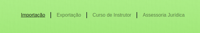
<li class="nav-item active">
<a class="nav-link" href="#">Importação</a>
</li>
<span class="linha-vertical"></span>
<li class="nav-item">
<a class="nav-link" href="#">Exportação</a>
</li>
<span class="linha-vertical"></span>
<li class="nav-item">
<a class="nav-link" href="#">Curso de Instrutor</a>
</li>
<span class="linha-vertical"></span>
<li class="nav-item">
<a class="nav-link" href="#">Assessoria Jurídica</a>
</li>
</ul>
</div>
<div class="collapse navbar-collapse" id="navbarNav1">
<ul class="navbar-nav">
<li class="nav-item active">
<a class="nav-link" href="#">Vendas</a>
</li>
<span class="linha-vertical"></span>
<li class="nav-item">
<a class="nav-link" href="#">Consultores</a>
</li>
<span class="linha-vertical"></span>
<li class="nav-item">
<a class="nav-link" href="#">Relatórios</a>
</li>
</ul>
</div>
</nav>
</div>
<script src="https://code.jquery.com/jquery-3.2.1.min.js"></script>
<script src="https://cdnjs.cloudflare.com/ajax/libs/popper.js/1.12.9/umd/popper.min.js"></script>
<script src="https://maxcdn.bootstrapcdn.com/bootstrap/4.0.0/js/bootstrap.min.js"></script>
<script src="https://maxcdn.bootstrapcdn.com/bootstrap/4.0.0-beta.3/js/bootstrap.bundle.min.js"></script>
</body>
</html>
Face do not know if it is your goal, but when the screen is small and the Menu gets "shrunk" inside the menu button when opening it only appear the items of first Nav, the second Nav the items do not appear when you click on the btn of the Menu...
– hugocsl
Hello Hugo. Actually it appears, but it ends up overlapping one part of the other kkkkkkkk. There would be some other way for me to solve this?
– user24136
Guy put an answer there, as you can see it will open both Nav, but the HTML structure of this component is totally compromised... the correct would be you start again, because the html structure is totally wrong from the documentation point of view and it would not have worked if it wasn’t for the CSS gambit I made, even if it is not 100%... Qq thing comments there on the answer.
– hugocsl
Hello Ugo. All right. This is a project of a client who already has a site, even though I have already presented a new layout, he wants to remain with the current interface, but the current structure is very old, developed with Tables, etc. From what I saw, is dated in 2003. I accepted the challenge, I already changed all the content to Bootstrap, but I’m having difficulties exactly on the menu. I’ll test your code and anything else I come back here. Thank you again for the force.
– user24136