1
I’m making my site responsive, and I found a menu that becomes a hamburger menu depending on the screen size, the way I wanted it. However, the menu opens as you hover your mouse (and probably your finger) above, and I would like it to open and close if you click the button.
HTML:
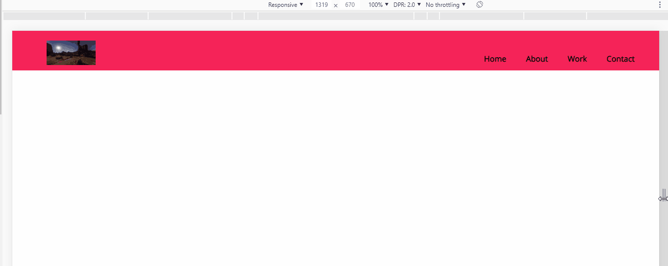
<header>
    <a href="#" id="logo"></a>
    <nav id="menu">
        <a href="#" id="menu-icon"></a>
        <ul>
            <li style="list-style: none; display: inline"></li>
            <li>
                <a href="#">Home</a>
            </li>
            <li style="list-style: none; display: inline"></li>
            <li>
                <a href="#">About</a>
            </li>
            <li style="list-style: none; display: inline"></li>
            <li>
                <a href="#">Work</a>
            </li>
            <li style="list-style: none; display: inline"></li>
            <li>
                <a href="#">Contact</a>
            </li>
            <li style="list-style: none; display: inline"></li>
        </ul>
    </nav>
</header>
CSS:
@import 'https://fonts.googleapis.com/css?family=Open+Sans';
header {
  background: #F62459;
  width: 100%;
  height: 76px;
  position: fixed;
  top: 0;
  left: 0;
  z-index: 100;
  border-bottom: 5px solid #F62459;
}
ul {
  list-style: none;
}
li {
  display: inline-block;
  float: left;
  padding: 10px
}
a {
  color: #fff;
  text-decoration: none;
  font-weight: bold;
}
a:hover {
  text-decoration: underline;
}
#logo {
  margin: 20px;
  float: left;
  width: 200px;
  height: 50px;
  background: url(logo.svg) no-repeat center;
  display: block;
}
nav {
  float: right;
  padding: 20px;
  font-family: 'Open Sans', sans-serif;
}
#menu-icon {
  background: url(menu-icon.png) no-repeat center;
  display: hidden;
  width: 32px;
  height: 32px;
}

@media only screen and (max-width: 640px) {
header {
    position: absolute;
}
#menu-icon {
    display: inline-block;
}
nav ul {
    display: none;
    position: absolute;
    padding: 20px;
    background: #c5c5c5;
    right: 10px;
    top: 65px;
    width: 35%;
}
nav:hover ul {
    display: block;
}
nav li {
    text-align: center;
    width: 100%;
    padding: 15px 0;
    margin: 0;
}
}
JAVASCRIPT:
<script>
    $('#menu-icon').on('click', function() {
        $('#menu').slideToggle('slow');
    });
</script>
Your menu already working on
.on('click')note his script... Note also that for it to work it needs jQuery indexed in the document.– hugocsl
You removed the question
Exibir se dado já existe no banco dentro do formulário. I just developed an answer for it, see working on http://kithomepage.com/sos/lua.html– user60252
Leo, I restored the post, did you could reply there?
– lua