Column that fills the screen according to width

Asked

Viewed 193 times

5

I’m trying to do something that should be simple, but my CSS skills are lame. I would like to make a login screen with a fixed column on the right, as in the image below, but I would like the right column to fill the entire width when the screen is narrow, for example, on mobile phones.

inserir a descrição da imagem aqui

Thank you!

  • 1

    Hello, welcome to stackoverflow en! Try to post along with your question some code you have already tasted. But I think what you’re looking for is called responsiveness.

  • I suggest you use Bootstrap, with it you can do it for both desktop and mobile.

  • @Renanosorio why use Bootstrap for this? For which you will import a 90kb Framework if you can solve this with less than 10 CSS lines?

  • Bootstrap will help not only to make this login screen, but for future structures that it may need for both mobile and desktop, in these cases you have a framework ready, no need to remake something that is already ready.

  • Hello, welcome to stackoverflow! : D Just a hint for your next questions, avoid using links to, examples or code, as it may occur the link becomes inactive. So you stop helping others. ;)

2 answers

7

There are several ways to do it. Here is a simple example with Flexbox.

This model works like this, using the media query @media when the screen is larger than 660px with the flex-basis I determine that the right column will have 70% and the right 30%, When the screen is smaller than 660px every column gets 100% of flex-basis, so each column occupies an entire row.

inserir a descrição da imagem aqui

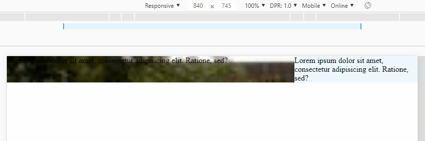
Code with the image result above:

OBS: Display under "Whole Page" to better see how responsive it is. If I want to adjust the width of the columns just adjust proportionally the 70% and 30% always adding up to 100%, Ex: 75%, 25%

* {
    box-sizing: border-box;
}
.container {
    display: flex;
    flex-wrap: wrap;
}
.esq {
    flex-basis: 70%;
    background-image: radial-gradient(transparent, rgba(0,0,0,0.9)), url(https://unsplash.it/360/200);
    background-size: cover;
}
.dir {
    flex-basis: 30%;
    background-color: aliceblue;
}
@media screen and (max-width: 660px) {
    .container > div {
        flex-basis: 100%;
    }
}
<div class="container">
    <div class="esq">
        Lorem ipsum dolor sit amet, consectetur adipisicing elit. Ratione, sed?
    </div>
    <div class="dir">
        Lorem ipsum dolor sit amet, consectetur adipisicing elit. Ratione, sed?
    </div>
</div>


TIP: as a matter of curiosity

In this case in specific vc tb can use the technique known as Flex-Grow 9999 Hack with her you can make the columns break no need for media query! Here you can read more about it: https://joren.co/flex-grow-9999-hack/

inserir a descrição da imagem aqui

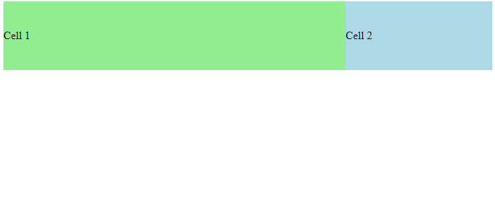
See the code used to get the image result above:

.container {
  display: flex;
  flex-wrap: wrap;
}
.cell {
  display: flex;
  align-items: center;
  height: 100px;
}
.first {
  flex-grow: 1;
  background-color: lightgreen;
  flex-basis: 70%;
  min-width: 320px; 
}
.second {
  flex-grow: 9999;
  flex-basis: 30%;
  background-color: lightblue;
}
<div class="container">
  <div class="cell first">
    Cell 1
  </div>
  <div class="cell second">
    Cell 2
  </div>
</div>

  • Just to complement, if you want to hide the image from the left on mobile (so n stays at the top of the screen), just add a jquery/css that hides the div on small screens

  • 1

    @Renanosorio actually just put inside the media display querie:None in the left div, why use jQuery or JS? It’s already ready there, just add 1 line of css.....

  • Oh it’s true, well noted.

2

Hello, this type of screen is called Feature Screen and usually do not have a content that exceeds the size of the screen itself. To make a screen like this you can use the structure below:

   * {
  margin: 0;
  padding: 0;
}

.wrapper {
  display: flex;
  flex-direction: row;
  width: 100%;
  height: 100vh;
}

.wrapper>* {
  flex: 1
}

.feature {
  background-size: cover;
  background-repeat: no-repeat;
  background-position: center center;
  /* background-image: url('minha-imagem-aqui.jpg') */
  background-color: red; /* troque essa linha pela de cima */
}

.main {
  width: 100%;
  max-width: 350px;
  min-width: 350px;
}

@media only screen and (max-width: 576px) {
    .feature {
        display: none;
    }
}
<div class="wrapper">
  <div class="feature"></div>
  <div class="main">
    <p>o conteúdo da página aqui</p>
  </div>
</div>

Just like the comment above, you should take a look at responsiveness because this kind of control is done with media queries. Take a look at this article:

EDIT

I made changes to the solution presented above to fit the width of the screen when it is in a specific size. Based on the bootstrap, which defines that a screen is the size of an application when it is at most 576px

  • 1

    Hello @Leandrouk, thank you for the answer. Of all the answers here, your code is the closest thing I want to do. But the column is missing take over the entire screen when the width of the screen becomes narrow as a cell phone. So far I’ve been able to do something similar. Can you please pay attention to that last detail? Thank you!

  • When I get home I put it on for you OK? I’m in college

  • 1

    Thank you @Leandroluk.

  • Hello, could you please mark the correct answer to close the question?

Browser other questions tagged

You are not signed in. Login or sign up in order to post.