1
I am trying to create a template for PDF generation, which will serve for order label.
 I wanted to structure everything in place.
As it is PDF, I cannot use Boostrap or any other facilitator, only HTML and CSS code.
I wanted to structure everything in place.
As it is PDF, I cannot use Boostrap or any other facilitator, only HTML and CSS code.
<style>
.conteudo {
font-size: 10px;
}
.destaque-1 {
font-size: 14px;
line-height: 2px;
}
.destaque-2 {
line-height: 2px;
}
.destaque-3 {
font-family: sans-serif, Arial, Verdana, "Trebuchet MS";
line-height: 2px;
}
.tabela-de-nutrientes{
float: right;
}
tr,td {
border: 1px solid #0a0a0a;
}
.qrcode{
}
</style>
<div class="conteudo">
{{-- Dados do cliente / pedido / produto --}}
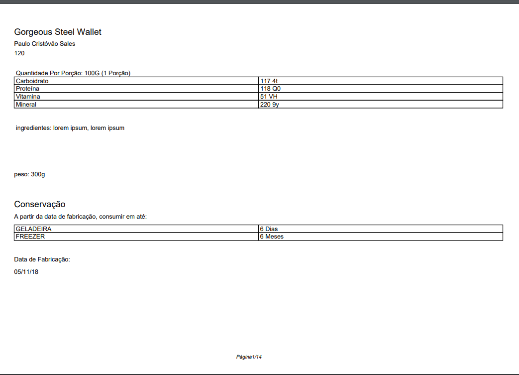
<div class="pedido">
<p class="destaque-1">{{ $item->product->name }}</p>
<p class="destaque-2">{{ $item->order->client->user->name }}</p>
<p class="destaque-3">{{ $item->order->id }}</p>
</div>
{{-- Dados do cliente / pedido / produto --}}
{{-- Dados Nutricionais // Inicio --}}
<table class="tabela-de-nutrientes" cellspacing="0">
<tr>
<th colspan="2">Quantidade Por Porção: 100G (1 Porção)</th>
</tr>
@foreach($item->product->nutrients as $nutrient)
<tr>
<td>{{$nutrient->name}}</td>
<td>{{$nutrient->pivot->amount}} {{$nutrient->unity}}</td>
</tr>
@endforeach
</table>
{{-- Dados Nutricionais // Fim --}}
{{-- Ingredientes ou Componentes // Inicio--}}
<div class="ingredientes-componentes">
<p> ingredientes: lorem ipsum, lorem ipsum </p>
</div>
{{-- Ingredientes ou Componentes // Fim--}}
<div>
<p>peso: 300g</p>
</div>
{{-- QRCODE --}}
<img class="qrcode" src="data:image/png;base64, {{ $qrcode }} ">
{{-- QRCODE --}}
{{-- conservação // Inicio--}}
<div>
<p class="destaque-1">Conservação</p>
<p class="destaque-3">A partir da data de fabricação, consumir em até:</p>
<table>
<tr>
<td> GELADEIRA </td>
<td> 6 Dias </td>
</tr>
<tr>
<td> FREEZER </td>
<td> 6 Meses </td>
</tr>
</table>
</div>
{{-- conservação // Fim --}}
{{-- Fabricacao --}}
<div>
<p class="destaque-2">Data de Fabricação:</p>
<p>{{ $item->created_at->format('d/m/y') }}</p>
</div>
</div>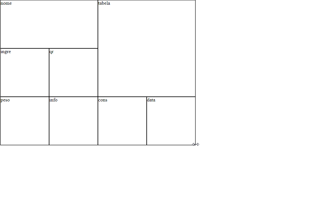
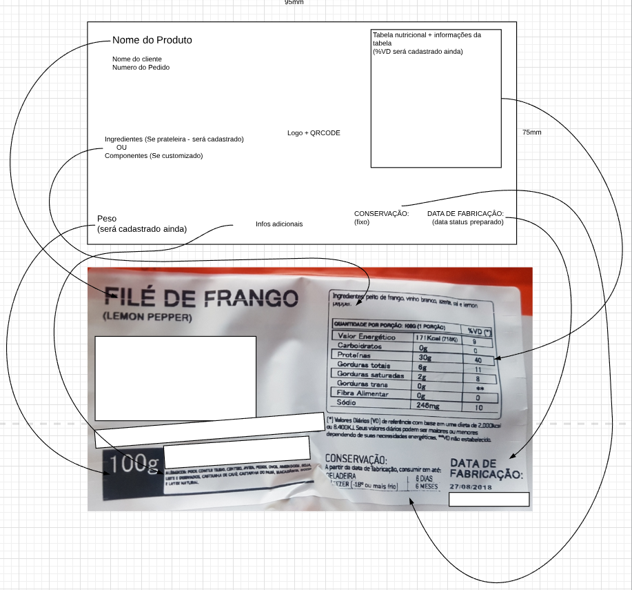
Friend the ideal is that you post a wireframe at least, defining the regions you need etc... The way you drew got a little confused...
– hugocsl
I edited it for you see what it’s like to stay.
– Romulo Sousa
as I reduce the space inside the cell table.
– Romulo Sousa
Your HTML does not seem to be just HTML. Could elaborate a [mcve]?
– Woss
Reduce space? What do you refer to? If over the edge use
border-collapse: collapse;intableBut anyway I do not recommend you to make this layout with Table. The most correct would be with Flex display or Grid– hugocsl
I want to reduce the spaces in
<td>– Romulo Sousa
want to ident the table to the right and do this, with the spaces of the <td>
– Romulo Sousa
There are some variables, because the data that will be fed out came from the controller, I’m using Laravel @Andersoncarloswoss
– Romulo Sousa
@Romulosousa exactly. The question is about HTML/CSS, do not need to involve Laravel in the middle. This makes us unable to reproduce your code. If the question is about HTML/CSS, keep only the HTML/CSS code. You can generate some data fakes and fill in the data that would come from Laravel and make a [mcve].
– Woss