Is it possible to animate text-Decoration with CSS?

Asked

Viewed 572 times

11

I recently saw this animation made with SVG,

inserir a descrição da imagem aqui

But I was wondering, is it possible to animate the text-decoration-style: wavy in the :hover in order to achieve the same result?

   body {
        font-family: sans-serif;
        font-size: 2rem;
    }
    p {
        font-weight: bold;
        display: inline-block;
        text-underline-position: under;
        text-decoration: underline orange;
    }
    p:hover {
        font-weight: bold;
        display: inline-block;
        text-underline-position: under;
        text-decoration-style: wavy;
    }
    
<p>Meu efeito</p> Lorem, ipsum.

OBS1: If vc in your browser the property text-decoration-style: wavy do not appear consult here the support: https://caniuse.com/#search=text-Decoration-style

OBS2: Mozilla documentation about the text-decoration-style: wavy https://developer.mozilla.org/en-US/docs/Web/CSS/text-decoration-style#Values

  • The question is how to leave excited (moving)?

  • @Guilhermecostamilam this there, how to put this underline to run?

  • 1

    @David thanks for editing

  • @hugocsl where do you get this gif? there’s some link for me to take a look at?

  • 1

    @Renanosorio, svg effect

  • @Renanosorio is this link right there that David said, inclusive la tem MUITO coisa boa, da para perder uma tarde la fácil

Show 1 more comment

3 answers

3

I made this code based in this Codepen but only works perfectly in Firefox:

inserir a descrição da imagem aqui

Testing in Opera and Chrome, the waves get cut and smaller compared to what Firefox displays:

inserir a descrição da imagem aqui

When using this property text-underline-position: under; the code crashes in Chrome/Opera. It seems to me that these browsers do not support 100% ownership. In Edge/IE 11 nothing happens, no support. I have not tested in modern Safari.

The idea is to create a pseudo ::after with overflow: hidden in the text and this pseudo have the same transparent text pulling 2x of an attribute data with the same text, and use @keyframes to move the pseudo to the left continuously, giving the effect of infinite movement:

body {
   font-family: sans-serif;
   font-size: 2rem;
}
p {
   font-weight: bold;
   display: inline-block;
   text-decoration: underline orange;
   position: relative;
   overflow: hidden;
   padding-bottom: 7px; /* só funcionou no Firefox */
   white-space: nowrap;
}

p:hover {
   text-decoration: none;
}

p::after {
   visibility: hidden;
   z-index: -1;
   position: absolute;
   top: 0;
   left: 0;
   right: 0;
   bottom: 0;
   content: attr(data-texto) attr(data-texto);
   color: transparent;
   text-decoration: underline;
   -webkit-text-decoration-style: wavy;
   text-decoration-style: wavy;
   -webkit-text-decoration-color: orange;
   text-decoration-color: orange;
}

p:hover::after {
   visibility: visible;
   -webkit-animation: wavy-slide 3s linear infinite;
   animation: wavy-slide 3s linear infinite;
}

@-webkit-keyframes wavy-slide {
   to {
      left: -51%;
   }
}

@keyframes wavy-slide {
   to {
      left: -51%;
   }
}
<p data-texto="Meu efeito wavy underline">Meu efeito wavy underline</p>

Limitations detected:

  • I only got the expected effect in Firefox, however waves are larger than appear in Chrome/Opera. Leads me to believe that there is no standardization to the property.
  • Only serves for an entire line and no line break due to the overflow.
  • 1

    Dude the result turned out pretty cool, seems to be the penalty way this crossbrowser problem

  • Cara posted an answer, it was not perfect tb, but solved this issue of the bug in the underline Wavy, then look there as solved, tested in your code and it seems that improves the result tb. Put that line in your p::after to test later there background-image: linear-gradient(rgba(0,0,0,0.0), rgba(0,0,0,0.0)); but as I commented do not ask me why Chrome rendered better with this

2

I got a movement effect (very red), the idea is to create a pseudo element that will have the same content and it will have the underline. This element will stretch, giving this slight effect of movement

It’s not exactly what you want but it already provides a basis for a better answer

body { margin:0; padding:0; }
p {
    position: absolute;
    left: 0;
    top: 10px;
    line-height: 2;
}
[under]::before {
    width: 100px;
    overflow: hidden;
    content: attr(under);
    color: transparent;
    position: absolute;
    text-underline-position: under;
    text-decoration: underline orange;
    text-decoration-style: wavy;
    opacity: 0;
}
[under]:hover::before {
    opacity: 1;
    animation: under 1s linear;
    animation-fill-mode: both;
}
@keyframes under {
    0% {
        transform: scaleX(1);
    }
    100% {
        transform: scaleX(2);
    }
}
<p>
    <span under="Meu efeito">Meu efeito</span> Lorem, ipsum.
</p>

  • Advice: put the option inifinite in the animation

  • 1

    Puts the property Transform-origin: bottom left; I think it can improve the effect... The idea of the pseudo element is really interesting

0

I will post a solution that I arrived here that I found interesting and solves some bugs.

The main thing here was to make a small Hake to the underline cool rendering. For this I needed to use a transparent linear-gradient as span background. I don’t wonder why, because I discovered this accidentally... While I was testing the behavior of the animated element I put a background-color on it and I realized that the bug stopped, but using the color in rgba() the problem comes back, but with a background-imagem: linear-gradiend the bug does not happen, at least in the Chrome!

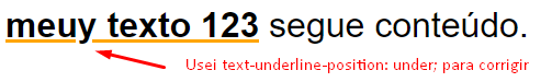
I also had to use the property text-underline-position: under; to fix this problem on Chrome:

inserir a descrição da imagem aqui

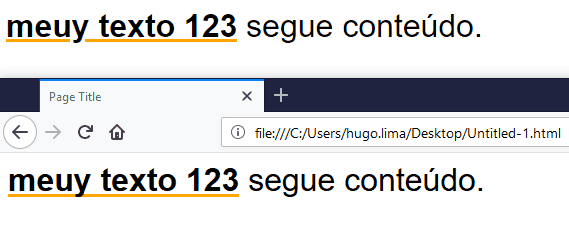
See the result In Chrome and Firefox

inserir a descrição da imagem aqui

I also needed to make an adjustment using display:inline-block, overflow and height to control how the line will get cut off etc...

Follow the code used:

div {
    font-family: sans-serif;
    font-size: 2rem;
}
div span,
div .efeito{
    display: inline-block;
    height: 60px;
    overflow: hidden;
}
div .efeito{
    font-weight: bold;
    text-decoration: underline;
    text-decoration-color: orange;
    text-underline-position: under;
    position: relative;
}
div .efeito:hover{
    text-decoration: none;
}
div .efeito::after{
    content: attr(data-text);
    width: 100%;
    color: transparent;
    position: absolute;
    top: 0;
    left: 15px;
    transition: 0s linear;
    text-decoration: none;
    text-decoration-style: none;
    text-decoration-color: orange;
    display: inline-block;
    height: 60px;
    text-underline-position: under;
    background-image: linear-gradient(rgba(0,0,0,0.0), rgba(0,0,0,0.0));
    z-index: -1;
}

div .efeito:hover::after {
    animation: underx 500ms infinite linear;
    text-decoration: underline;
    text-decoration-style: wavy;
    text-decoration-color: orange;
}

@keyframes underx {
    to {
        left: 0px;
    }
}
<div>
    <span class="efeito" data-text="meuy texto 123">meuy texto 123</span> <span>segue conteúdo.</span>
</div>

OBS: In fonts of different sizes quite possibly you will need to adjust the values that are in PX

Browser other questions tagged

You are not signed in. Login or sign up in order to post.