How to center an icon along with an LI added via CSS within a UL

Asked

Viewed 265 times

2

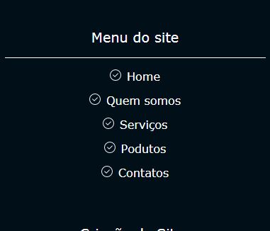
I would like to know how to centralize an icon implemented via background url() in the css along with my li, the problem is that when I add the icon, it pushes my li and how he appears glued to the li I have to give a margin, And when I do that, that’s when he pulls away and everything gets decentralized compared to mine header as I show in the prints with and without these changes. Is there any way that this does not happen?

CSS--


.main_footer_content{
display: flex;
flex-direction: column;
padding: 1em;
background-color: #010f19;
max-width: 400px;
margin: 0 auto;
}

.main_footer_content article{
display: flex;	
flex-direction: column;
flex: 1;
text-align: center;
padding: 1em 0;
}

.main_footer_content article header{
padding: 1em 0;
color: #fff;
font-size: 1.2em;	
border-bottom: 1px solid #fff;
}

.main_footer_menus{
padding: 0.5em 0;	
display: flex;
flex-direction: column;

}


.main_footer_menus li{
padding: 0.5em 0;
flex: 1;
}

.main_footer_menus li a{
color: #FFF;

}

.main_footer_menus li::before{
content: url(../img/verified.png);	
margin-right: 0.5em;
}
HTML--

<section class="main_footer_content">

        <h1 class="font_zero">Vem ver nossas novidades!</h1>


        <article>
            <header>
                <h1 class="menu_site_titulo">Menu do site</h1>
            </header>
            <ul class="main_footer_menus">

                <li><a href="#">Home</a></li>
                <li><a href="#">Quem somos</a></li>
                <li><a href="#">Serviços</a></li>
                <li><a href="#">Podutos</a></li>
                <li><a href="#">Contatos</a></li>

            </ul>

        </article>
        
        </section>

ANTES

DEPOIS

  • 3

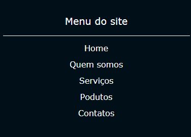
    paste the code, and leave the images to show only the result. It was best a minimal example!

  • 1

    Without the code not to give you an accurate answer, please edit your question and include your HTML and CSS

  • 1

    there it is... sorry...

  • Tony was for you to edit by putting the CSS of the entire LI, as it was in the images...

2 answers

1

You can basically put position: absolute and transform: translateX(-21px) in the pseudo-element ::before that you resolve the situation. O position:absolute will make the element "exit the flow" so it stays "floating" inside the LI that I needed to put position:relative, and with the transform: translateX(-21px) you put the ::before 16px which is the width of it +5px that would be the margin between him and the text.

article {
  text-align: center;
}
.main_footer_content{
display: flex;
flex-direction: column;
padding: 1em;
background-color: #010f19;
max-width: 400px;
margin: 0 auto;
}

.main_footer_content article{
display: flex;	
flex-direction: column;
flex: 1;
text-align: center;
padding: 1em 0;
}

.main_footer_content article header{
padding: 1em 0;
color: #000;
font-size: 1.2em;	
border-bottom: 1px solid #000;
}

.main_footer_menus{
padding: 0.5em 0;	
display: flex;
flex-direction: column;

}


.main_footer_menus li{
padding: 0.5em 0;
flex: 1;
position: relative;
}

.main_footer_menus li a{
color: #000;

}

.main_footer_menus li::before{
content: url(https://unsplash.it/16/16);	
position: absolute;
transform: translateX(-21px);
}
<article>
  <header>
    <h1 class="menu_site_titulo">Menu do site</h1>
  </header>
  <ul class="main_footer_menus">

    <li><a href="#">Home</a></li>
    <li><a href="#">Quem somos</a></li>
    <li><a href="#">Serviços</a></li>
    <li><a href="#">Podutos</a></li>
    <li><a href="#">Contatos</a></li>

  </ul>
  
</article>

  • 1

    Hugo, Your solution helped me understand how to solve some other problems and this too... Thank you so much for teaching me to improve the visualization of my post and to solve my problem... Obg for dedicating a little of your time too... Obg by strength and a big hug!

  • 1

    @Tonyivan without problems, life is a constant learning. We are here to help. If any answer helped you in any way consider marking it as Accept, in this icon below the arrows on the side of the chosen answer, so the site does not get your open question even though it has already been solved. Abs

0


Create the ::before in the a and not in the li, and use position: absolute to position the icon with left negative, remembering that the a must have position: relative. As the icons will have absolute position, they will not interfere with the alignment of the links.

Example:

.main_footer_menus li a::before{
content: url(https://cdn3.iconfinder.com/data/icons/fugue/icon_shadowless/tick-circle-frame.png);
position: absolute;
top: 0;
left: -20px;
display: flex;
}

a{
   position: relative;
}

/* exemplos. não use os códigos abaixo */
article{
   text-align: center;
}

ul, li{
   list-style: none;
   margin: 0;
   padding: 0;
}

.main_footer_menus li a{
   text-decoration: none;
   color: white;
}

body{
   background: black;
   font-size: 22px;
   color: white;
}
<article>
   <header>
       <h1 class="menu_site_titulo">Menu do site</h1>
   </header>
   <ul class="main_footer_menus">

       <li><a href="#">Home</a></li>
       <li><a href="#">Quem somos</a></li>
       <li><a href="#">Serviços</a></li>
       <li><a href="#">Podutos</a></li>
       <li><a href="#">Contatos</a></li>

   </ul>

</article>

  • Sam, I could solve yes with this solution yes... Obg for providing a little of your time to give me this strength! Great hug!!!

  • Good. If you decided to mark the answer with . Obg!

  • Tony, I saw that you marked my answer and then you canceled. That’s right?

  • 1

    You can only mark one answer. If you mark another, uncheck the previous one, but you can reward answers by also voting positive in the up arrow.

  • it is... I realized that now...hehe Both your answer and that of the friend above solved my problem in different ways... The right is one joinha for two neh...rs

Browser other questions tagged

You are not signed in. Login or sign up in order to post.