With CSS is it possible to fill in the "eyes" of the Font? Is it possible to fill in the "holes" of the letters A, O, P, etc?

Asked

Viewed 673 times

4

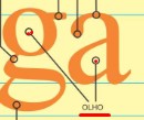
I was wanting to create a title to use in the sessions of my site, but wanted the source to have an effect similar to those images, With eyes filled giving the impression that the source has the inside of the characters filled.

With CSS there is some practical way to fill the letters inside?
Or I have to resort to other resources?

inserir a descrição da imagem aqui inserir a descrição da imagem aqui inserir a descrição da imagem aqui


TEST

I ran some tests with text-shadow but I did not reach an applicable result...

h1 {
  color: blue;
  font-size: 100px;
  font-family: sans-serif;
  text-shadow: 
  8px 8px 0 red,
  16px 16px 0 red,
  22px 22px 0 red;
}
<h1>AaBbDdOoPpQqR</h1>

  • I think the valid way would be to create a layer behind the text by filling in the holes only

  • @Giovannidias I tried in some ways, like "clip" that red part that’s out of the text, but I couldn’t... Or use a inset text-shadow, but I couldn’t do it...

  • 1

    see this idea in this post, https://stackoverflow.com/questions/30375406/to-add-bg-color-inside-the-space-of-an-single-letter-in-a-word,

  • @Leocaracciolo It is an idea, but it would have to be made a class for each letter.. besides I don’t know if separating a character with span would keep the semantics of the whole word...

  • it is, but it was the only thing I found on the net! It’s only 23 letters. Hahaha Alias, less than 23 pq some have no holes

  • 1

    I will summarize, any answer is something quite laborious that is often unnecessary, the best is to look for a font that follows exactly this style you want, but is just suggestion.

  • @Guilhermenascimento I think this time to the solution eh around in dafont.com I’ve found some and then eh just generate a font-face Pack on some site like fontsquirrel.com

  • 1

    Surely many solutions can and should be like this, certain things in CSS break the expected behavior, for example the positioning of the text can be affected and "break" making the "mask" that used to plug the holes stay elsewhere, the control is much more difficult, remember that a few years ago they were using a JS+Canvas+CSS technique to load custom external fonts for websites, if the effect of "Blink" is still noticeable with @fonte, imagine with a JS solution "mirabolante", has time that it is better to simplify :)

  • hahaha is sad no, I made a letter generator without holes, see http://kithomepage.com/sos/letras-sem-buracos.php

  • @Leocaracciolo very good, it was really cool! You have to build the list of classes before right? And he takes the string in the array list and puts the class? Must have given a "work" rss, but it was nice congratulations!

  • 1

    Nothing laborious, see $novaFrase = str_split($frase); and hence foreach( $novaFrase as $value ){&#xA; if( $value === 'a' ){&#xA; $novaFraseConvertida .='<span class="fill-letter a">a</span>';&#xA; }else if ( $value === 'A' ){ ......

  • @Leocaracciolo I’m just in the arrays and loops class, very cool to see this example! Thanks for sharing and giving the trouble!

  • put the whole code in a textarea for you to see, access the link again

  • Note: without the <!DOCTYPE html> doesn’t look good, no

  • Thanks again @Leocaracciolo thanks ;)

Show 10 more comments

2 answers

2


The best solution would be to use a font that is as you want, however ...

A gambiarrenta shape that resembles what it wants is to use several text-shadow to create the filled phrase, use letter-spacing not to overlap the letters and then transform: scaleX to flatten

h1 {
  color: transparent;
  font-size: 100px;
  font-family: sans-serif;
  text-shadow: red 0px 0px 0px, red 10px 0px 0px, red 20px 0px 0px, red 30px 0px 0px, red 40px 0px 0px;
  letter-spacing: 35px;
  transform: scaleX(0.30);
}
<h1>AaBbDdOoPpQqR</h1>

  • It was even a cool gambit! It’s only strange when trying to select the rss text, but it was worth the try. I think the ideal is to use a font that is already in this style....

  • 1

    That "question of the day" was more complicated, soon put there a brilliant solution

  • This time I have no alternative if you don’t use a font that already comes in this style

0

What I had thought was exactly what is in the link stack in English that sent you I gave an edited with your lyrics. Something like creating a layer underneath the letter and just cover the hole

h1 {
  font-size: 100px;
  font-family: Verdana;
}

.fill-letter {
  position: relative;
}

.fill-letter:after {
  display: block;
  content: "";
  position: absolute;
}

.A:after {
  background-color: orange;
  height: 30%;
  left: 33%;
  top: 30%;
  width: 35%;
  z-index: -1;
}

.a:after {
  background-color: orange;
  height: 20%;
  left: 32%;
  top: 60%;
  width: 35%;
  z-index: -1;
}

.B:after {
  background-color: orange;
  height: 50%;
  left: 33%;
  top: 30%;
  width: 38%;
  z-index: -1;
}

.b:after {
  background-color: orange;
  height: 33%;
  left: 33%;
  top: 45%;
  width: 38%;
  z-index: -1;
}

.D:after {
  background-color: orange;
  height: 45%;
  left: 33%;
  top: 30%;
  width: 40%;
  z-index: -1;
}

.d:after {
  background-color: orange;
  height: 35%;
  left: 30%;
  top: 40%;
  width: 40%;
  z-index: -1;
}

.O:after {
  background-color: orange;
  height: 50%;
  left: 25%;
  top: 30%;
  width: 50%;
  z-index: -1;
}

.o:after {
  background-color: orange;
  height: 35%;
  left: 25%;
  top: 40%;
  width: 50%;
  z-index: -1;
}

.P:after {
  background-color: orange;
  height: 30%;
  left: 25%;
  top: 30%;
  width: 50%;
  z-index: -1;
}
.p:after {
  background-color: orange;
  height: 30%;
  left: 25%;
  top: 45%;
  width: 50%;
  z-index: -1;
}
.Q:after {
  background-color: orange;
  height: 45%;
  left: 25%;
  top: 30%;
  width: 50%;
  z-index: -1;
}
.q:after {
  background-color: orange;
  height: 35%;
  left: 25%;
  top: 40%;
  width: 50%;
  z-index: -1;
}
.R:after {
  background-color: orange;
  height: 30%;
  left: 25%;
  top: 30%;
  width: 42%;
  z-index: -1;
}
.e:after {
  background-color: orange;
  height: 20%;
  left: 25%;
  top: 40%;
  width: 45%;
  z-index: -1;
}
.g:after {
  background-color: orange;
  height: 35%;
  left: 25%;
  top: 40%;
  width: 45%;
  z-index: -1;
}
<h1><span class="fill-letter A">A</span><span class="fill-letter a">a</span><span class="fill-letter B">B</span></span><span class="fill-letter b">b</span><span class="fill-letter D">D</span><span class="fill-letter d">d</span><span class="fill-letter O">O</span></span><span class="fill-letter o">o</span><span class="fill-letter P">P</span><span class="fill-letter p">p</span><span class="fill-letter Q">Q</span>
<span class="fill-letter q">q</span><span class="fill-letter R">R</span>
<span class="fill-letter e">e</span>
<span class="fill-letter g">g</span>
</h1>

  • 1

    letters are missing e g q and accented letters :D

  • I only used the letters he put as an example :)

  • @Example Giovannidias is example. The ideal would be a more practical and sustainable way, which keeps the semantics and is a little better to be customized etc... I think in this particular case...

  • A, O, P, etc? etc... all others :)

  • @Leocaracciolo meant in his code. I added the other letters but as he said is not viable for his problem

  • 3

    I voted against the answer because, in my view, even if it produces visually what is desired, the solution is entirely unviable. In addition to having to implement all the letters manually, it is attached to the font shape; that is, if you want to change the font, you will have to redo the CSS. In this case, it would be much simpler and semantic to edit the font characters, create a custom one, and use it. The interesting thing about using CSS in these cases is the versatility and this solution has zero. Perhaps if you agree with me and add the information to the answer, I will review my vote.

  • I’ll leave the answer there to help someone see another solution to the problem.

Show 2 more comments

Browser other questions tagged

You are not signed in. Login or sign up in order to post.