0
 I wanted to know how I do to leave the first image when mobile device the image is only on the screen only the first in the case"computer"without getting divided the way you see the "about"
<div class="carousel-inner" id="home">
<div class="carousel-item ">
<img src="imgs/lago.jpg" class="img-fluid d-block">
<div class="carousel-caption d-none d-md-block text-light">
<!-- d-none some se minimiza -->
<div class="img1" align="center" id="nome">Alyson Zancanaro Ramos</div>
</div>
</div>
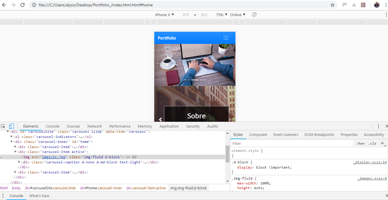
<div class="carousel-item active">
<img src="imgs/pc.jpg" class="img-fluid d-block">
<div class="carousel-caption d-none d-md-block text-light">
<div class="img2" align="center">Alyson Zancanaro Ramos</div>
</div>
</div>
Guy couldn’t quite understand what you want... you want when it’s mobile Slider to disappear and stay just a static image there without spinning is this?
– hugocsl
I want the image of "computer" reach the entire screen of the mobile phone and I was not divided with the bottom
– user127492
I think I get it, you want the slider to occupy the entire height of the screen correct? You know that if you do this the sides of your image will practically disappear and will appear only the middle piece right? Like in the case of your picture most likely the cup will fade to the left and the guy in blue will fade to the right... could be like this?
– hugocsl
I wish it centered without missing anything there is not possible ?
– user127492
Face is possible, but the image vei get deformed... It will be too flattened!! Type http://www.myinternalgps.com/wp-content/uploads/2009/10/Stretched-Face-Oct-Post-credit-Bobcatnorth1.jpg is what you want?
– hugocsl