How to change the image displayed in the Desktop and Mobile versions of a website

Asked

Viewed 1,671 times

2

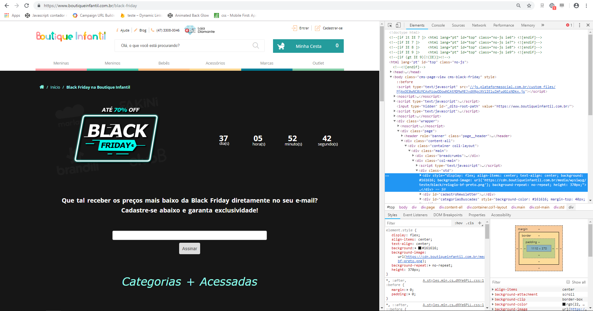
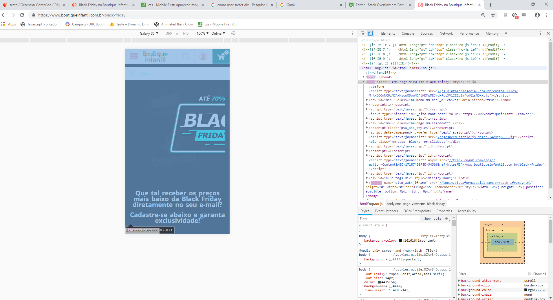
I needed the desktop version of a website to display an image and the mobile version another image.

Since on the desktop the counter would be on top of the image (as it already is) and in mobile would show another image, and the counter below.

The page is this one:

https://www.boutiqueinfantil.com.br/black-friday

I don’t have much programming experience.

Página do website na versão desktop

Página do website na versão mobile

  • Are you using bootstrap? if you are just using the class hidden-xs

  • Dude, do you have the ability to edit this image? Because from what I’ve seen she’s got a long piece to the right and with a black background, like the symbol is on one side and there’s an empty piece all black on the other... there’s no need for that. You have access to this image to edit or change it if you need to?

  • Yes Hugo there as I put her to line up

1 answer

2

In your CSS file you can use Media Query, which makes it possible to change the behavior of CSS for different resolutions.

In this case the ideal would be to have two different images in your html. The desktop image is visible by default, and the mobile image is hidden

Through the example below ((max-width: 700px)) if the screen resolution is at most 700px, you can put custom css code that will work only in this situation.

Example:

/** Para mostrar somente no celular*/
@media (max-width: 700px) 
{
  .imagem_mobile
   {
       display: block;
   }
   .imagem_desktop{
       display: none;
   }
}

Browser other questions tagged

You are not signed in. Login or sign up in order to post.