Style input type='number' to change arrows

Asked

Viewed 6,427 times

12

How to customize the input type='number' as the image below?

ilustração do campo com controles + e -

Click on the +/- sum or subtract the number inside the box.

Currently my code is:

.bedrooms
      = f.input :bedrooms, :label => false, as: "number", placeholder: 'Quantos quartos?', min: 0

which results in the following image:

ilustração do campo sem controles + e -

one type='number' pattern, I want to know how to style to change the arrows up/down to an icon or image +/-

  • 1

    I don’t think it is possible to style the arrows. You will have to create something a little more complex to create the buttons + and -. This will involve JS.

  • 3

    I believe that I do not know if the solution is to hide the original arrows of the input, and create two false btns that will add or subtract in the value of this input. Modify the original arrows I think you won’t be able...

  • 1

    Take a look at this solution Demo Solution I believe this is what you seek.

  • @Luizfelipe Yes, just disable the default buttons

  • 1

    @RORSCHACH I’m sorry, but I looked there and I didn’t see where he customized the arrow...!? I just saw that he removed the default arrow from the input, I think that’s why the article calls Turn Off Number Input Spinners , but I didn’t see anything of him doing a new arrow pro input? Or I’m wrong?

  • @hugocsl can only deactivate them.

  • 1

    @RORSCHACH It is.... is what I said there in the second comment of this question ;)

Show 2 more comments

3 answers

9


Standard increment and decrement buttons have been disabled, and custom buttons have been placed instead:

function mais(){
  var atual = document.getElementById("total").value;
  var novo = atual - (-1); //Evitando Concatenacoes
  document.getElementById("total").value = novo;
}

function menos(){
  var atual = document.getElementById("total").value;
  if(atual > 0) { //evita números negativos
    var novo = atual - 1;
    document.getElementById("total").value = novo;
  }
}
*{
margin:0;
}
div{
margin-top:10%;
}

input[type="number"] {
  -webkit-appearance: textfield;
     -moz-appearance: textfield;
          appearance: textfield;
}
input[type=number]::-webkit-inner-spin-button, 
input[type=number]::-webkit-outer-spin-button { 
  -webkit-appearance: none;
}
input[type="number"]{
outline:none;
border-right: 0px;
border-top: 1px solid black;
border-left: 1px solid black;
border-bottom: 1px solid black;
height: 20px;
padding:1%;
border-right: 0 px solid black;
}
label, input, button {
    font-size: inherit;
    padding: 0.2em;
    -moz-box-sizing: content-box;
    -webkit-box-sizing: content-box;
    box-sizing: content-box;
}
button{
height:20px;
padding:1%;
border-top: 1px solid black;
border-bottom: 1px solid black;
background-color: white;
border-left: 0px solid black;
padding-left:2%;
padding-right:2%;
outline:none;
cursor: pointer;

}
button.a{
  border-right: 0px solid black;
}
button.b{
    border-right: 1px solid black;
}
<center>
<div>

  <input placeholder="Quantos quartos?" min=0 id="total" type="number"><button onclick="menos()" class="a">-</button><button onclick="mais()" class="b">+</button>

</div>
</center>

Noteworthy

To disable the default arrows of input type='number' the following code should be made:

input[type=number]::-webkit-inner-spin-button, 
input[type=number]::-webkit-outer-spin-button { 
  -webkit-appearance: none; 
  margin: 0; 
}
<input type="number">

  • 1

    Well, I just ran a check to avoid negative numbers at the time of subtração

  • @Jorgematheus well pointed out his suggestion, since it refers to the number of rooms, and this may not be negative.

  • 1

    I made the edition :) +1

  • 1

    Now yes! Got mass the example!

  • 1

    @hugocsl You know until I liked this design too, when I saw the question I found the idea very good.

6

I’ll give you an answer with CSS only since you have the CSS tag in the question...

But already I say that it will only work in browsers -Webkit- IE will only work in Chrome, Safari and soon in the Edge, yes in Edge will use the rendering engine of Chromium very soon. Currently the Edge already uses -Webkit- in some property as you can see here

Now let’s go to the code.

Option 1

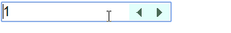
Let’s clean up the original styles of pseudo-elemento ::-Webkit-Inner-spin-button which is normally stylised by user-agent of Chromium, As you can see this pseudo element uses the prefix vendor -webkit-, so I said it only works in browser with this rendering engine.

inserir a descrição da imagem aqui

After removing the original styles with a all:unset we will build our indicators using linear-gradient to make a - and a + within the click area of input.

input {
    font-size: 20px;
    padding:6px;
}

input[type=number]::-webkit-inner-spin-button { 
  all: unset; 
  min-width: 21px;
  min-height: 45px;
  margin: 17px;
  padding: 0px;
  background-image: 
  linear-gradient(to top, transparent 0px, transparent 16px, #fff 16px, #fff 26px, transparent 26px, transparent 35px, #000 35px,#000 36px,transparent 36px, transparent 40px),
  linear-gradient(to right, transparent 0px, transparent 10px, #000 10px, #000 11px, transparent 11px, transparent 21px);
  transform: rotate(90deg) scale(0.8, 0.9);
  cursor:pointer;
}

    
<input type="number" value="1" autofocus name="" id="">


Option 2

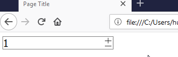
Here we will customize the original element itself, without removing it, we will use padding, width and heigth to control size, and margin to fit inside the input. Then with filter we will change the color, and with rotate() lay him flat.

inserir a descrição da imagem aqui

Follow the image code above.

input {
    font-size: 20px;
}
input[type=number]::-webkit-inner-spin-button { 
  width: 30px;
  height: 50px;
  margin: 17px;
  padding: 5px;
  transform: rotate(90deg);
  filter: sepia(100%) hue-rotate(90deg);
  cursor: pointer;
}
<input type="number" value="1" autofocus name="" id="">


Workaround for Firefox

but that can be adapted to other browsers...

Although Firefox tb has its pseudo-elements (::-moz-number-spin-box, ::-moz-number-spin-up and ::-moz-number-spin-down) to customize the input[number] it seems that the browser does not recognize the formatting done in CSS and continues with the style of user-agent. You can refer here to the standard CSS of user-agente firefox -moz-

Then the workaround is to put the input within a label and in that label use the pseudo-elements ::after and ::before to "cover up" the button default Firefox. Then it is important to put in these pseudo-elements the property pointer-events: none;. So when you click on it you will actually be clicking on the original arrows of input that are underneath

This CSS will only be beefed into Firefox using @-moz-document url-prefix() { css aqui } inserir a descrição da imagem aqui

The button of + and - was also made using linera-gradiente, ms you can use up a gif animado there if you want....

IMPORTANT: In the FF do not to place the elements next to each other, because I have to click on the element that is below it fixed to increase and decrease the value. And for the CSS in this case it’s just for the FF, this style is not going to be for the -webkit- that you can continue to do as mentioned above. To do this put the CSS of this input within that rule @-moz-document url-prefix() { css aqui }

The option below ONLY works on FIREFOX

input  {
  font-size: 20px;
  padding: 0;
}

/* Esses estilos só serão aplicado no FireFox */
@-moz-document url-prefix() {
  label {
    position: relative;
  }
  label::before,
  label::after {
    content: "";
    display: inline-block;
    position: absolute;
    width: 15px;
    height: 13px;
    background-color: #fff;
    background-image: 
      linear-gradient(to right, transparent 0px, transparent 7px, black 7px, black 8px, transparent 8px, transparent 15px),
      linear-gradient(to bottom, #fff 0px, #fff 5px, black 5px, black 6px, #fff 6px, #fff 9px);
    z-index: 3;
    pointer-events: none;
    right: 5px;
    background-position-y: -11.5px;
    top: -42%;
    transform: scale(0.9);
    border: 2px solid #fff;
  }
  label::after {
    background-image: 
      linear-gradient(to bottom, #fff 0px, #fff 4px, black 4px, black 5px, #fff 5px, #fff 6px, transparent 6px);
    top: 30%;
    z-index: 2;
    height: 6px;
  }
}
<label>
  <input type="number" value="1" autofocus name="" id="">
</label>

  • 1

    I really liked your solution using CSS. It makes code very clean.

  • 1

    @Thank you very much RORSCHACH my dear! It’s not as crossbrowser as yours, but you can do the css :) way, the advantage is that it gets more customizable makes the most of the original component, so it works closer to the default system input, including with positive or negative counting etc... was worth the strength

  • 1

    Curiosity @hugocsl, do you use Peek to make these Gifs? No doubt they are very instructive to the community.

  • 1

    @Renatojunior thanks Renato! Guy for Windows and Linux I used Screantogif, but now that I’m on iOS I’ve used Gifox, abs

5

The controls input[type=number] natives are not cross-browser capable of being stylized. The easiest and safest way to get what you want:

input[type="number"] {
  -webkit-appearance: textfield;
     -moz-appearance: textfield;
          appearance: textfield;
}
input[type=number]::-webkit-inner-spin-button, 
input[type=number]::-webkit-outer-spin-button { 
  -webkit-appearance: none;
}

This allows you to use your custom buttons, which can be linked to perform the functions that spinners(arrows) would make (.stepUp() and .stepDown()), as long as you keep the entrances type="number".

For example:

input[type="number"] {
  -webkit-appearance: textfield;
  -moz-appearance: textfield;
  appearance: textfield;
}

input[type=number]::-webkit-inner-spin-button,
input[type=number]::-webkit-outer-spin-button {
  -webkit-appearance: none;
}

.number-input {
  border: 2px solid #ddd;
  display: inline-flex;
}

.number-input,
.number-input * {
  box-sizing: border-box;
}

.number-input button {
  outline:none;
  -webkit-appearance: none;
  background-color: transparent;
  border: none;
  align-items: center;
  justify-content: center;
  width: 3rem;
  height: 3rem;
  cursor: pointer;
  margin: 0;
  position: relative;
}

.number-input button:before,
.number-input button:after {
  display: inline-block;
  position: absolute;
  content: '';
  width: 1rem;
  height: 2px;
  background-color: #212121;
  transform: translate(-50%, -50%);
}
.number-input button.plus:after {
  transform: translate(-50%, -50%) rotate(90deg);
}

.number-input input[type=number] {
  font-family: sans-serif;
  max-width: 5rem;
  padding: .5rem;
  border: solid #ddd;
  border-width: 0 2px;
  font-size: 2rem;
  height: 3rem;
  font-weight: bold;
  text-align: center;
}
<div class="number-input">
  <button onclick="this.parentNode.querySelector('input[type=number]').stepDown()" ></button>
  <input class="quantity" min="0" name="quantity" value="1" type="number">
  <button onclick="this.parentNode.querySelector('input[type=number]').stepUp()" class="plus"></button>
</div>

Browser other questions tagged

You are not signed in. Login or sign up in order to post.