10
I know it sounds confusing, there is some way for a layout to be "prepared" to be responsively visible when the customer resizes the browser and to any device?
10
I know it sounds confusing, there is some way for a layout to be "prepared" to be responsively visible when the customer resizes the browser and to any device?
13
Some considerations:
The first, and most obvious, rendering difference between devices you need to pay attention to is the resolution, usually measured in pixels - the number of points on each screen. As a simple rule, the more pixels the largest is the space for displaying elements.

But another factor must be taken into account:
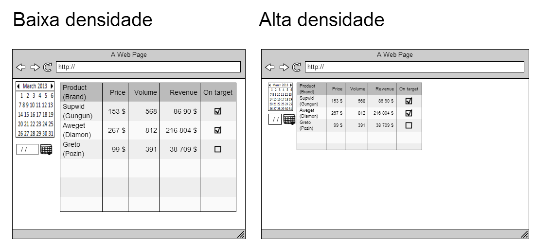
The density of a device is equal to the amount of pixels which can be represented in a given area. The most common measure is DPI (of the English Dots per inch, points per inch). My experience is that this is the point of greatest conflict when designing a web solution that serves both desktop and mobile views: Many phones today have higher resolutions than standard 1080p monitors.
The result is visually similar to resolution distortion, with the additional factor that your mobile device interface will be greatly reduced.
To help develop responsive websites, the CSS3 standard introduced the calls media queries, where different behaviors can be associated with different resolutions:
@media(max-width:767px){}
@media(min-width:768px){}
@media(min-width:992px){}
@media(min-width:1200px){}
To complicate your life, devices like iPad do not report changes in the size of viewport when rotated (changing mode Portrait for Landscape, for example.)
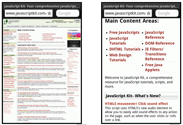
One of the outputs is to turn off the zoom factor on mobile devices caused by higher density, using the following meta tag:
<meta name="viewport" content="width=device-width">
This is an example of a page viewed without the meta viewport (left) and with the viewport set (right):
Thanks @Onosendai, I am reading everything that is being posted, thanks for the help.
@adventistapr It is always a pleasure to help; feel free to bring any questions you may have.
+1 excellent response!
12
You need to use the media queries styled css to format your code according to the resolution used. Example of media queries:
@media screen and (min-width: 320px) { html, body {background-color: red} }
@media screen and (min-width: 480px) { html, body {background-color: green} }
@media screen and (min-width: 640px) { html, body {background-color: yellow} }
@media screen and (min-width: 768px) { html, body {background-color: blue} }
@media screen and (min-width: 992px) { html, body {background-color: gray} }
If you repair, for each screen resolution the attribute background-color color change.
You can write your media queries right inside the style sheets .css or between tags <style></style> inside a file html or php or extensions thereof.
Since the media queries are not welcomed by the IE8 and earlier, one of the solutions to try to approximate the desired result in these browsers is to include the following code in your web content:
<!--[if lt IE 9]>
    <script src="http://css3-mediaqueries-js.googlecode.com/svn/trunk/css3-mediaqueries.js"></script>
<![endif]-->
This will allow the media queries are recognised by the browsers mentioned.
I tried to give an explanation there, but an example is worth a thousand explanations. : P +1
You have to be aware that @media gives a headache with IE8.
Complementing when using @media I recommend writing in ascending order, ex: min-width: 320px, 480.. (Because you are talking: minimum width(min-width) p/ apply this style, as the smallest is last he will always catch it, because the rule is the "minimum" value and not "from".
Hello @Marcos Vinicius Nasc. Pereira, Kaduamaral and Felipe Stoker, I am grateful for the attention of each of you, I am reading and following each tip, which for me are being precious.
3
If you want to do this all the way through, I recommend the combination of media queries combined with relative page element dimensions (instead of using % or . pixels for fonts).
Media Queries:
http://en.wikipedia.org/wiki/Media_queries (For general knowledge and openness) http://www.w3.org/TR/css3-mediaqueries/ (Most complete specification) http://designshack.net/articles/css/20-amazing-examples-of-using-media-queries-for-responsive-web-design/ (Some examples)
Another alternative would be to use a framework, which would address the "responsiveness" of your page:
http://designinstruct.com/roundups/html5-frameworks/ (Top 10 most used frameworks, choose and use)
I believe that with these guidelines there is already an idea of what to look for.
Hello @Cold, thank you so much for the excellent tips, are definitely helping me a lot.
2
There is, and it’s called Responsive Design. Where all layouts are defined for multiple resolutions.
And what opened the doors to this design was the media querys.
I recommend studying the subject in depth if you want to be a web designer.
Hello @Kaduamaral, about the media querys had already used in some small projects but now I am involved in larger site, thanks for the tip.
Browser other questions tagged css3
You are not signed in. Login or sign up in order to post.
The simplest way is to use some responsive framework. The most popular might be: Bootstrap, Foundation 3, Skeleton, there are several.
– haykou
take a look at this: article is very well explained, you can not understand...
– Jader A. Wagner
That was a very good question, remind me to leave a reward here as soon as I can.
– Oralista de Sistemas
You can tell what will be resolution x to resolution y for each resolution variation https://stackoverflow.com/questions/17967842/automatically-change-css-when-resolution-is-changed
– Dexxtz
The @Jader tip was interesting, had already seen the site but never this section, thank you very much.
– adventistapr