0
I need to make the background image of the slide change and the content should be static as in the image 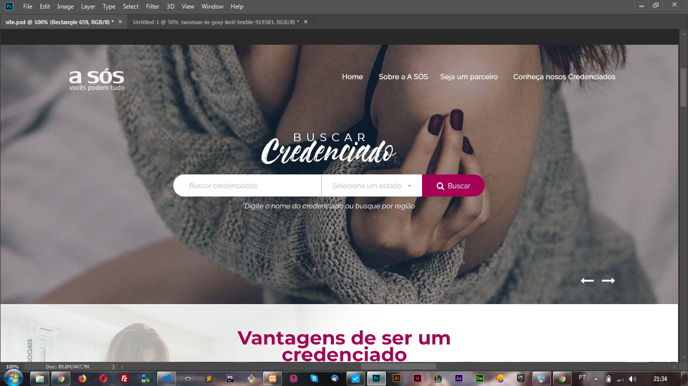 I believe doing with
 background-image to do more I don’t know how anyone knows how to help me
0
I need to make the background image of the slide change and the content should be static as in the image I believe doing with background-image to do more I don’t know how anyone knows how to help me
1
Dude I made this example trying to make the most of the standard Bootstrap components since you said you’re using it. I also made the merry-go-round with Owl Caroucel like you said you were using.
I had to put some elements with position:absolute to position on the slider, but it was all 100% responsive and working. A navbar original Bootstrap works smoothly just like the slider
I didn’t use the original Owl Carousel Nav Buttons, I used a custom model to navigate the slides (here’s the code I used as a base)
It was necessary to set a height for the carousel, but you can change this the will that the image will always occupy the entire screen extension without deforming, because I used object-fit
The responsive part is on the Bootstrap Grid itself which was used quietly to adjust the content in containers.
See how the model looked, test also in "Whole page" to see how it looks:
<!DOCTYPE html>
<html lang="en">

<head>
  <meta charset="utf-8" />
  <title>Page Title</title>
  <meta name="viewport" content="width=device-width, initial-scale=1">
  <link rel="stylesheet" type="text/css" media="screen" href="https://maxcdn.bootstrapcdn.com/bootstrap/4.0.0/css/bootstrap.min.css" />
  <link rel="stylesheet" type="text/css" media="screen" href="https://maxcdn.bootstrapcdn.com/font-awesome/4.7.0/css/font-awesome.min.css" />

  <link rel="stylesheet" href="https://cdnjs.cloudflare.com/ajax/libs/OwlCarousel2/2.3.4/assets/owl.carousel.min.css">
  <link rel="stylesheet" href="https://cdnjs.cloudflare.com/ajax/libs/OwlCarousel2/2.3.4/assets/owl.theme.default.min.css">

  <style>

.owl-carousel .item{
  height: 300px;
}
.owl-carousel .owl-item img {
  width: 100%;
  height: 100%;
  object-fit: cover;
}
.jumbotron-fluid-topo {
  margin: 0;
  padding: 0;
  height: 300px;
  position: relative;
}
.navbar {
  position: absolute;
  width: 100%;
  top: 0;
  left: 0;
  z-index: 1000;
  background-color: rgba(255,255,255,0.5);
}
.container-input {
  position: absolute;
  top: 50%;
  z-index: 100;
}
.btn-meio {
  border-radius: 0;
}
.container-nav {
  position: absolute;
  bottom: 0;
  z-index: 100;
  color: #fff;
  font-size: 2rem;
}
.container-nav .btns {
  cursor: pointer;
  opacity:0.5;
}
.container-nav .btns:hover {
  opacity:1;
}
</style>
</head>

<body>

  <div class="jumbotron jumbotron-fluid jumbotron-fluid-topo">

    <div class="owl-carousel owl-theme">
      <div class="item">
        <img class="img-responsive" src="https://placecage.com/360/200" alt="">
      </div>
      <div class="item">
        <img class="img-responsive" src="https://placecage.com/360/200" alt="">
      </div>
      <div class="item">
        <img class="img-responsive" src="https://placecage.com/360/200" alt="">
      </div>
      <div class="item">
        <img class="img-responsive" src="https://placecage.com/360/200" alt="">
      </div>
    </div>

    <div class="container-fluid">
      <nav class="navbar navbar-expand-lg navbar-light">
        <a class="navbar-brand" href="#">Navbar</a>
        <button class="navbar-toggler" type="button" data-toggle="collapse" data-target="#navbarSupportedContent"
          aria-controls="navbarSupportedContent" aria-expanded="false" aria-label="Toggle navigation">
          <span class="navbar-toggler-icon"></span>
        </button>

        <div class="collapse navbar-collapse" id="navbarSupportedContent">
          <ul class="navbar-nav mr-auto">
            <li class="nav-item active">
              <a class="nav-link" href="#">Home <span class="sr-only">(current)</span></a>
            </li>
            <li class="nav-item">
              <a class="nav-link" href="#">Link</a>
            </li>
            <li class="nav-item">
              <a class="nav-link disabled" href="#">Disabled</a>
            </li>
          </ul>
        </div>
      </nav>
    </div>

    <div class="container-fluid container-input">
      <div class="row">
        <div class="col-12 col-md-6 offset-md-3 d-flex justify-content-center align-items-center">

          <div class="input-group">
            <input type="text" class="form-control" aria-label="Text input with dropdown button">
            <div class="input-group-append">
              <button class="btn dropdown-toggle btn-meio" type="button" data-toggle="dropdown" aria-haspopup="true"
                aria-expanded="false">Dropdown</button>
              <div class="dropdown-menu">
                <a class="dropdown-item" href="#">Action</a>
                <a class="dropdown-item" href="#">Another action</a>
                <a class="dropdown-item" href="#">Something else here</a>
                <div role="separator" class="dropdown-divider"></div>
                <a class="dropdown-item" href="#">Separated link</a>
              </div>
              <button class="btn" type="button"></button>
            </div>
          </div>

        </div>
      </div>
    </div>

    <div class="container-fluid container-nav">
      <div class="row">
        <div class="col-12 d-flex justify-content-end" id="navs">
            <div class="btns"></div>
            <div class="btns"></div>
        </div>
      </div>
    </div>

  </div>


  <script src="https://code.jquery.com/jquery-3.2.1.min.js"></script>
  <script src="https://cdnjs.cloudflare.com/ajax/libs/popper.js/1.12.9/umd/popper.min.js"></script>
  <script src="https://maxcdn.bootstrapcdn.com/bootstrap/4.0.0/js/bootstrap.min.js"></script>
  <script src="https://maxcdn.bootstrapcdn.com/bootstrap/4.0.0-beta.3/js/bootstrap.bundle.min.js"></script>

  <script src="https://cdnjs.cloudflare.com/ajax/libs/OwlCarousel2/2.2.1/owl.carousel.min.js"></script>

  <script>
    $(document).ready(function () {
      var owl = $('.owl-carousel');
      owl.owlCarousel({
        loop: true,
        margin: 0,
        items: 1,
        nav: false,
        dots: false,
        onInitialized: function () {
          $("#navs .btns")
            .click(function () {
              var navBtn = $(this).parent().children().index(this);
              owl.trigger((navBtn == 1 ? 'next' : 'prev') + '.owl.carousel');
            });
        }
      });
    });
  </script>

</body>

</html>Browser other questions tagged html5 twitter-bootstrap bootstrap-4 owl-carousel
You are not signed in. Login or sign up in order to post.
How many images do you want to keep swapping? What is the transition effect you imagined? Fade or slide to the side? It is mandatory to be with background or can be with the tag img?
– hugocsl
@hugocsl I believe that a 4 the effect can be fade can be with more img since the input does not leave it when the slide runs the input has to stay always there
– Felipe Henrique
I’ll set up a basic example for you with 4 img, fade and the menu and the "top" input. And the arrow to pass the images is mandatory or can be running automatically?
– hugocsl
@hugocsl the arrows are mandatory thanks for the help I will be waiting
– Felipe Henrique
Cara I was going to come up with an answer, but I think your question is very close to that, if this link doesn’t solve your problem tell me: https://answall.com/questions/334204/transi%C3%A7%C3%A3o-autom%C3%A1tica-de-imagens-no-slider-com-css#comment676065_334204
– hugocsl
@hugocsl ?
– Felipe Henrique
Cara I think you can, tomorrow I’ll set you an example with Owl caroucel vcs using bootstrap?
– hugocsl
@hugocsl yes I’m using Bootstrap 4
– Felipe Henrique