CSS image gallery

Asked

Viewed 189 times

1

I’m trying to make an image gallery for a website, I took a demo that I found on the Internet and I’m trying to edit it, but I would like to modify to the mini-tura of the images to be interspersed, one to the left and one to the right, but I couldn’t find a way to do it. Can someone give me a hand ? CSS is too big to run around here, but if you need me I’ll send.
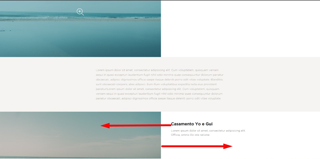
 inserir a descrição da imagem aqui

HTML

<!doctype html>
<html lang="pt-br" class="no-js">
<head>
    <meta charset="UTF-8">
    <meta name="viewport" content="width=device-width, initial-scale=1">

    <link rel="stylesheet" href="css/reset.css"> <!-- CSS reset -->
    <link rel="stylesheet" href="css/style.css"> <!-- Resource style -->
    <script src="js/modernizr.js"></script> <!-- Modernizr -->

    <title>Farol Filmes</title>
</head>
<body>
    <header class="gotham">
        <h1></h1>
    </header>

    <section class="cd-single-item">
        <div class="cd-slider-wrapper">
            <ul class="cd-slider">
                <li class="selected"><img src="img/teste.jpeg" ></li>
                <li><img src="img/img-2.jpg"></li>
                <li><img src="img/img-3.jpg"></li>
            </ul> <!-- cd-slider -->

            <ul class="cd-slider-navigation">
                <li><a href="#0" class="cd-prev inactive">Next</a></li>
                <li><a href="#0" class="cd-next">Prev</a></li>
            </ul> <!-- cd-slider-navigation -->

            <a href="#0" class="cd-close">fechar</a>
        </div> <!-- cd-slider-wrapper -->

        <div class="cd-item-info">
            <h2 class="gotham">Casamento Yo e Gui</h2>

            <p class="gotham-light">Lorem ipsum dolor sit amet, consectetur adipisicing elit. Officia, omnis illo iste ratione.</p>

        </div> <!-- cd-item-info -->
    </section> <!-- cd-single-item -->

    <section class=" gotham-light cd-content">
        <p>
            Lorem ipsum dolor sit amet, consectetur adipisicing elit. Cum voluptatem, quisquam veniam sequi in quasi excepturi laudantium fugit nihil odio minima quae consequuntur dolorum pariatur obcaecati, adipisci dignissimos officia saepe itaque deleniti porro odit vitae voluptate. Blanditiis sunt obcaecati corporis, alias adipisci. Eum illum voluptatibus expedita nulla eius provident pariatur!Lorem ipsum dolor sit amet, consectetur adipisicing elit. Cum voluptatem, quisquam veniam sequi in quasi excepturi laudantium fugit nihil odio minima quae consequuntur dolorum pariatur obcaecati, adipisci dignissimos officia saepe itaque deleniti porro odit vitae voluptate.
        </p>
    </section>

Site Codyhouse - Source

  • Young you really need this library to make something so simple? With CSS you solve it easy... If you are using Bootstrap 4 there is that you do not really need this scheme there...

  • I’m actually using this template because it matches well with the style of the site I’m doing. With Bootstrap has something like ?

  • The scheme of opening the gallery with the carousel would be much more complicated, but putting an image on each side alternating with the content would be very quiet

  • In that case I’ll leave it that way, because I would need the carousel because each line would be a photo shoot and I would need the carousel. Thank you

  • I got it.. I gave a custom one there in the CSS of the gallery. I think it looks like you want it. Put the response CSS in the component CSS there, and place the class .direita in the section you want the gallery to the right. The details are in the answer qq thing comments there.

1 answer

1


Look to do what you want like the image below you will have to make some adaptations in CSS, it’s little thing! But they make all the difference. No need to touch the HTML and the structure or order of the tags, you will solve everything with CSS.

inserir a descrição da imagem aqui

First you need to keep in mind that you will use this only for the galleries you want right (your custom position). Then create a type class .direta and place in the Section that will have the gallery in the direita

OBS IMPORTANTE: Notice that in all class i includes .cd-single-item.direita before. That’s because I just want this CSS in this section that I’ve determined that the gallery should be right <section class="cd-single-item direita">

I left some comments on the CSS so you can understand where I’ve changed

Follows the CSS:

@media only screen and (min-width: 1024px)
.cd-single-item.direita .cd-slider-wrapper.direita {
    width: 50%;
    margin-left: 50%; /* aqui alinho a galeria a direita */
}
.cd-single-item.direita .cd-slider-wrapper {
    position: relative;
    z-index: 1;
    -webkit-transition: width .4s;
    -moz-transition: width .4s;
    transition: all .4s; /* aqui habilito a animação também para o margin */
    -webkit-transform: translateZ(0);
    -moz-transform: translateZ(0);
    -ms-transform: translateZ(0);
    -o-transform: translateZ(0);
    transform: translateZ(0);
    -webkit-backface-visibility: hidden;
    backface-visibility: hidden;
    will-change: width;
}

@media only screen and (min-width: 1024px)
.cd-single-item.direita .cd-slider-active .cd-slider-wrapper {
    width: 100%;
    margin-left: 0; /* aqui coloco a galeria crescendo para esquerda e não para direita como a original */
}

@media only screen and (min-width: 1024px)
.cd-single-item.direita .cd-item-info {
    position: absolute;
    width: 50%;
    top: 0;
    /* right: 0;  retire o right para jogar o conteúdo para esquerda */
    padding: 60px 60px 0;
    margin: 0;
}
  • Dude, so I tried to implement in my css what you went through and it didn’t go very well, (https://gifs.com/gif/erro-jqpjOY), next to it goes gif of how it went. http://prntscr.com/kzhtq1 - This is how I left the html, put the right class in the Section and div. http://prntscr.com/kzhuax - And this is the css that you gave me, I just didn’t get bored of creating the class. right what I needed to put, sorry to ignore, but it is that I did not understand right how to implement.

  • @Lucascorrêa is that if you do not create a different class for each gallery all will be on the right. and you won’t get to step one on each side understand. No need to put the class direita in DIV, only in Section! Even so I can’t say why it didn’t work there... Have you published this site somewhere? Do a quick test there, put at the end of your CSS those same classes there of the answer, but take that out of the front of the class names .cd-single-item.direita ai tests with the rest of the CSS to see if it works. Do not put . right on anything and forehead Anything tells me

  • So I did it woe to take out all . right and erase . cd-single-item.right and left everything on the right and worked the carousel when clicked, according to the print (http://prntscr.com/kzi8ru), but the text was below the image. The CSS thus (http://prntscr.com/kzia3o). What I may have done wrong ?

  • @Lucascorrêa in this class puts a "left: 0" in addition to the rest of the CSS you already have there: @media only screen and (min-width: 1024px)&#xA;.cd-single-item.direita .cd-item-info { ... left: 0 !important ... } the right: 0still commented ok, do not use the right. If still do not roll include a margin-right: auto; along with this left:0 and look if the content that was below aligns on the left!

  • It didn’t work, I put it on a server for you to take a look at (https://goo.gl/4q9TnL). The way you’re up there, you’re without the class .direita. When I put the class . right of that gif problem I sent before.

  • @Lucascorrêa face look there! Fí just put the left:0 see if this is the same class you handled. https://imgur.com/4Iy30W0 @media only screen and (min-width: 1024px)&#xA;.cd-single-item .cd-item-info {&#xA; position: absolute;&#xA; width: 50%;&#xA; top: 0;&#xA; padding: 60px 60px 0;&#xA; margin: 0;&#xA; /* right: 0; */&#xA; left: 0;&#xA;}

  • now it worked, I do not know pq kkkkk, I just did not understand why with .direitadidn’t work. You want me to Upe so you can take a look at what I did wrong ?

  • @Lucascorrêa I think it was because you put this class . right in some places we did not need rss... But you will know.... You can create the same entire class in full and only change the name at the end type .cd-slider-wrapper-teste { copiar o css para alinhar a direita } then put this class where you need it. It may have been the hierarchy of classes tb, this is when a style of another class is overwriting yours, you can research on this that will help you! Do you think you’ve solved the question now? If the answer helped you consider marking the :)

  • I think it went pretty well, just one little problem I couldn’t solve, (http://prntscr.com/kzj651) <-- this closing was supposed to be a closing icon, but I don’t know what I need to do to get him back. I will leave the CSS (http://prntscr.com/kzj71s) and HTML (http://prntscr.com/kzj7or) LINK OF THE UPADO SITE here (https://goo.gl/4q9TnL).

  • @Lucascorrêa cara mas Can the classes of your btn close?? You erased or did not even put? It’s all there on the official website, just you inspect the btn with Devtools.. Look at the CSS of btn close before clicking on galerai https://imgur.com/5bFnrh2 and here like the red box the CSS after the gallery is open. https://imgur.com/pcDdFBx ... You can take CSS directly from the website by inspecting btn close X from the gallery after opening

  • On the desktop I was able to do ok, but when it’s below 1024px I can’t seem to fix the close issue, CSS(http://prntscr.com/kzjs39), I need to create another tag for @media ? And the .cd-info is smaller than should also and I did not cosegui find out why. I believe it is my last question rsrs, sorry to ask so many questions. Website: https://goo.gl/4q9TnL .

  • @The face of the Btn close is[a in the correct size, at least on your site and on the site of the example they are of the same size. Regarding smaller screens you by what I saw in the example on smaller screens nor have the option to expand the gallery, as well as should not appear btn to close, you must have touched some CSS ai and put display:block somewhere... Any way you try @media only screen and (max-width: 1023px)&#xA;.cd-slider-wrapper .cd-close {&#xA; display: none !important;&#xA;}

  • Man, getting a way to fix here, thank you so much for the tips, was very helpful.

  • @Lucascorrêa good young lady! This was complicated to make it work, but good that solved and stayed with you wanted. CSS has hours that is difficult to understand, but calmly the "plug falls" and we understand how to make it work. Good luck there with the project!

Show 9 more comments

Browser other questions tagged

You are not signed in. Login or sign up in order to post.