6
What’s the point of padding of container of Bootstrap if the row has a margin negative that cancels this padding? If I want my entire page to have one padding so it doesn’t stick to the edge like I do?
6
What’s the point of padding of container of Bootstrap if the row has a margin negative that cancels this padding? If I want my entire page to have one padding so it doesn’t stick to the edge like I do?
6
See that: (whether it is Bootstrap 3 or Bootstrap 4)
Container: The container works that way so the container edges can have that padding 15px virtual around the content, but not requiring the tag body have a padding 15px. This was a change in Bootstrap 3’s RC1. Otherwise, the whole body would have a padding 15px, that would make even the divs without the bootstrap classes do not occupy 100% of the width of the body
Rows: As rows have negative margin equal to filling the containers so that they also touch the edge of the container, the negative margin overlapping the padding of container. This allows the row not be pushed in by padding container.
Cols: as cols- also have the padding 15px, so they finally keep their 15px content away from the container edge / browser / viewport, and provide the median of 15px + 15px between the columns. That is, it serves to create a consistency between column spacings, no matter if the column is the first or the last. Now, there will always be 15px spacing between the columns.
Now let’s look at these images
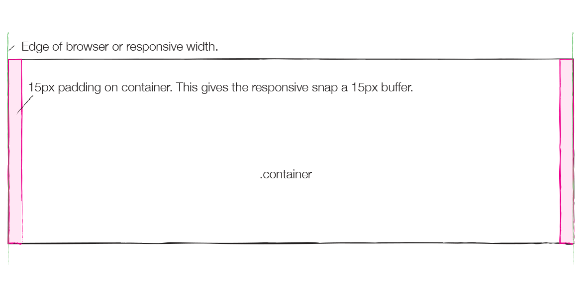
The container has two purposes:
Provide width restrictions in responsive widths. When Responsive sizes change, it’s the container that changes. Rows and columns are all based on percentage, so they need not be altered.
Provide padding so that the content does not touch the edge of the
browser. That’s 15px on each side, as seen in pink in the image.
You should never wear one container within another!
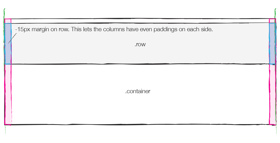
As rows also have a unique aspect of having 15px negative margin on each side, as seen in blue in the image below. The div that makes up the row normally it would be restricted inside the filling of containers, touching the edges of the pink area, but not beyond it. Negative margins of 15px push the line out over the padding of 15px of containers.
Never use a line out of a container, it won’t work.
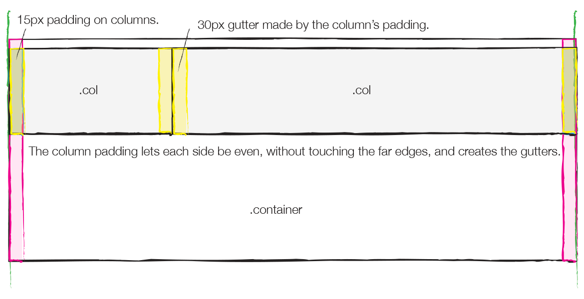
The speakers now have 15px padding, seen in yellow. This filler means that the columns actually touch the edge of the row, which in turn touches the edge of the container, because the row has negative margin and the container has positive padding. But, the column padding pushes anything inside the column to where it needs to be, and also provides a 30px spacing between them.
Never use a column out of a row, it won’t work.
Source: http://www.helloerik.com/the-subtle-magic-behind-why-the-bootstrap-3-grid-works
Briefly:
As cols need a padding not to let the content go to the margins, and to maintain a spacing between one column and the other. A row needs the margin to equalize the padding of container not letting the content touch the browser window and to avoid that only the first and last columns have left and right spaces. So with this set of padding and margins vc achieves consistency in grid spacing and can still have divs that reach up to the edge of the browser window since you don’t need to padding in the body
Browser other questions tagged css3 twitter-bootstrap bootstrap-3 bootstrap-4
You are not signed in. Login or sign up in order to post.