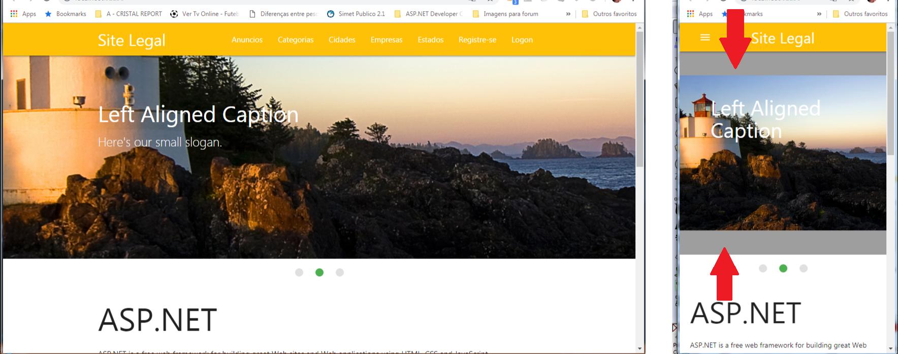
Media Querys serve to determine a style for a given situation (for example, specific screen size, orientation, among others)
For screen size, these breakpoints are usually used:
/* Extra small devices (phones, 600px and down) */
@media only screen and (max-width: 600px) {...}

/* Small devices (portrait tablets and large phones, 600px and up) */
@media only screen and (min-width: 600px) {...}

/* Medium devices (landscape tablets, 768px and up) */
@media only screen and (min-width: 768px) {...}

/* Large devices (laptops/desktops, 992px and up) */
@media only screen and (min-width: 992px) {...}

/* Extra large devices (large laptops and desktops, 1200px and up) */
@media only screen and (min-width: 1200px) {...}
Materialize uses different breakpoints, from a look at the section Creating Responsive Layouts
An example of use:
document.addEventListener('DOMContentLoaded', function() {
  var elems = document.querySelectorAll('.carousel');
  var instances = M.Carousel.init(elems, {});
});
img {
  height: 100%;
}

/* Extra small devices (phones, 600px and down) */
@media only screen and (max-width: 600px) {
  .carousel-item {
    height: 100px !important;
  }
}

/* Small devices (portrait tablets and large phones, 600px and up) */
@media only screen and (min-width: 600px) {
  .carousel-item {
    height: 200px !important;
  }
}

/* Medium devices (landscape tablets, 768px and up) */
@media only screen and (min-width: 768px) {
  .carousel-item {
    height: 300px !important;
  }
}

/* Large devices (laptops/desktops, 992px and up) */
@media only screen and (min-width: 992px) {
  .carousel-item {
    height: 400px !important;
  }
}

/* Extra large devices (large laptops and desktops, 1200px and up) */
@media only screen and (min-width: 1200px) {
  .carousel-item {
    height: 500px !important;
  }
}
<!-- Compiled and minified CSS -->
<link rel="stylesheet" href="https://cdnjs.cloudflare.com/ajax/libs/materialize/1.0.0/css/materialize.min.css">

<div class="carousel">
  <a class="carousel-item" href="#one!"><img src="https://lorempixel.com/250/250/nature/1"></a>
  <a class="carousel-item" href="#two!"><img src="https://lorempixel.com/250/250/nature/2"></a>
  <a class="carousel-item" href="#three!"><img src="https://lorempixel.com/250/250/nature/3"></a>
  <a class="carousel-item" href="#four!"><img src="https://lorempixel.com/250/250/nature/4"></a>
  <a class="carousel-item" href="#five!"><img src="https://lorempixel.com/250/250/nature/5"></a>
</div>

<!-- Compiled and minified JavaScript -->
<script src="https://cdnjs.cloudflare.com/ajax/libs/materialize/1.0.0/js/materialize.min.js"></script>
Need to use
media query, but if you want for example the slider to be half the screen height, you can use50vh– Costamilam
This same @Guilherme Costamilam could post the example, I need this same
– Cyberlacs
media queryorvh?– Costamilam
Saw posted the two if possible, already used media query and vh never used, I would like to know what is vh, I will try to inform me what is vh, put the two if you give friend, BUT preferred media query that I have more affinity.
– Cyberlacs
Which version of Materialize you are using
– hugocsl
I’m using Release: 1.0.0
– Cyberlacs
@Guilhermecostamilam can post only media query.
– Cyberlacs