Customization

Asked

Viewed 182 times

3

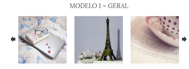
Hello to everyone I’m beginner in Bootstrap, and I’m developing a Carousel in boostrap, only instead of showing only one image I would like to show 3, as in the image below. How could I be doing this

inserir a descrição da imagem aqui

Code

   <div class="container">
    <div id="carouselExampleControls" class="carousel slide" data-ride="carousel">
        <div class="carousel-inner">
            <div class="carousel-item active">
                <img class="d-block w-100" src="https://via.placeholder.com/350x150" alt="Primeiro Slide">
            </div>
            <div class="carousel-item">
                <img class="d-block w-100" src="https://via.placeholder.com/350x150" alt="Segundo Slide">
            </div>
            <div class="carousel-item">
                <img class="d-block w-100" src="https://via.placeholder.com/350x150" alt="Terceiro Slide">
            </div>
        </div>
        <a class="carousel-control-prev" href="#carouselExampleControls" role="button" data-slide="prev">
            <img src="img/seta_e.png">
                <span class="sr-only">Anterior</span>
        </a>
        <a class="carousel-control-next" href="#carouselExampleControls" role="button" data-slide="next">
            <img src="img/seta_l.png">
                <span class="sr-only">Próximo</span>
        </a>
    </div>
</div>
  • I know it’s not about the question, but I was gonna do the owlcarousel. It is responsive, highly customizable, can apply transition effects, edit and put as many items as you want, set size...

  • Here’s an example using Bootstrap 3, https://www.bootply.com/94444

1 answer

0


You can put 3 images on container and use Bootstrap classes as d-none d-flex to go doing responsiveness. On the desktop vc shows 3, on tablet 2 and on smartphone 1 at a time?

Here is a simple example I did following this concept. Sometimes it can be useful for you.

.carousel-item-next, .carousel-item-prev, .carousel-item.active {
    display: flex !important;
}
    <link rel="stylesheet" type="text/css" media="screen" href="https://maxcdn.bootstrapcdn.com/bootstrap/4.0.0/css/bootstrap.min.css" />
    <script src="https://code.jquery.com/jquery-3.2.1.min.js"></script>

    <script src="https://maxcdn.bootstrapcdn.com/bootstrap/4.0.0/js/bootstrap.min.js"></script>

<div class="container">
    <div id="carouselExampleControls" class="carousel slide" data-ride="carousel">
        <div class="carousel-inner">
            <div class="carousel-item active">
                <img class="w-100 m-md-1" src="https://www.placecage.com/350/150" alt="Primeiro Slide">
                <img class="d-none d-md-flex w-100 m-0 m-md-1" src="https://www.placecage.com/351/150" alt="Primeiro Slide">
                <img class="d-none d-lg-flex w-100 m-md-1" src="https://www.placecage.com/352/150" alt="Primeiro Slide">
            </div>
            <div class="carousel-item">
                <img class="w-100 m-md-1" src="https://www.placecage.com/350/150" alt="Primeiro Slide">
                <img class="d-none d-md-flex w-100 m-md-1" src="https://www.placecage.com/351/150" alt="Primeiro Slide">
                <img class="d-none d-lg-flex w-100 m-md-1" src="https://www.placecage.com/352/150" alt="Primeiro Slide">
            </div>
        </div>
        <a class="carousel-control-prev" href="#carouselExampleControls" role="button" data-slide="prev">
            <img src="img/seta_e.png">
                <span class="sr-only">Anterior</span>
        </a>
        <a class="carousel-control-next" href="#carouselExampleControls" role="button" data-slide="next">
            <img src="img/seta_l.png">
                <span class="sr-only">Próximo</span>
        </a>
    </div>
</div>
    

Browser other questions tagged

You are not signed in. Login or sign up in order to post.