Bootstrap 3 - dropdown-toggle - Changing menu with it open is possible?

Asked

Viewed 1,122 times

2

With Bootstrap the task of creating menus for ASP.NET websites is much simpler.

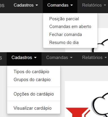
However I noticed that when a dropdown menu is "open" when passing the mouse over another item it does not "open" automatically, creating a certain visual confusion for the user, see in the image two menus highlighted but only one "open".

The mouse is on the option "Registrations" and the option "Commands" is open, only opens the other option if we click on the option. I see in other sites that when the menu is "open" when browsing the other options, which are dowpdown, they will be presented automatically.

It is possible to "open" a dropdown while moving the mouse over another option, which is also dropwdown, it "opens" automatically ?

Thank you for your attention, friends!

vejam a imagem

2 answers

1


You can accomplish this by using :hover in the parent element .dropdown and changing the child element display .dropdown-menu for block.

See the example below:

.dropdown:hover>.dropdown-menu {  display: block;}
<!-- Latest compiled and minified CSS -->
<link rel="stylesheet" href="https://maxcdn.bootstrapcdn.com/bootstrap/3.3.7/css/bootstrap.min.css" integrity="sha384-BVYiiSIFeK1dGmJRAkycuHAHRg32OmUcww7on3RYdg4Va+PmSTsz/K68vbdEjh4u" crossorigin="anonymous">
<nav class="navbar navbar-default">
  <div class="container-fluid">
    <!-- Brand and toggle get grouped for better mobile display -->
    <div class="navbar-header">
      <button type="button" class="navbar-toggle collapsed" data-toggle="collapse" data-target="#bs-example-navbar-collapse-1" aria-expanded="false">
        <span class="sr-only">Toggle navigation</span>
        <span class="icon-bar"></span>
        <span class="icon-bar"></span>
        <span class="icon-bar"></span>
      </button>
      <a class="navbar-brand" href="#">Brand</a>
    </div>

    <!-- Collect the nav links, forms, and other content for toggling -->
    <div class="collapse navbar-collapse" id="bs-example-navbar-collapse-1">
      <ul class="nav navbar-nav">        
        <li class="dropdown">
          <a href="#" class="dropdown-toggle" data-toggle="dropdown" role="button" aria-haspopup="true" aria-expanded="false">Dropdown <span class="caret"></span></a>
          <ul class="dropdown-menu">
            <li><a href="#">Action</a></li>
            <li><a href="#">Another action</a></li>
            <li><a href="#">Something else here</a></li>
            <li role="separator" class="divider"></li>
            <li><a href="#">Separated link</a></li>
            <li role="separator" class="divider"></li>
            <li><a href="#">One more separated link</a></li>
          </ul>
        </li>
      </ul>      
      <ul class="nav navbar-nav navbar-right">
        <li><a href="#">Link</a></li>
        <li class="dropdown">
          <a href="#" class="dropdown-toggle" data-toggle="dropdown" role="button" aria-haspopup="true" aria-expanded="false">Dropdown <span class="caret"></span></a>
          <ul class="dropdown-menu">
            <li><a href="#">Action</a></li>
            <li><a href="#">Another action</a></li>
            <li><a href="#">Something else here</a></li>
            <li role="separator" class="divider"></li>
            <li><a href="#">Separated link</a></li>
          </ul>
        </li>
      </ul>
    </div><!-- /.navbar-collapse -->
  </div><!-- /.container-fluid -->
</nav>
<script
  src="https://code.jquery.com/jquery-3.3.1.slim.js"
  integrity="sha256-fNXJFIlca05BIO2Y5zh1xrShK3ME+/lYZ0j+ChxX2DA="
  crossorigin="anonymous"></script>
<script src="https://maxcdn.bootstrapcdn.com/bootstrap/3.3.7/js/bootstrap.min.js" integrity="sha384-Tc5IQib027qvyjSMfHjOMaLkfuWVxZxUPnCJA7l2mCWNIpG9mGCD8wGNIcPD7Txa" crossorigin="anonymous"></script>

  • Jorge Matheus, thanks for your help. Your Bootstrap is more current version, what I use is 3.3.7, I’m trying but it didn’t work. I believe that only by updating the bootstrap, which I can’t even think about doing, I would disassemble the entire layout of the site.

  • @Arivenuth put the version you are using, but the solution remains the same. Take a look.

  • PERFECT!!! I only had to put dropdown class in my html <li> tags, thank you very much !!!

0

You can do it using the events mouseenter and mouseleave, firing a click manual on button (see comments on code). This way the dropdown will open only when passing the mouse (event mouseenter) and close at take (event mouseleave).

Run the example in full screen:

$(".dropdown-toggle").on("mouseenter mouseleave", function(e){
   
   // só irá usar os eventos se o menu hamburguer estiver oculto
   if(!$(".navbar-toggle").is(":visible")){
      if(e.type == "mouseenter"){
         $(this)
         .attr("aria-expanded", "true")
         .closest(".dropdown")
         .addClass("open"); // adiciona a classe que abre o menu
      }
      if(e.type == "mouseleave"){
         var $t = $(this);
         setTimeout(function(){ // este pequeno delay é para não piscar
            $t
            .attr("aria-expanded", "false")
            .closest(".dropdown")
            .removeClass("open"); // remove a classe que abre o menu
         }, 100);
      }
   }
});

// se sair do menu, dispara o click no botão e esconde
$(".dropdown-menu").on("mouseleave", function(){
   if(!$(".navbar-toggle").is(":visible")){
      $(this)
      .closest(".dropdown")
      .find(".dropdown-toggle")
      .trigger("click");
   }
});
.bs-example{
   margin: 20px;
}
<link rel="stylesheet" href="https://maxcdn.bootstrapcdn.com/bootstrap/3.3.7/css/bootstrap.min.css">
<script src="https://ajax.googleapis.com/ajax/libs/jquery/1.12.4/jquery.min.js"></script>
<script src="https://maxcdn.bootstrapcdn.com/bootstrap/3.3.7/js/bootstrap.min.js"></script>

<div class="bs-example">
    <nav id="myNavbar" class="navbar navbar-default" role="navigation">
        <!-- Brand and toggle get grouped for better mobile display -->
        <div class="container">
            <div class="navbar-header">
                <button type="button" class="navbar-toggle" data-toggle="collapse" data-target="#bs-example-navbar-collapse-1">
                    <span class="sr-only">Toggle navigation</span>
                    <span class="icon-bar"></span>
                    <span class="icon-bar"></span>
                    <span class="icon-bar"></span>
                </button>
                <a class="navbar-brand" href="#">Brand</a>
            </div>
            <!-- Collect the nav links, forms, and other content for toggling -->
            <div class="collapse navbar-collapse" id="bs-example-navbar-collapse-1">
                <ul class="nav navbar-nav">
                    <li><a href="#">Home</a></li>
                    <li><a href="#">Profile</a></li>
                    <li class="dropdown">
                        <a href="#" data-toggle="dropdown" class="dropdown-toggle">Messages <b class="caret"></b></a>
                        <ul class="dropdown-menu">
                            <li><a href="#">Inbox</a></li>
                            <li><a href="#">Drafts</a></li>
                            <li><a href="#">Sent Items</a></li>
                            <li class="divider"></li>
                            <li><a href="#">Trash</a></li>
                        </ul>
                    </li>
                </ul>
                <ul class="nav navbar-nav navbar-right">
                    <li class="dropdown">
                        <a href="#" data-toggle="dropdown" class="dropdown-toggle">Admin <b class="caret"></b></a>
                        <ul class="dropdown-menu">
                            <li><a href="#">Action</a></li>
                            <li><a href="#">Another action</a></li>
                            <li class="divider"></li>
                            <li><a href="#">Settings</a></li>
                        </ul>
                    </li>
                </ul>
            </div><!-- /.navbar-collapse -->
        </div>
    </nav>
</div>

  • the solution of Jorge Matheus solved perfectly, later I will use your solution on another site I am editing, thank you very much for the reply.

  • Blz, young man. I hope it helps.

Browser other questions tagged

You are not signed in. Login or sign up in order to post.