-1
I have developed a mobile application and am unable to keep the layout responsive on other devices...
You can give me an example of a CSS and a form with CSS applied?
Any help, I really appreciate it! D
-1
I have developed a mobile application and am unable to keep the layout responsive on other devices...
You can give me an example of a CSS and a form with CSS applied?
Any help, I really appreciate it! D
0
Florence. To create responsive forms you can use a property called media query. That according to the documentation of MDN is:
It consists of a media type and at least an expression limiting the scope of style sheets using media Features, such as width, height and color. Media queries, added in CSS3, let the presentation of the content adapted to a specific range of devices not needing to change the content itself.
Therefore, the media query can be used to change the visual property of an element under certain circumstances.
See this example for a form:
.central {
max-width: 1280px;
margin: 0 auto;
padding-left: 1rem;
padding-right: 1rem;
}
.form-group {
padding-bottom: 1.5rem;
width: 50%;
display: grid;
}
@media only screen and (max-width: 700px) {
.form-group {
width: 100%;
}
}
.btn {
background-color: #C8D6E5;
color: #000000;
border: none;
padding: 0.8rem;
font-size: 1rem;
font-family: Raleway, sans-serif;
cursor: pointer;
text-align: center;
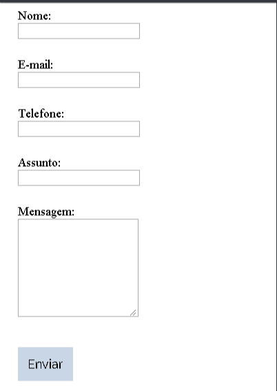
}<div class="central">
<form>
<div class="form-group">
<label for="name">Nome:</label>
<input type="text" class="field">
</div>
<div class="form-group">
<label for="email">E-mail:</label>
<input type="email" class="field">
</div>
<div class="form-group">
<label for="phone">Telefone:</label>
<input type="text" class="field">
</div>
<div class="form-group">
<label for="subject">Assunto:</label>
<input type="text" class="field">
</div>
<div class="form-group">
<label for="message">Mensagem:</label>
<textarea cols="10" rows="8"></textarea>
</div>
<input type="button" class="btn btn-success" value="Enviar">
</form>
</div>In it we have a div calling for form-group. That one div has 3 CSS properties. Among them one that regulates its size in 50% of the div "mother". Soon, she will not occupy the whole form.
But if you decrease the page to a certain width you will see that it will not be responsive, or better, not visually pleasant. As the image:
What happens is that the div is only 50% of a very small width.
To solve this we use the media query, which according to the example presented above will define that at 700px width, or better, when the screen reaches 700px a div form-group will occupy 100% of the screen, solving the problem.
This is just a small example of media query. They can be used for different types of problems and situations.
Browser other questions tagged css mobile
You are not signed in. Login or sign up in order to post.
Florence first welcome you. Then click on the edit link at the end of your question and include the code of your form, both HTML and CSS. Only then can we give you a precise answer. Without this information your question will be closed by not being clear enough, or not having a viable minimum example to simulate the problem
– hugocsl
In https://codepen.io/ you usually find many examples of html and css code
– Vinicius Morais
Florence, if any answer has solved your problem you can mark as accepted by clicking on the green V side of the chosen points. Or, if you want, you can leave it open for a while if you want more alternatives, but it is good that after it is resolved you mark some to close the subject. Learn more in "How and why to accept an answer".
– João Pedro Schmitz