The closest I could get was using background-clip: textand text-fill-color: transparent.
Behold:
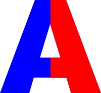
.two-colors{
   font-size: 160px;
   background: linear-gradient(to right, blue 50%, red 0);
   -webkit-background-clip: text;
  -webkit-text-fill-color: transparent;

  font-weight: 900;
  font-family: Arial;

}
<span class="two-colors">A</span>
<span class="two-colors">B</span>
<span class="two-colors">ABC</span>
I developed the CSS similar to this response in the SOEN, however I changed the direction of the gradient, to be half and half vertically colors and preferred to apply the style letter by letter.
In case, for the letters to be "in the same line", it is necessary that the element that receives the style has defined the display with the value inline-block or inline.

I lost. I’ll let someone answer
– Wallace Maxters
@Wallacemaxters if you have something with CSS would be interesting!
– hugocsl
I tried to define the
color: transparentand put two values intext-shadow. You can play with it if you want.– Wallace Maxters
@Wallacemaxters think that with linear-gradient vc would have a better result huh...
– hugocsl