Div’s overlapping in cell phone

Asked

Viewed 43 times

2

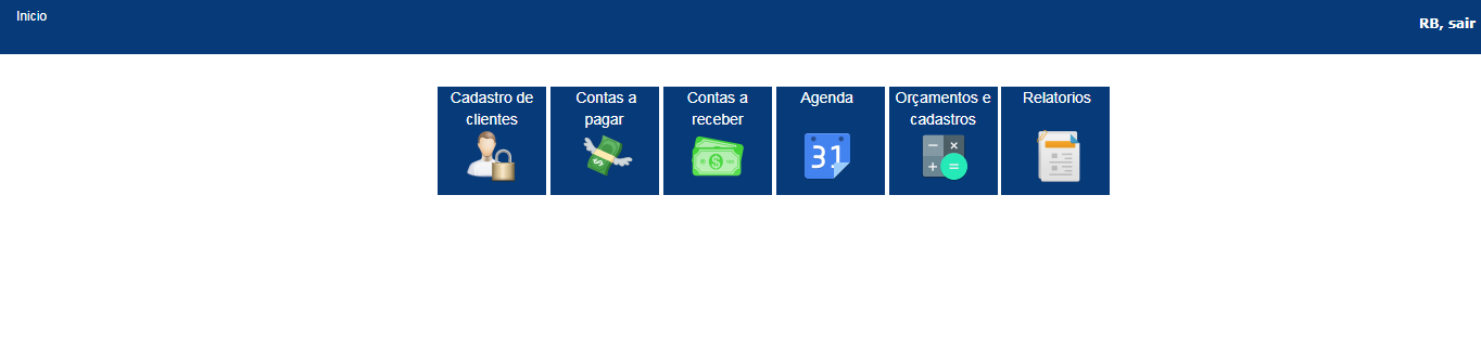
I have a menu made with CSS that has a certain header spacing as can be seen below: inserir a descrição da imagem aqui

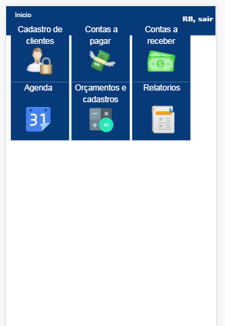
However, when I open the phone, the same align in a way that end up being on top of the header:

inserir a descrição da imagem aqui

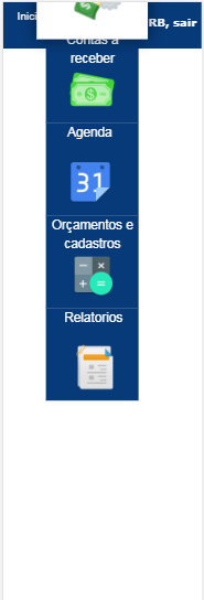
And without "Expremo" the page a little more, many of the buttons end up being inaccessible: inserir a descrição da imagem aqui

The last example ends up being kind of impossible to happen, but still I would like to know a way to "force" the Divs to keep the distance from the header, equal to the distance from the first image, regardless of the screen size.

Follow the HTML and CSS of the header and menu (Running the code below, because the display area is small this error is occurring there too):

/*Cabeçalho*/
#menu ul {
    padding:5px;
    margin:0px;  
    background-color: rgb(7, 58, 121);      
    list-style: none;
    width:99.85%;
    height: 50px ;
    position: relative;
}
    #menu ul li { display: inline; }
        
    #menu ul li a {
    font-family: arial;
    font-size: 12px;
    padding: 2px 10px;
    display: inline-block;   
    background-color: rgb(7, 58, 121);;
    color: white;
    text-decoration: none;
    border-bottom:3px solid rgb(7, 58, 121);
    transition: background-color 0.5s , color 0.5s , border-bottom 0.5s; 
    transition-timing-function: ease-out;
}
      #menu ul li a:hover {
    background-color: white;
    color: rgb(7, 58, 121);
    border-bottom:5px solid white;
}

h6 {   
   font-family: verdana;
    font-weight: bold;
   color: white;
   float: right;
   }

   a { color: inherit; }  
   
   /*Botoes abaixo da cabeçalho*/
   
   .container {
position: relative;
top: 20%;
left: 45%;
transform: translate(-50%, -50%);
}
.container div {
  display: inline-flex;
  width: 100px;
  height: 100px;
  background-color: rgb(7, 58, 121);
  margin: 0;
  padding: 0;
  transition: all .5s ease-in-out;
  position: relative;
  z-index: 0;
  color: white;
  text-decoration: none;
}
.container div:hover {
  background-color: white;
  transform: scale(1.2);
  box-shadow: 0 0 20px rgba(0,0,0,.5);
  position: relative;
  z-index: 2;
  cursor: pointer;
  color: rgb(7, 58, 121);
  text-decoration: none;
}
<nav id="menu">                      
    <ul>
        <h6>RB, sair</h6>
        <li><a href="index.php">Inicio</a></li>
    </ul>
</nav>

<br><br><br><br>
<center>
<div class="container">
  <div><center>Cadastro de clientes<br></center></div>
  <div><center>&nbsp&nbsp&nbsp&nbsp&nbsp&nbspContas a <br>&nbsp&nbsp&nbsp&nbsppagar<br>&nbsp&nbsp&nbsp&nbsp&nbsp&nbsp</center></div>
  <div><center>Contas a receber<br></center></div>
  <div><center>&nbsp&nbsp&nbsp&nbsp&nbsp&nbspAgenda<br><br>&nbsp&nbsp&nbsp&nbsp&nbsp&nbsp</center></div>
  <div><center>Orçamentos e cadastros<br></center></div>
  <div><center>&nbsp&nbsp&nbsp&nbsp&nbspRelatorios<br><br>&nbsp&nbsp&nbsp&nbsp&nbsp</center></div>
</div>
</center>

1 answer

2


Remove the properties top, left and transform class .container and add a margin-top to give spacing of the Nav. Do not use <br> followed up for this.

/*Cabeçalho*/
#menu ul {
    padding:5px;
    margin:0px;  
    background-color: rgb(7, 58, 121);      
    list-style: none;
    width:99.85%;
    height: 50px ;
    position: relative;
}
    #menu ul li { display: inline; }
        
    #menu ul li a {
    font-family: arial;
    font-size: 12px;
    padding: 2px 10px;
    display: inline-block;   
    background-color: rgb(7, 58, 121);;
    color: white;
    text-decoration: none;
    border-bottom:3px solid rgb(7, 58, 121);
    transition: background-color 0.5s , color 0.5s , border-bottom 0.5s; 
    transition-timing-function: ease-out;
}
      #menu ul li a:hover {
    background-color: white;
    color: rgb(7, 58, 121);
    border-bottom:5px solid white;
}

h6 {   
   font-family: verdana;
    font-weight: bold;
   color: white;
   float: right;
   }

   a { color: inherit; }  
   
   /*Botoes abaixo da cabeçalho*/
   
   .container {
position: relative;
margin-top: 20px;
/* top: 20%;
left: 45%;
transform: translate(-50%, -50%); */
}
.container div {
  display: inline-flex;
  width: 100px;
  height: 100px;
  background-color: rgb(7, 58, 121);
  margin: 0;
  padding: 0;
  transition: all .5s ease-in-out;
  position: relative;
  z-index: 0;
  color: white;
  text-decoration: none;
}
.container div:hover {
  background-color: white;
  transform: scale(1.2);
  box-shadow: 0 0 20px rgba(0,0,0,.5);
  position: relative;
  z-index: 2;
  cursor: pointer;
  color: rgb(7, 58, 121);
  text-decoration: none;
}
<nav id="menu">                      
    <ul>
        <h6>RB, sair</h6>
        <li><a href="index.php">Inicio</a></li>
    </ul>
</nav>

<center>
<div class="container">
  <div><center>Cadastro de clientes<br></center></div>
  <div><center>&nbsp&nbsp&nbsp&nbsp&nbsp&nbspContas a <br>&nbsp&nbsp&nbsp&nbsppagar<br>&nbsp&nbsp&nbsp&nbsp&nbsp&nbsp</center></div>
  <div><center>Contas a receber<br></center></div>
  <div><center>&nbsp&nbsp&nbsp&nbsp&nbsp&nbspAgenda<br><br>&nbsp&nbsp&nbsp&nbsp&nbsp&nbsp</center></div>
  <div><center>Orçamentos e cadastros<br></center></div>
  <div><center>&nbsp&nbsp&nbsp&nbsp&nbspRelatorios<br><br>&nbsp&nbsp&nbsp&nbsp&nbsp</center></div>
</div>
</center>

Use properties like text-align: center to centralise the texts, don’t use <center>. I also saw no use in these various &nbsp.

Browser other questions tagged

You are not signed in. Login or sign up in order to post.