How to rotate a 90º IMG occupying 100% of the element?

Asked

Viewed 119 times

2

I have the following image for example:

inserir a descrição da imagem aqui

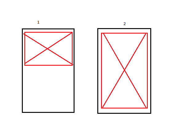
The black line is the container of the page(mobile) and the red one the image, In example 1 is what I have today, and the 2 the result I’m trying to get, I’m not finding a solution without distorting the image, there’s some way?

follows code:

img {
  display: inline-block;
  width: 100%;
  height: 100%;
  transform: rotate(90deg);
}

.container {
  background-color: #bbb;
  width: 300px;
  height: 400px;
}
<div class="container">
  <img src="https://www.paypalobjects.com/digitalassets/c/website/marketing/na/us/credit/hub/prepaid-image.png?01AD=3tN7YRjc7dW4pgCz6srp1Zwrd3T603duDiW7xKKoinH54ISdhxQdalQ&01RI=BDC70922D249C25&01NA="/>
</div>

1 answer

3


Option 1

You can use object-fit: contain in the image.
(this option does not work in IE as you can see here: https://caniuse.com/#feat=Object-fit)

See how it looks:

img {
  display: inline-block;
  width: 100%;
  height: 100%;
  transform: rotate(90deg) scale(1.35);
  object-fit: contain;
}

.container {
  background-color: #bbb;
  width: 300px;
  height: 400px;
}
<div class="container">
  <img src="https://www.paypalobjects.com/digitalassets/c/website/marketing/na/us/credit/hub/prepaid-image.png?01AD=3tN7YRjc7dW4pgCz6srp1Zwrd3T603duDiW7xKKoinH54ISdhxQdalQ&01RI=BDC70922D249C25&01NA="/>
</div>


Option 2 using the image as background.

This option works on IE, but the image has to be a Background of container, you can consult the support of the browsers here: https://caniuse.com/#feat=background-img-opts

.container {
  background-color: #bbb;
  width: 300px;
  height: 400px;
  overflow: hidden;
  position: relative;
}
.container::after {
    content: "";
    top: 15px;
    left: -55px;
    bottom: 0;
    right: 0;
    margin: auto;
    position: absolute;
    display: inline-block;
    width: 410px;
    height: 300px;
    transform: rotate(90deg);
    background-image: url(https://www.paypalobjects.com/digitalassets/c/website/marketing/na/us/credit/hub/prepaid-image.png?01AD=3tN7YRjc7dW4pgCz6srp1Zwrd3T603duDiW7xKKoinH54ISdhxQdalQ&01RI=BDC70922D249C25&01NA=);
    background-size: contain;
    background-repeat: no-repeat;
    background-position: center;
}
<div class="container">
</div>

  • Interesting, it comes very close to what I would like, but there is no way to get the image as close as possible to the screen size?

  • @Lennons.Bueno has as yes, note the second example that I edited the code, adjusting the Heigh and width, and the left and top you can get very close to the container size.

  • @Lennons.Bueno guy also set the first option, in it I used a Scale(1.35) to make the image occupy more space in the container

Browser other questions tagged

You are not signed in. Login or sign up in order to post.