0
I’m having a problem on my style sheet.
I have a generic Input as shown below:
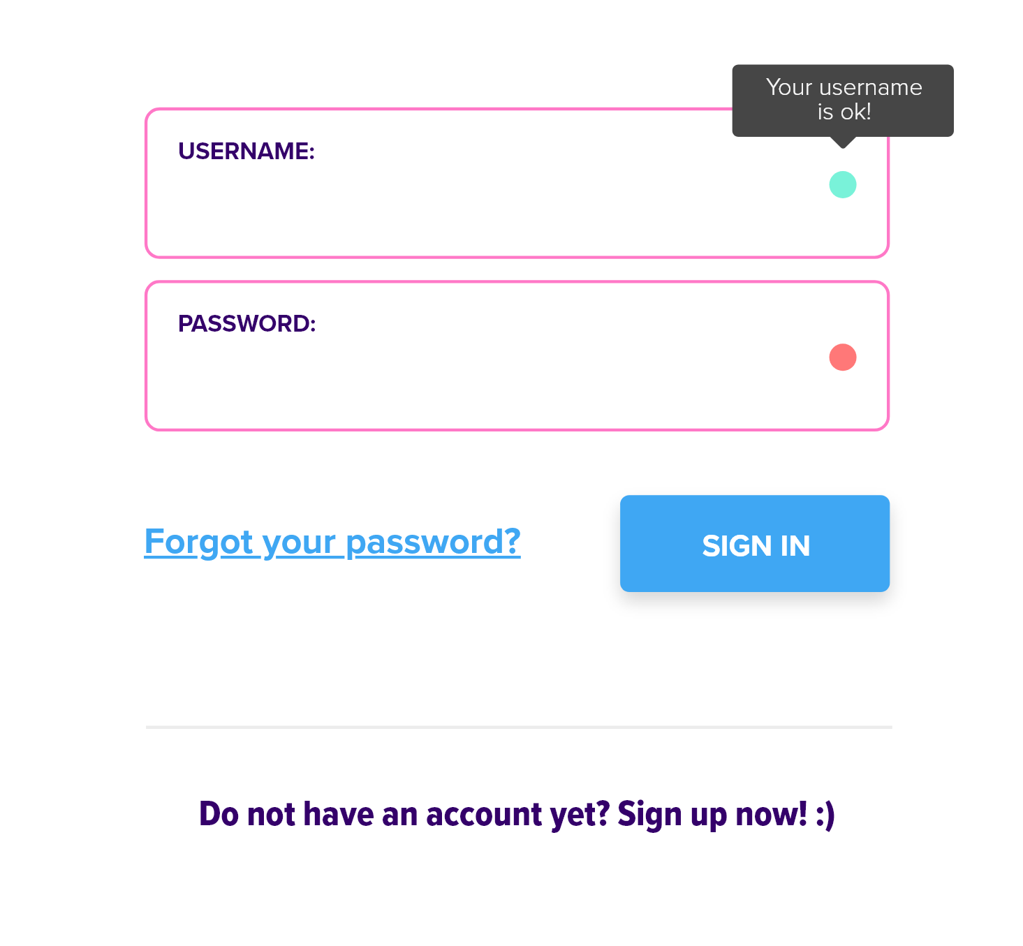
I put an element to validate my form, the validation this OK, but I’m having problems in alignment, because if I increase or decrease the text field, the element remains.
Take an example:

The validation element remained in the same place, even though I increased the Input. I would like it to follow the input according to its format. My code is as follows:
<div class="input-container">
  <input type="{{type}}" class="form-control" id="{{name}}" placeholder="{{placeholder}}" [value]="value || ''  " (keyup)="capterField(fieldValue.value)"
    #fieldValue>
  <div class="circle-validation" data-toggle="tooltip" data-placement="top" title="{{messageError}}" [ngClass]="{ 'default': defaultValidation, 'success': isValid && isValid !== undefined, 'danger': !isValid && isValid !== undefined}">
  </div>
  <label for="{{name}}">{{label}}</label>
</div>
My SCSS treating that state is just below:
input.form-control {
  border: 1px solid $pink-color;
  line-height: 20px;
  padding: 45px 15px 30px 15px;
  &:hover {
    border: 1px solid $primary-color;
  }
}

.circle-validation {
  content: '';
  height: 15px;
  width: 15px;
  border-radius: 20px;
  position: relative;
  text-align: right;
  left: 300px;
  top: -45px;
  cursor: pointer;

  &.default {
    background-color: $default-light-color;
  }
  &.success {
    background-color: $success-color;
  }
  &.danger {
    background-color: $danger-color;
  }
}


label {
  font-size:  12.5px;
  opacity:  .8;
  font-weight:  400;
}

.input-container {
  position:  relative;
  margin-bottom:  10px;
  label {
    color: $blue-color;
    text: {
      transform: uppercase;
    }
    font-weight: 700;
    position:  absolute;
    top: calc(50% - 30px);
    left:  15px;
    opacity:  1;
    transition: all .3s ease;
  }
  input:not(:placeholder-shown) {
    padding:  45px 15px 30px 15px;
  }
  input:not(:placeholder-shown) + label {
    transform:  translateY(0px);
    color: $primary-color;
    opacity:  .7;
  }
}
Thank you for your contribution from now on!
what is the bootstrap version?
– hugocsl
Version 4 of bootstrap.
– Thiago Cunha
Another thing the main CSS would be of the class
.circle-validationis not in the code above... it would be good if it had to be able to answer you accurately– hugocsl
This one... I had performed an update....
– Thiago Cunha