How to set a limit of 4 images per line?

Asked

Viewed 840 times

1

I want to place a row of 4 images with a small text below each image, I already know how to do this, but I have many images and I need each row to have a maximum of 4 images.

I tried to do this using 4 li within 1 ul, and using flex display, it worked, but I need to keep editing the content. So I need to know how to put a limit of 4 images per row.

Take a look at the example:

inserir a descrição da imagem aqui

Edit:

My script:

<article>
  <div>
    <ul>
      <li>
        <a><img></a>
        <h4><a></a></h4>
        <h5><a></a></h5>
      </li>

Edit 2:

inserir a descrição da imagem aqui

3 answers

5

This would be very easy to do with a server-side language, but as it was not put this option in the question, let’s go from CSS.

In the examples below were used img and div, but logic serves for any element.

Using Nth-Child

Whenever you need something that happens to every n items, you can use the :nth-child (or others nth, depending on the context).

Take an example:

.quatro {
  display:block;
  float:left;
  margin:10px;
}
.quatro:nth-child(4n+1) {
  clear:both;
}
<img class="quatro" src="http://placecage.com/100/100">

To learn more:

What do "n" means, numbers and signals on "Nth-Child" or "Nth-last-Child" selectors"?

Make an HTML checklist
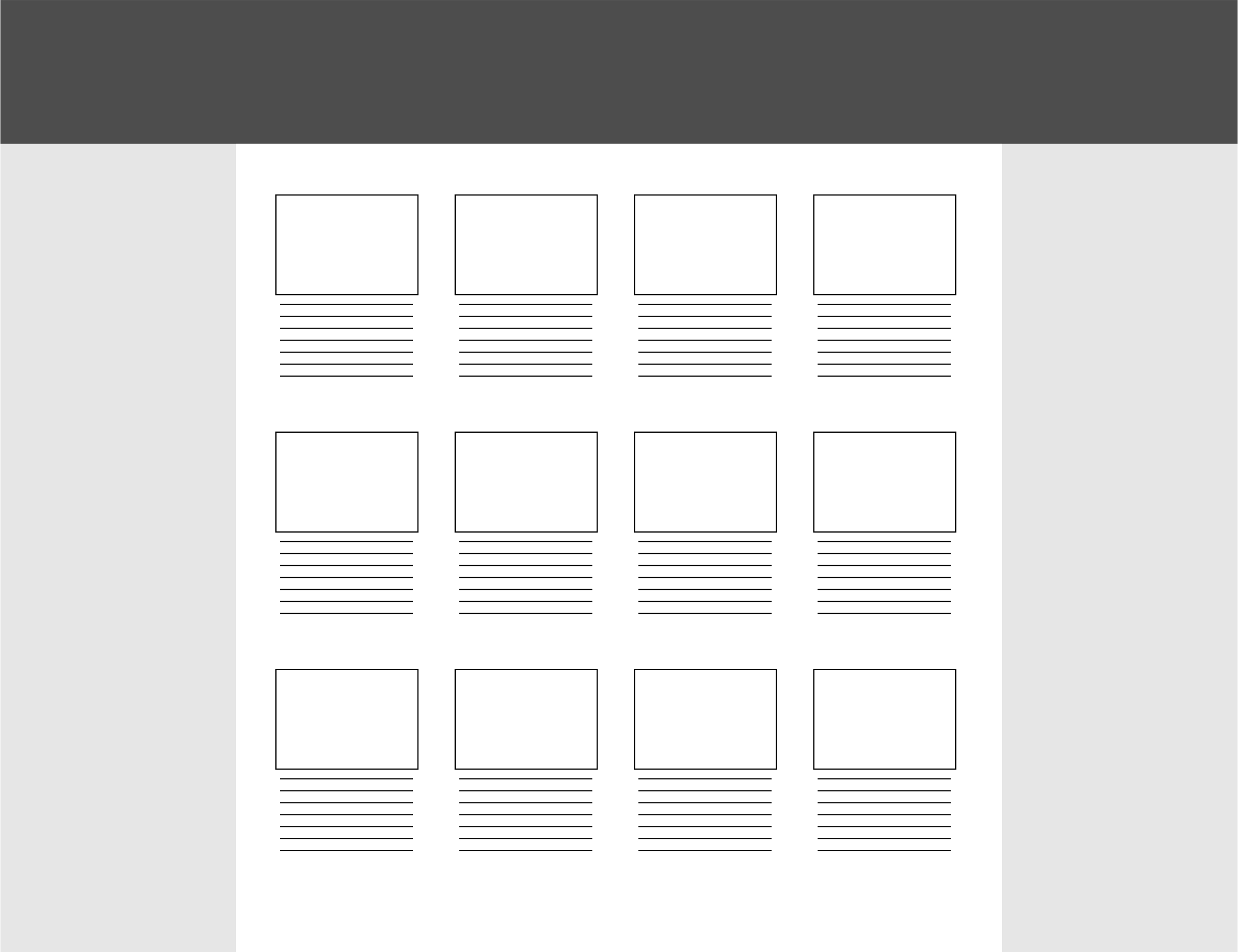

Using Divs

Depending on the desired effect, just set the width of your DIVs for 25%. Just watch out for the box-model:

.quatro {
  width:25%;
  float:left;
}
<div class="quatro"><img src="http://placecage.com/100/120"></div>

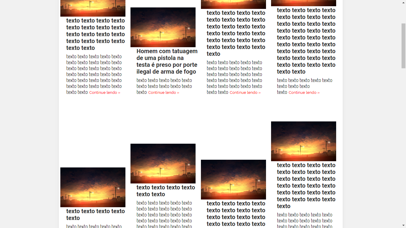
  • You really managed to put a limit of 4 images per line. But I tried to apply this code to mine and I got it. I updated my question with an example of the code I have. This read of my code repeats several times within ul

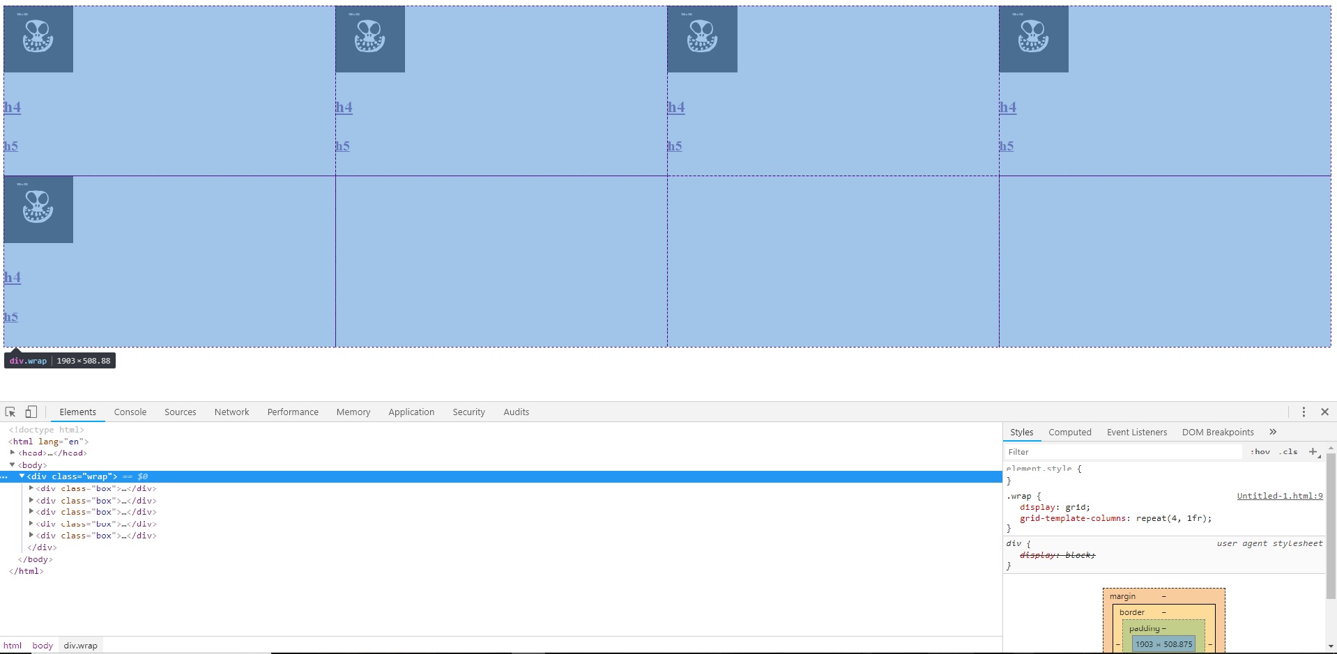
  • The element can be any one, I used IMG and DIV as a mere example. Just put the class "four" (or the name you want) in the desired element. Obviously you should start from a clean CSS, so that your current rules do not interfere with the effect (which has been proven in the above executable examples). If you try to mix with the rest of the previous CSS, it is difficult to detect the problem.

  • see working with your code: https://codepen.io/anon/pen/yxeEpB

4


It can do so by dividing the total width of the ul by 4 (25%). Other explanations in the code.

In case I didn’t use float: left, which is not recommended because it will prevent the ul expands with the content.

body{ /* só para exemplo, elimina espaçamento do body a seta um fundo escuro*/
   margin: 0;
   background-color: #444;
   font-size: 16px;
}

article ul{
   font-size: 0; /* elimina espaços entre as li */
   background-color: #fff; /* fundo branco na ul, se for preciso */

}

article ul li img{
   width: 100%; /* ajusta a largura da imagem dentro da li */
   display: block; /* convertendo para block elimina espaço natural abaixo da imagem */
}

article ul, article ul li{ /* remove espaços e o bullet da ul e das li */
   list-style: none;
   margin: 0;
   padding: 0;
}

article ul li{
   display: inline-block;
   width: 25%; /* divide a largura por 4 */
   box-sizing: border-box; /* restringe o padding à área da li */
   text-align: center; /* centraliza o conteúdo */
   padding: 15px; /* espaçamento interno entre o conteúdo e a borda da li */
   font-size: 16px; /* ajusta o tamanho da fonte nas li com o tamanho padrão */
   vertical-align: top; /* alinha as li no topo da linha */
}
<article>
   <ul>
      <li>
         <a href="#"><img src="https://www.cleverfiles.com/howto/wp-content/uploads/2016/08/mini.jpg"></a>
         <h4><a href="#">Texto texto texto texto</a></h4>
         <h5><a href="#">Texto texto texto texto</a></h5>
      </li>
      <li>
         <a href="#"><img src="https://www.cleverfiles.com/howto/wp-content/uploads/2016/08/mini.jpg"></a>
         <h4><a href="#">Texto texto texto texto</a></h4>
         <h5><a href="#">Texto texto texto texto</a></h5>
      </li>
      <li>
         <a href="#"><img src="https://www.cleverfiles.com/howto/wp-content/uploads/2016/08/mini.jpg"></a>
         <h4><a href="#">Texto texto texto texto</a></h4>
         <h5><a href="#">Texto texto texto texto</a></h5>
      </li>
      <li>
         <a href="#"><img src="https://www.cleverfiles.com/howto/wp-content/uploads/2016/08/mini.jpg"></a>
         <h4><a href="#">Texto texto texto texto</a></h4>
         <h5><a href="#">Texto texto texto texto</a></h5>
      </li>
      <li>
         <a href="#"><img src="https://www.cleverfiles.com/howto/wp-content/uploads/2016/08/mini.jpg"></a>
         <h4><a href="#">Texto texto texto texto</a></h4>
         <h5><a href="#">Texto texto texto texto</a></h5>
      </li>
      <li>
         <a href="#"><img src="https://www.cleverfiles.com/howto/wp-content/uploads/2016/08/mini.jpg"></a>
         <h4><a href="#">Texto texto texto texto</a></h4>
         <h5><a href="#">Texto texto texto texto</a></h5>
      </li>
      <li>
         <a href="#"><img src="https://www.cleverfiles.com/howto/wp-content/uploads/2016/08/mini.jpg"></a>
         <h4><a href="#">Texto texto texto texto</a></h4>
         <h5><a href="#">Texto texto texto texto</a></h5>
      </li>
      <li>
         <a href="#"><img src="https://www.cleverfiles.com/howto/wp-content/uploads/2016/08/mini.jpg"></a>
         <h4><a href="#">Texto texto texto texto</a></h4>
         <h5><a href="#">Texto texto texto texto</a></h5>
      </li>
   </ul>
</article>

  • I managed to put the limit of 4 images per line. But the text is aligned at the bottom. I updated the question by pasting a print.

  • True. We missed one vertical-align: top; in the lis

  • Put in the article ul li{.

  • Got it, thank you very much colleague!

2

Another way to do it is by using display:grid you can determine the break to quad 4 this way repeat(4, 1fr). If you are going to use this example I suggest that one studied on the Grid to better understand how to use it in a practical way.

Here you can consult the browser support https://caniuse.com/#feat=css-grid partially works from IE 10 forward using prefix -ms-.

See the practical example.

.wrap {
  display: -ms-grid;
  display: grid;
  -ms-grid-columns: (1fr)[4];
  grid-template-columns: repeat(4, 1fr);
}
<div class="wrap">
  <div class="box">
    <a href="#"><img src="https://fillmurray.com/100/100" alt=""></a>
    <h4><a href="#">Título</a></h4>
    <h5><a href="#">Lorem, ipsum dolor.</a></h5>
  </div>
  <div class="box">
    <a href="#"><img src="https://fillmurray.com/100/100" alt=""></a>
    <h4><a href="#">Título</a></h4>
    <h5><a href="#">Lorem, ipsum dolor.</a></h5>
  </div>
  <div class="box">
    <a href="#"><img src="https://fillmurray.com/100/100" alt=""></a>
    <h4><a href="#">Título</a></h4>
    <h5><a href="#">Lorem, ipsum dolor.</a></h5>
  </div>
  <div class="box">
    <a href="#"><img src="https://fillmurray.com/100/100" alt=""></a>
    <h4><a href="#">Título</a></h4>
    <h5><a href="#">Lorem, ipsum dolor.</a></h5>
  </div>
  <div class="box">
    <a href="#"><img src="https://fillmurray.com/100/100" alt=""></a>
    <h4><a href="#">Título</a></h4>
    <h5><a href="#">Lorem, ipsum dolor.</a></h5>
  </div>
</div>

Image Inspecting the Grid by Chrome Devtools

inserir a descrição da imagem aqui

Browser other questions tagged

You are not signed in. Login or sign up in order to post.