Edge at intersection between 2 elements - CSS

Asked

Viewed 355 times

3

I am creating the following menu: inserir a descrição da imagem aqui

but I’m not getting to create this edge: inserir a descrição da imagem aqui

How can I create it with CSS?

.m{
  position: fixed;
  top: 0;
  left: 0;
  height: 100%;
  width: 100%;
  background: #aaa;
}
.a{
  background: #777;
  position: relative;
  padding: 0 1rem;
  margin-top: 1rem;
  margin-left: 1rem;
  height: 2rem;
  border-radius: .5rem .5rem 0 0
}
.b{
  position: absolute;
  width: 5rem;
  background: #777;
  top: 2rem;
  left: 0;
  border-radius: 0 .5rem .5rem .5rem;
  padding: 1rem;
}
<link href="https://stackpath.bootstrapcdn.com/bootstrap/4.1.0/css/bootstrap.min.css" rel="stylesheet"/>

<div class='m d-flex flex-row'>
  <div class='a'>
    <span>a</span>
    <div class='b'>
      <div class='d-flex flex-column'>
        <div><span>a1</span></div>
        <div><span>a2</span></div>
        <div><span>a3</span></div>
        <div><span>a4</span></div>
        <div><span>a5</span></div>
      </div>
    </div>
  </div>
</div>

See the code on Fiddle

  • If you can share the code already made in a jsbin, codepen or similar, so that it is possible to play with it, it is easier to help. You can only share an example without having the actual code. Because creating something from scratch to test a solution is laborious.

  • 2

    I added the link to the question.

4 answers

4


Only with CSS, you can use pseudo-elements ::before and ::after, however this solution works only if the bottom of the page is solid.

In your case, as it is a gradient, it is possible only with the ::after using the border-radius and the box-shadow of the same.

The theory is to put the ::after outside the element father and apply a border-radius as necessary to achieve the desired curve effect and use the box-shadow for fill in the outside of the border with the same tab color.

Here is the code:

.m{
  position: fixed;
  top: 0;
  left: 0;
  height: 100%;
  width: 100%;
  background: #aaa;
}
.a{
  background: #777;
  position: relative;
  padding: 0 1rem;
  margin-top: 1rem;
  margin-left: 1rem;
  height: 2rem;
  border-radius: .5rem .5rem 0 0
}
.a::after {
  content: " ";
  position: absolute;
  right: -.5rem;
  bottom: 0;
  width: .5rem;
  height: .5rem;
  
  border: .1rem solid transparent;
  border-bottom-left-radius: 1rem;
  border-width: 0 0 .2rem .2rem;
  box-shadow: -.1rem 2px 0 #777;
}

/* ou usando o :before e :after - so funciona com fundos solidos */
/*.a::before {
  content: "";
  background: #777;
  position: absolute;
  right: -.5rem;
  bottom: 0rem;
  width: .5rem;
  height: .5rem;
}
.a::after {
  content: "";
  position: absolute;
  right: -1rem;
  bottom: 0rem;
  width: 1rem;
  height: 1rem;
  border-radius: 100%;
  background-color: #aaa;
}
*/

.b{
  position: absolute;
  width: 5rem;
  background: #777;
  top: 2rem;
  left: 0;
  border-radius: 0 .5rem .5rem .5rem;
  padding: 1rem;
}
<link href="https://stackpath.bootstrapcdn.com/bootstrap/4.1.0/css/bootstrap.min.css" rel="stylesheet"/>
<div class='m d-flex flex-row'>
  <div class='a'>
    <span>a</span>
    <div class='b'>
      <div class='d-flex flex-column'>
        <div><span>a1</span></div>
        <div><span>a2</span></div>
        <div><span>a3</span></div>
        <div><span>a4</span></div>
        <div><span>a5</span></div>
      </div>
    </div>
  </div>
</div>

See the code working on Jsfiddle

  • 1

    Very cool Milk, but seeing that it seems that it was missing a fill in the curvature, it seems that appears a little bit of the bottom... To fix this I suggest you put the shadow values like this. box-shadow: -0.1rem 2px 0 2px #777 Now the shadow covers all the space you need between the elements. I did a similar response, but using radial-gradient to make it easier to control it

  • Thank you! It’s true, there is a bit of the background of the site, invisible here on the monitor of work, but at home it is a 2px by 2px, very visible. With the suggested change, I see a slight line on the right of this element. Here at work, change to box-shadow: -0.1rem 3px 0 1px #777; seems to be right, and maybe it’s enough to hide the space, but I’d have to test it at home where I see the problem. My suggestion would be to play a little with values, it will also depend on one of the other attributes since you are using Rems.

  • It is possible that even this line appears, You have to adjust the values of box-shadow to try to minimize this "hole" to the maximum, but the idea is pretty cool without a doubt. These fine adjustments sometimes depends on the same resolution of the monitor, maybe in a retina monitor is less noticeable, or worse rss, unfortunately I do not have a monitor of these or 4k to test the rendering of these effects with CSS

2

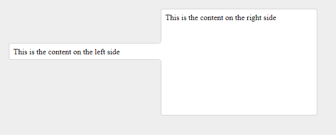
One way to solve this is by using svg. Here’s an example.

inserir a descrição da imagem aqui

index.html

<html>
  <head>
    <link rel="stylesheet" href="style.css">
  </head>
  <body>
    <div id="left">
      This is the content on the left side
      <div class="fancy-join">
    <div class="stroke"></div>
      </div>
    </div>
    <div id="right">
      This is the content on the right side
    </div>
  </body>
</html>

Circle-bottom-right.svg

<svg baseProfile="full" height="10" version="1.1" width="10" xmlns="http://www.w3.org/2000/svg" xmlns:ev="http://www.w3.org/2001/xml-events" xmlns:svg="http://www.w3.org/2000/svg" xmlns:xlink="http://www.w3.org/1999/xlink">
  <path fill="white" stroke="white" stroke-width="1" d="M5,9A4,4 0 0,0 9,5L10,5L10,10L5,10Z"/>
  <path fill="none" stroke="#ccc" stroke-width="1" stroke-linecap="square" d="M5,9A4,4 0 0,0 9,5"/>
</svg>

Circle-top-right.svg

<svg baseProfile="full" height="10" version="1.1" width="10" xmlns="http://www.w3.org/2000/svg" xmlns:ev="http://www.w3.org/2001/xml-events" xmlns:svg="http://www.w3.org/2000/svg" xmlns:xlink="http://www.w3.org/1999/xlink">
  <path fill="white" stroke="white" stroke-width="1" d="M9,5A4,4 0 0,0 5,1L5,0L10,0L10,5Z"/>
  <path fill="none" stroke="#ccc" stroke-width="1" stroke-linecap="square" d="M9,5A4,4 0 0,0 5,1"/>
</svg>

css style.

body {
  background-color: #eee;
}
#left, #right {
  margin: 10px;
  width: 300px;
  float: left;
  padding: 0.5em;
  border: 1px solid #ccc;
  border-radius: 4px;
  background-color: white;
}
#left {
  margin-top: 80px;
  margin-right: 0px;
  padding-right: 0em;
  border-right: none;
  border-top-right-radius: 0px;
  height: 1em;
  border-bottom-right-radius: 0px;
}
#right {
  margin-left: 0px;
  height: 200px;
}


.fancy-join{
  position:relative;
  width:0;
  height:0;
  left:100%;
  top:-1.5em;
  z-index:2;
}
.fancy-join .stroke{
  position:absolute;
  top: -2px;
  width:1px;
  height:2.1em;
  background-color:#fff;
}
.fancy-join .stroke:after{
  content:"";
  position:absolute;
  left:-9px;
  top:-10px;
  background-image:url("circle-bottom-right.svg");
  background-repeat:no-repeat;
  z-index:4;
  width:10px;
  height:10px;
}
.fancy-join .stroke:before{
  content:"";
  position:absolute;
  left:-9px;
  bottom: -8px;
  background-image:url("circle-top-right.svg");
  background-repeat:no-repeat;
  z-index:4;
  width:10px;
  height:10px;
}
  • I also believe that the best way to solve problems with "shapes" is using <svg>. This is not the case with this question, but many of the solutions that propose the use of CSS only sound like gambiarra.

1

Another simple way to do it is with a radial-gradient going to transparent for the color you need.

Vc can create a pseudo element ::after and in it put his radial-gradient. The way I did no matter the size of Tab text, everything will always be aligned (ou vc pode colocar um valor fixo se quiser), you just need to define the values of .container if you want... To better understand see the code below

body {
  background-image: linear-gradient(45deg, red, blue);
  background-repeat: no-repeat;
}
.tab {
  box-sizing: border-box;
  padding: 16px;
  background-color: #fff;
  border-radius: 10px 10px 0 0;
  position: relative;
  display: inline-block;
  text-align: center;
}
.tab::after {
  content: "";
  position: absolute;
  bottom: 0;
  left: 100%;
  width: 20px;
  height: 20px;
  background-image: radial-gradient(circle at 100% 0%, transparent 0px, transparent 19.5px, #fff 20.5px);
  background-repeat: no-repeat;
}
.txt {
  height: 120px;
  background-color: #fff;
  border-radius: 0 10px 10px 10px;
  box-sizing: border-box;
  padding: 10px;
}
.container {
  padding: 20px;
  box-sizing: border-box;
  width: 50%;
  float: left;
}
<div class="container">
  <div class="tab">tab</div>
  <div class="txt">texto</div>
</div>

<div class="container">
  <div class="tab">tgdfg dfgdfab</div>
  <div class="txt">texto</div>
</div>

1

CSS solution

The solution of this problem can be done only with CSS, using two pseudo-elements ::after and ::before in class .to

Code analysis to follow :)

.a::after,
.a::before {
  content: "";
  display: block;
  width: 10px;
  height: 10px;
  position: absolute;  
  z-index: 1;
  border-radius: 50%;
}
.a::after {
  background: red;
  right: -10px;
  bottom: 0px;
}
.a::before {
  background: #000;  
  right: -5px;
  bottom: -5px;
}
.m{
  position: fixed;
  top: 0;
  left: 0;
  height: 100%;
  width: 100%;
  background: #aaa;
}
.a{
  background: #000;
  position: relative;
  padding: 0 1rem;
  margin-top: 1rem;
  margin-left: 1rem;
  height: 2rem;
  border-radius: .5rem .5rem 0 0
}
.b{
  position: absolute;
  width: 5rem;
  background: #000;
  top: 2rem;
  left: 0;
  border-radius: 0 .5rem .5rem .5rem;
  padding: 1rem;
}

<div class='m d-flex flex-row'>
  <div class='a'>
    <span>a</span>
    <div class='b'>
      <div class='d-flex flex-column'>
        <div><span>a1</span></div>
        <div><span>a2</span></div>
        <div><span>a3</span></div>
        <div><span>a4</span></div>
        <div><span>a5</span></div>
      </div>
    </div>
  </div>
</div>

https://jsfiddle.net/lucaslimax/aq9Laaew/171297/

Browser other questions tagged

You are not signed in. Login or sign up in order to post.