1
I got a problem I can’t seem to solve. I made an accordion, as in the image below using bootstra 4, the desktop version of it looks like this:
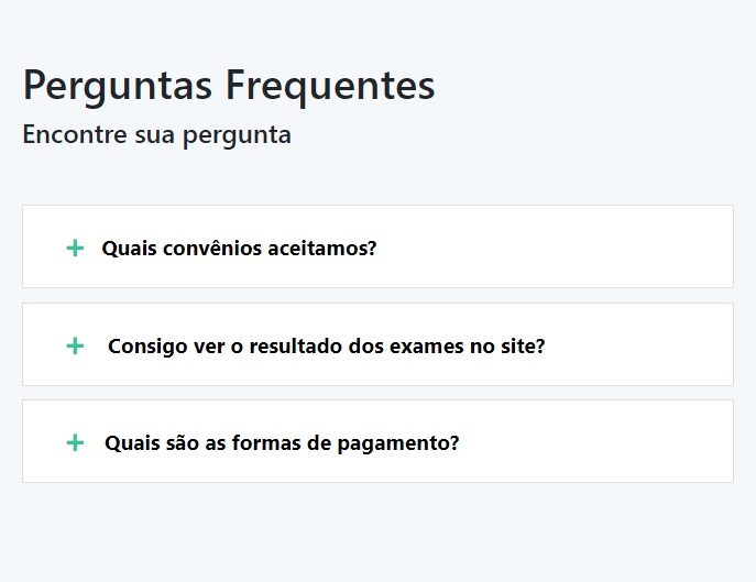
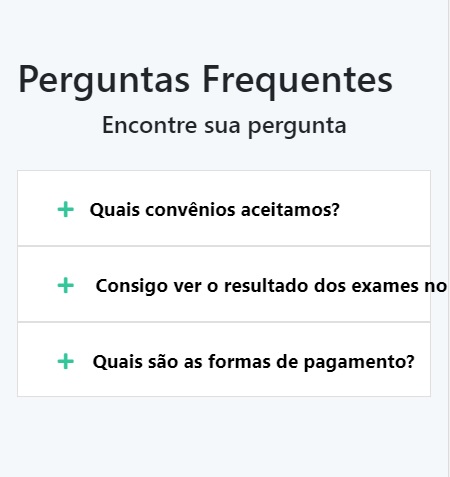
But the cell phone version the text gets bigger and ends up extrapolating the limit, I tried to use overflow-x, but the result was not good. Is there any way when the text will exceed the limit of the button it goes down?
If you put the
iwithin apdoesn’t work?– LeAndrade
@leAndrade didn’t work :(
– Lucky
Put a class on this
pand in css put white-space: normal– LeAndrade
It worked! But now it’s breaking in the desktop version tbm, is there any way to take this attribute? I’m using the right media queries, but as white-space is already "normal", I don’t know "cancel" it
– Lucky
You’ll have to use media queries, knows how to use?
– LeAndrade
Ahhhh, it worked :) Actually I had a bug in Brackets that wasn’t updating the page, I applied white-space: normal only to the mobile version in media querie and it worked. Thank you!!!!!!!
– Lucky
Beauty, jewel that worked.
– LeAndrade
If you want to put the answer there I mark as a solution
– Lucky