0
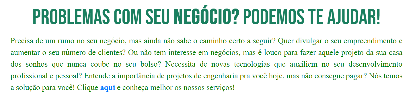
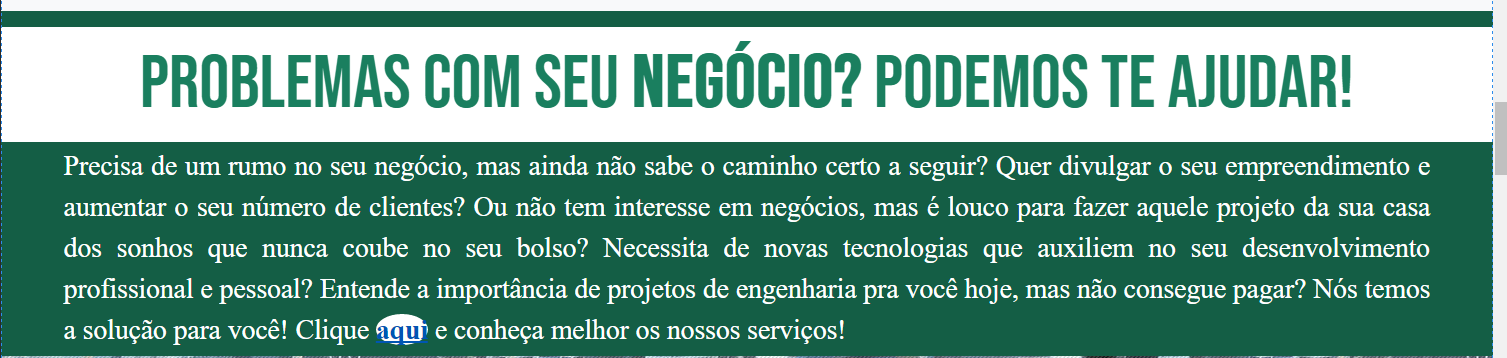
Hello! Good afternoon, sir. I’m trying to have the following effect: by hovering over an "a" tag, the background-color of the parent div in which this "a" tag is daughter, can change in transition but in a circular format where this circle would start from the "a" tag and expand until it reaches the entire div. It’s like a radial gradient transition from background-color.
I thought of creating an invisible circular element of white color as father of the tag "a" but daughter of the major div. The structure would be:
<main>
  <article>
    <div class="box-de-texto" id="div-servicos">

     <p>texto...<p>
      <circle>
       <a>clique aqui</a>
      </circle>
     <p> mais texto>

    </div>
  </article>
</main>
In CSS, I did the following:
#div-servicos {
    transition: all 150ms ease;

}

circle {
    border-radius: 50%;
    position: relative;
    max-width: 100%;
    max-height: 100%;
}
and in the Js:
var a = document.getElementById("aLink");
var div = document.getElementById("div-servicos");
var circle = document.getElementById("circle");

$(a).on("mouseover", function(){
    div.setAttribute("style","background-color: rgba(20,94,69,1.00); color: white;");
    circle.setAttribute("style","transform: scale(25); background-color: white;");
});
With that, I was able to create the effect of:
for:
The big problem is that even putting the attribute "Transform: Scale(25)" in Js, it seems that it is not working in the "circle" that I created.
The problem is almost solved and I managed to insert a change in the color of the text contained within the "p" tag when the animation occurs but I think I will need to play the "p" tag in front of the ripple class div layer (according to the suggestion of the comment below).
You helped me a lot! Thank you very much! , but only one question: I need the text of the "p" tag inside the div to be white to contrast with the green background caused by the event. Then I added within the JS a line: $divServicos.setAttribute("style","color: rgba(255,255,255, 1); "); this variable is $divServicos referring to the div that is the parent of the tag "p". The text is blank but it looks like this ripple class div is in front of the div containing the text.
– Mikhael Araujo
But from what I understood from the code, this class ripple div has position Absolute so it will be on top even... so maybe it would be easier to try to insert a "p" tag with the already white text, inside the ripple class div construction, in the JS code. what you think?
– Mikhael Araujo
There, I take back what I said. If I put the text to turn black, it stays. The white that is disappearing lol
– Mikhael Araujo
I didn’t get it right, look and critique I did at the beginning of css, it’s what you want?
– Costamilam
Yes, you understood what I want. It would be to change the color of the text within the "p" tag when the mouseover occurs in that data-ripple attribute. But it didn’t work with the change "[data-ripple]:Hover + p { color: red; }"
– Mikhael Araujo
look at the end of it
– Mikhael Araujo
What didn’t work? Remembering that the event
mouseoveris when the mouse "enters" the element and themouseleavewhen the mouse "gets off" the element, thehoveris while the mouse is over the element– Costamilam
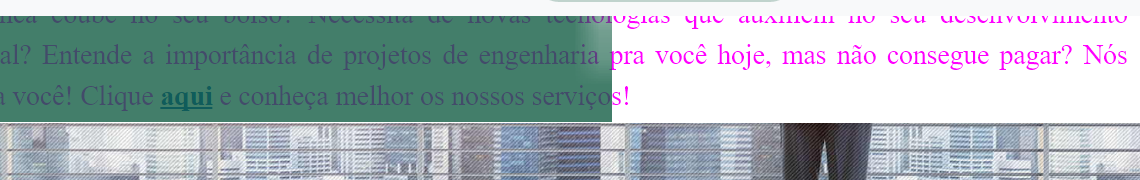
need to occur a color change in the text of the tag "and" when the mouseover event occurs in the tag "a". I was able to create this by inserting this change inside the function that is called in the Hover but it seems that the div that is created is in front of the text, which covers it a little.
– Mikhael Araujo
posted an image on Edit
– Mikhael Araujo
I believe I should ask another question, putting your complete code as it turned out, I can’t tell what the problem is just from the picture
– Costamilam
I created a new question: https://answall.com/questions/320271/trazendo-a-tag-p-para-frente-de-umadiv
– Mikhael Araujo