How to do with CSS a checkered checkerboard background for Body?

Asked

Viewed 2,323 times

3

I’d like to put in the <body> a checkered background, like a chessboard covering the whole body.

I tried with repeating-linear-gradient(), but I couldn’t...

html, body {
    width: 100%;
    height: 100%;
    margin: 0;
    padding: 0;
}
body {
    background-image: 
    repeating-linear-gradient(to bottom, black 0, black 20px, transparent 20px, transparent 40px),
    repeating-linear-gradient(to right, #fff 0, #fff 20px, black 20px, black 40px);
}

inserir a descrição da imagem aqui

OBS: Using 1 million divs or table will not serve, I need to apply at the bottom of body

  • 1

    a slight image with repeat would not look good?

3 answers

5


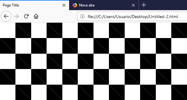
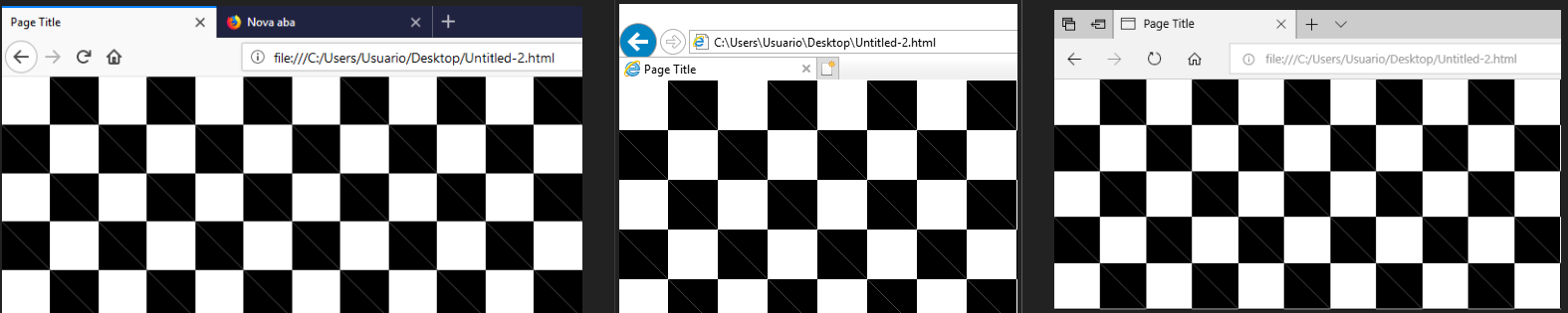
After testing the solution of colleagues I saw that there was a problem, which I believe is rendering, in Firefox, Edge and IE. As seen in the image

inserir a descrição da imagem aqui

inserir a descrição da imagem aqui

My solution was to use a SVG inline, in place of background-image: This way with only a few lines it is possible to make a checkered background even easier to customize than the one made with linear-gradiente, no request is made to the server, because the SVG is inline and it was also possible to make a fallback with another backgraund if the user’s browser does not support SVG. (recomendo que testem no IE caso tenham interesse para ver que ele usa o segundo URL como background e ignora o primeiro)

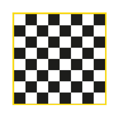
Follow the basic result. Remember that you can easily change the size of the blocks by background-size And the color of each square individually by fill of rect, Even within each square you can have a different gradient...

body {
    background-image:
        url("data:image/svg+xml;utf8,\
            <svg xmlns='http://www.w3.org/2000/svg' width='100' height='100' viewBox='0 0 100 100'>\
                <rect fill='%23000' width='50' height='50' x='0' y='0' />\
                <rect fill='%23000' width='50' height='50' x='50' y='50' />\
                <rect fill='%23fff' width='50' height='50' x='50' y='0' />\
                <rect fill='%23fff' width='50' height='50' x='0' y='50' />\
            </svg>"),
        url(https://abrilveja.files.wordpress.com/2018/01/mallandro.png);
    background-size: 80px, cover;
}

Below a result shown the versatility of colors in bg if you want something different.

body {
    background-image:
        url("data:image/svg+xml;utf8,\
            <svg xmlns='http://www.w3.org/2000/svg' width='100' height='100' viewBox='0 0 100 100'>\
                <defs>\
                    <linearGradient id='grad1' x1='0%' y1='0%' x2='100%' y2='0%'>\
                        <stop offset='0%' style='stop-color:rgb(255,255,0);stop-opacity:1' />\
                        <stop offset='100%' style='stop-color:rgb(255,0,0);stop-opacity:1' />\
                    </linearGradient>\
                </defs>\
                <rect fill='url(#grad1)' width='50' height='50' x='0' y='0' />\
                <rect fill='black' width='50' height='50' x='50' y='50' />\
                <rect fill='blue' width='50' height='50' x='50' y='0' />\
                <rect fill='%23fff' width='50' height='50' x='0' y='50' />\
            </svg>"),
        url(https://abrilveja.files.wordpress.com/2018/01/mallandro.png);
    background-size: 30px, cover;
}


EDITE:

New technique

New solution using mix-blend-mode, but does not work in IE or EDGE, you can consult your browser support here https://caniuse.com/#feat=css-mix-blend-mode

The technique is to place two pseudo elements in body one ::before and a ::after and makes them the mix-blend-mode along with a repeating-linear-gradient. The blend mode difference causes the overlapping colors to invert, so where there is a black line passing over the other black line at the intersection between them will be a "white square", generating this chessboard effect

html, body {
    width: 100%;
    height: 100%;
    margin: 0;
    padding: 0;
    position: relative;
}

body::before, body::after {
    content:"";
    position: absolute;
    width: 100%;
    height: 100%;
    top: 0;
    left: 0;
    background-image: repeating-linear-gradient(to right, #000 0, #000 40px, #fff 40px, #fff 80px);
}
body::after {
    background-image: repeating-linear-gradient(to bottom, #000 0, #000 40px, #fff 40px, #fff 80px);
    mix-blend-mode: difference;
}

  • interesting, generated the alternating frames in the cool svg :) clearer to understand than the background with gradient

  • @Ricardopunctual as it is, it was very versatile and easy to understand. In addition to solving the problem of the "phantom line". []’s

  • Very nice, but this second gave a headache, I didn’t need

  • @Guilhermecostamilam was just to test the rss possibilities, I even tried to put one of the squares as a "drunk" image inside the rect, but I think the inline style as I used does not accept. Qq forma ta ai an alternative solution

2

Taking your idea and adapting with some tips from the internet, I arrived at this result:

body {
    background-image:
    -moz-linear-gradient(45deg, #000 25%, transparent 25%,transparent 75%, #000 75%, #000 100%),
    -moz-linear-gradient(45deg, #000 25%, transparent 25%,transparent 75%, #000 75%, #000 100%);
    background-image:
    -webkit-linear-gradient(45deg, #000 25%, transparent 25%,transparent 75%, #000 75%, #000 100%),
    -webkit-linear-gradient(45deg, #000 25%, transparent 25%,transparent 75%, #000 75%, #000 100%);
    -moz-background-size:100px 100px;
    background-size:100px 100px;
    -webkit-background-size:101px 101px;
    background-position:0 0, 50px 50px;
}

Instead of squares, triangles ( 45deg in the linear-gradient)

  • In Chrome it was ok, but in Firefox and Edge had a white "line" crossing the squares diagonally... It looks like some kind of rendering problem or something. test there

  • the line that makes the adjustment of that is -webkit-background-size:101px 101px;, include background-size: 101px 101px or other value must resolve

  • Guy tried several values there and nothing solves, just you open with this code in Firefox you will understand what I’m talking about... I have tried on two different machines and the problem remains. IE, EDGE and FF all present the problem...

  • I got a solution that renders right, is inline despite being svg, has fallback for IE, and is perhaps easier and more versatile than linear-gradient, but was worth the force.

1

html, body {
    width: 100%;
    height: 100%;
    margin: 0;
    padding: 0;
}
body {
    background:
      -moz-linear-gradient(45deg, #000 25%, transparent 25%,transparent 75%, #000 75%, #000 100%),
      -moz-linear-gradient(45deg, #000 25%, transparent 25%,transparent 75%, #000 75%, #000 100%);
    background:
      -webkit-linear-gradient(45deg, #000 25%, transparent 25%,transparent 75%, #000 75%, #000 100%),
      -webkit-linear-gradient(45deg, #000 25%, transparent 25%,transparent 75%, #000 75%, #000 100%);
    background:
      linear-gradient(45deg, #000 25%, transparent 25%,transparent 75%, #000 75%, #000 100%),
      linear-gradient(45deg, #000 25%, transparent 25%,transparent 75%, #000 75%, #000 100%);
    -moz-background-size:100px 100px;
    background-size:100px 100px;
    -webkit-background-size:101px 101px;
    background-position:0 0, 50px 50px;
}

You just missed the values source

  • In Chrome it was ok, but in Firefox and Edge had a white "line" crossing the squares diagonally... It looks like some kind of rendering problem or something. test there

  • Young thanks for the help, but solved using an inline SVG as background and worked perfectly, it is even easier to customize that with linear-gradient and not from the rendering problem. Was worth the help.

Browser other questions tagged

You are not signed in. Login or sign up in order to post.