Align lists of different sizes in Bootstrap div

Asked

Viewed 187 times

1

I have some lists that are fed through a query to the database, IE, the amount that will show is uncertain, but I limit show up to 5 records per category.

How are you:

inserir a descrição da imagem aqui

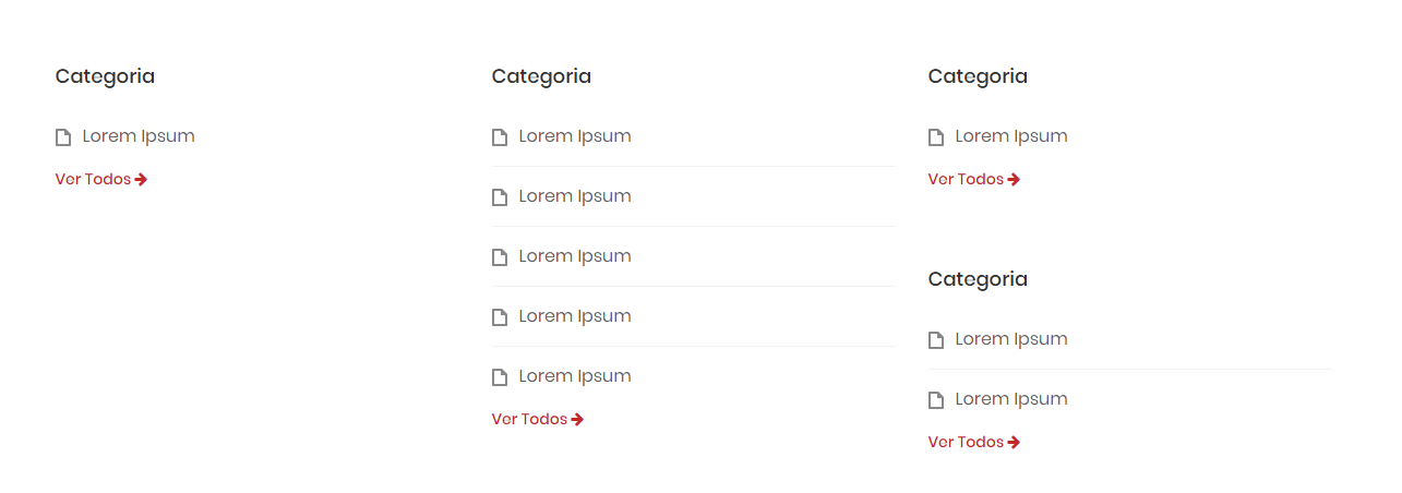
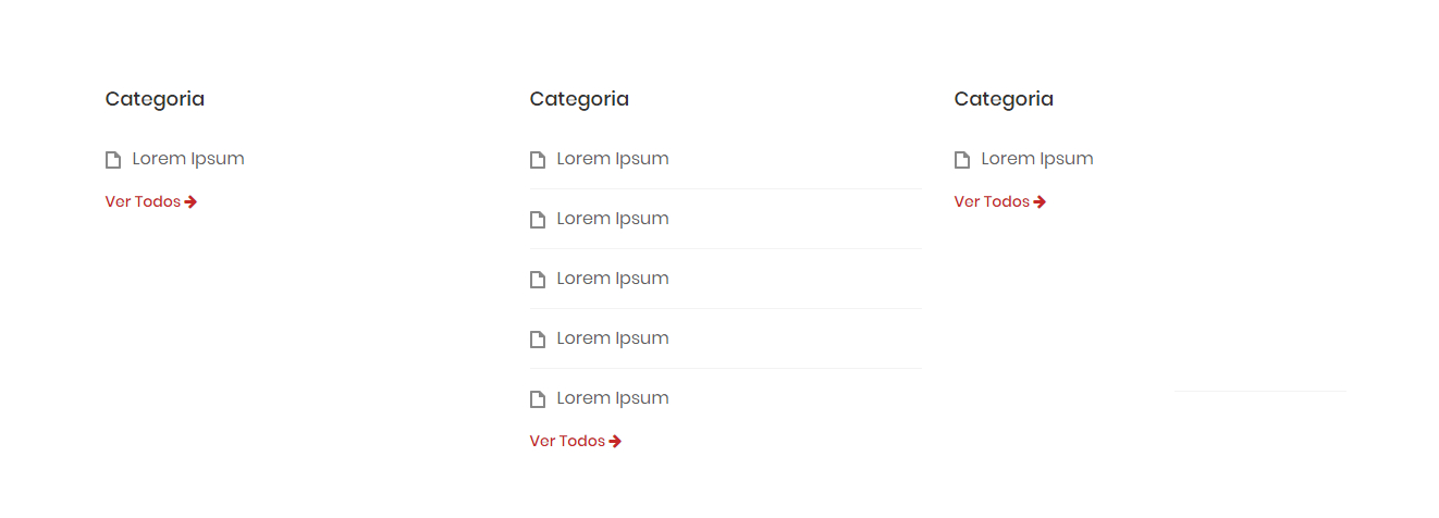
One list is occupying the "space" of the other and then I want to break into "Rows", basically like this:

inserir a descrição da imagem aqui

My code:

<div class="col-md-12 main-content">
<div class="row">
    <div class="col-md-4 col-sm-6 col-xs-12">
        <div class="box">
            <h3 class="box-title">Categoria</h3>
            <ul class="box-list">
                <li><a href="#">Lorem Ipsum</a></li>
            </ul>
            <a class="read-more" href="#">Ver Todos <i class="fa fa-arrow-right"></i></a>
        </div>
    </div>
    <div class="col-md-4 col-sm-6 col-xs-12">
        <div class="box">
            <h3 class="box-title">Categoria</h3>
            <ul class="box-list">
                <li><a href="#">Lorem Ipsum</a></li>
                <li><a href="#">Lorem Ipsum</a></li>
                <li><a href="#">Lorem Ipsum</a></li>
                <li><a href="#">Lorem Ipsum</a></li>
                <li><a href="#">Lorem Ipsum</a></li>
            </ul>
            <a class="read-more" href="#">Ver Todos <i class="fa fa-arrow-right"></i></a>
        </div>
    </div>
    <div class="col-md-4 col-sm-6 col-xs-12">
        <div class="box">
            <h3 class="box-title">Categoria</h3>
            <ul class="box-list">
                <li><a href="#">Lorem Ipsum</a></li>
                <li><a href="#">Lorem Ipsum</a></li>
            </ul>
            <a class="read-more" href="http://192.168.31.50/faq/view/teste-de-envio-para-web">Ver Todos <i class="fa fa-arrow-right"></i></a>
        </div>
    </div>
    <div class="col-md-4 col-sm-6 col-xs-12">
        <div class="box">
            <h3 class="box-title">Categoria</h3>
            <ul class="box-list">
                <li><a href="#">Lorem Ipsum</a></li>
            </ul>
            <a class="read-more" href="#">Ver Todos <i class="fa fa-arrow-right"></i></a>
        </div>
    </div>
</div>

How can I do that?

1 answer

2


You can treat the . Row that the lists are in with display:flex and flex-wrap so you avoid that the lists get "encavaladas" and play content that does not fit to the "line" below

To better understand how it looks see the snippet below (also display under "Whole page" to see the result)

.listas {
    display: flex;
    flex-wrap: wrap
}
<link rel="stylesheet" type="text/css" media="screen" href="https://maxcdn.bootstrapcdn.com/bootstrap/3.3.7/css/bootstrap.min.css" />
    
        <div class="col-md-12 main-content">
                <div class="row listas">
                    <div class="col-md-4 col-sm-6 col-xs-12">
                        <div class="box">
                            <h3 class="box-title">Categoria</h3>
                            <ul class="box-list">
                                <li><a href="#">Lorem Ipsum</a></li>
                            </ul>
                            <a class="read-more" href="#">Ver Todos <i class="fa fa-arrow-right"></i></a>
                        </div>
                    </div>
                    <div class="col-md-4 col-sm-6 col-xs-12">
                        <div class="box">
                            <h3 class="box-title">Categoria</h3>
                            <ul class="box-list">
                                <li><a href="#">Lorem Ipsum</a></li>
                                <li><a href="#">Lorem Ipsum</a></li>
                                <li><a href="#">Lorem Ipsum</a></li>
                                <li><a href="#">Lorem Ipsum</a></li>
                                <li><a href="#">Lorem Ipsum</a></li>
                            </ul>
                            <a class="read-more" href="#">Ver Todos <i class="fa fa-arrow-right"></i></a>
                        </div>
                    </div>
                    <div class="col-md-4 col-sm-6 col-xs-12">
                        <div class="box">
                            <h3 class="box-title">Categoria</h3>
                            <ul class="box-list">
                                <li><a href="#">Lorem Ipsum</a></li>
                                <li><a href="#">Lorem Ipsum</a></li>
                            </ul>
                            <a class="read-more" href="http://192.168.31.50/faq/view/teste-de-envio-para-web">Ver Todos <i class="fa fa-arrow-right"></i></a>
                        </div>
                    </div>
                    <div class="col-md-4 col-sm-6 col-xs-12">
                        <div class="box">
                            <h3 class="box-title">Categoria</h3>
                            <ul class="box-list">
                                <li><a href="#">Lorem Ipsum</a></li>
                            </ul>
                            <a class="read-more" href="#">Ver Todos <i class="fa fa-arrow-right"></i></a>
                        </div>
                    </div>
                </div>

  • It worked, I forgot about that possibility, thank you!

  • 1

    @Piupz Quiet young we are here for this! And if you want the 5 lists in the same row just take the flex-wrap: wrap

  • Thank you! Great solution. It can also be configured directly in the Row class in the styling file where it was implemented.

  • 1

    @Lucascoelho was worth young! You can do it this way yes, but there ALL . Row will look like this class, and can mess up your grid elsewhere, as this I preferred to create a class only with these properties, then you can use only on . Row you want! Remembering that here Boostrap is v3 does not have the flexbox classes of v4

Browser other questions tagged

You are not signed in. Login or sign up in order to post.