2
I need to make my burger menu that has an animation totally made by html and css is synchronized, IE, when I press on it both animations will happen... The code I’m using is this
HTML
<nav>
<input type="checkbox" id="check">
<label id="icone" for="check">
<label>
<div id="menu">
<input type="checkbox" id="check" value="value">
<label class="tent" for="check"></label>
<span></span>
</div>
</label>
</label>
<div class="barra">
<nav id="navMenu">
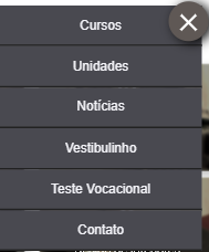
<a href="cursos480.html"><div class="link">Cursos</div></a>
<a href="unidades480.html"><div class="link">Unidades</div></a>
<a href="noticias480.html"><div class="link">Notícias</div></a>
<a href="vestib480.html"><div class="link">Vestibulinho</div></a>
<a href="test480.html"><div class="link">Teste Vocacional</div></a>
<a href="contat480.html"><div class="link">Contato</div></a>
</nav>
</div>
</nav>
CSS
    #check{
    display:none;
}
#icone{
    position: absolute;
    z-index: 3;
    margin-left: 64%;
    margin-top: 4%;
}
.barra{
    width: 100%;
    position:absolute;
    text-align:  center;
    z-index: 2;
    transition: all .2s linear;
}
#navMenu{
    width: 51%;
    margin-left: 42%;
    margin-top: 5%;
    position:absolute;
    visibility: hidden;
}
#navMenu a{
    text-decoration:none;
}
.link{
    background-color:#494950;
    padding: 6%;
    font-family:"arial";
    font-size:12pt;
    transition: .2s ease-in-out;
    color:#f4f4f9;
    border-bottom: 2px solid #222;
    opacity:0;
}
.link:hover{
    background-color:#050542;
}

#check:checked ~ .barra #navMenu a .link{
    opacity:1;
    margin-top: 0%;
    visibility: visible;
}
#menu{
    width: 48px;
    float: left;
    opacity: 0.6;
    height: 48px;
    position: relative;
}
#menu:hover{
    opacity: 1;
}
.tent{
    width: 100%;
    height: 100%;
    float: left;
    background-color: #5f5855;
    position: absolute;
    box-shadow: 5px 2px 23px;
    transition: all 0.1s linear;
    border-radius: 50%;
}
#check{
    position: absolute;
    /* z-index: 3; */
    display: none;
}
span{
    width: 54%;
    height: 7%;
    top: 47%;
    left: 24%;
    position: absolute;
    background-color: #fff;
    transition: all 0.1s linear;
}
span:before{
    content:'';
    top: 7px;
    position: absolute;
    background-color: #ffffff;
    transition: all 0.1s linear;
    width: 100%;
    height: 100%;
}
span:after{
    content:'';
    bottom: 7px;
    position: absolute;
    background-color: #ffffff;
    transition: all 0.1s linear;
    width: 100%;
    height: 100%;
}
#check:checked ~ span{
    background-color: transparent;
}
#check:checked ~ span:before{
    transform: translate(0px, -6px) rotate(-45deg);
}
#check:checked ~ span:after{
    transform: translate(0px, 8px) rotate(45deg);
}
#check:checked ~ .tent{
    border-radius: 50%;
}