I noticed that you use bootstrap 3 by class img-responsive, in bootstrap 3 still the grid system had some limitations, until I advise you to take a look at the new version is very good the part of grid and content alignment.
To do what you need in Bootstrap 3 you will need some custom CSS lines to complement.
You have several ways to make the way you want the first.
Let the session where text will be - image - text be flexible if it fits without .col.
The second is with the pre-defined sizes with .col for each item.
Check below the codes redone with Bootstrap v3 which I believe is the one you are using.
.fourth {
display: flex;
align-items: center;
}
.fourth div,
.fourth figure {
-ms-flex: 1 1 auto!important;
flex: 1 1 auto!important;
margin: 0 10px;
}
<!-- Bootstrap assets -->
<link rel="stylesheet" href="https://maxcdn.bootstrapcdn.com/bootstrap/3.3.7/css/bootstrap.min.css" integrity="sha384-BVYiiSIFeK1dGmJRAkycuHAHRg32OmUcww7on3RYdg4Va+PmSTsz/K68vbdEjh4u" crossorigin="anonymous">
<link rel="stylesheet" href="https://maxcdn.bootstrapcdn.com/bootstrap/3.3.7/css/bootstrap-theme.min.css" integrity="sha384-rHyoN1iRsVXV4nD0JutlnGaslCJuC7uwjduW9SVrLvRYooPp2bWYgmgJQIXwl/Sp" crossorigin="anonymous">
<div class="container fourth">
<div>
<h4>Título</h4>
<p>Lorem ipsum dolor sit amet, consectetur adipiscing elit. Curabitur a porta tellus. Donec lobortis, nibh non lacinia pellentesque, neque felis finibus justo, ac feugiat augue lectus ut orci. Duis ac volutpat ligula, sed cursus est.</p>
</div>
<figure>
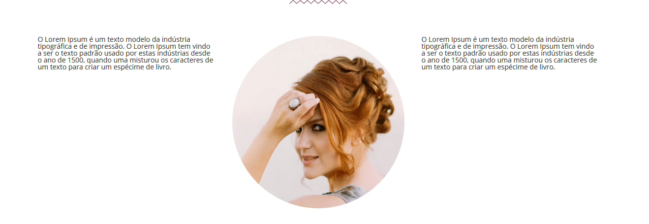
<img src="https://d2gg9evh47fn9z.cloudfront.net/800px_COLOURBOX23310792.jpg" class="img-responsive img-circle" >
</figure>
<div>
<h4>Título</h4>
<p>Lorem ipsum dolor sit amet, consectetur adipiscing elit. Curabitur a porta tellus. Donec lobortis, nibh non lacinia pellentesque, neque felis finibus justo, ac feugiat augue lectus ut orci. Duis ac volutpat ligula, sed cursus est.</p>
</div>
</div>
The second form is pre-defining the sizes of each area.
.fourth > .d-flex {
display: flex;
align-items: center;
}
.fourth div,
.fourth figure {
-ms-flex: 1 1 auto!important;
flex: 1 1 auto!important;
}
<!-- Bootstrap assets -->
<link rel="stylesheet" href="https://maxcdn.bootstrapcdn.com/bootstrap/3.3.7/css/bootstrap.min.css" integrity="sha384-BVYiiSIFeK1dGmJRAkycuHAHRg32OmUcww7on3RYdg4Va+PmSTsz/K68vbdEjh4u" crossorigin="anonymous">
<link rel="stylesheet" href="https://maxcdn.bootstrapcdn.com/bootstrap/3.3.7/css/bootstrap-theme.min.css" integrity="sha384-rHyoN1iRsVXV4nD0JutlnGaslCJuC7uwjduW9SVrLvRYooPp2bWYgmgJQIXwl/Sp" crossorigin="anonymous">

<div class="container fourth">
	<div class="row d-flex">
		<div class="col-xs-12 col-sm-12 col-md-4">
			<h4>Título</h4>
			<p>Lorem ipsum dolor sit amet, consectetur adipiscing elit. Curabitur a porta tellus. Donec lobortis, nibh non lacinia pellentesque, neque felis finibus justo, ac feugiat augue lectus ut orci. Duis ac volutpat ligula, sed cursus est.</p>
		</div>

		<figure class="col-xs-12 col-sm-12 col-md-4">
			<img src="https://d2gg9evh47fn9z.cloudfront.net/800px_COLOURBOX23310792.jpg" class="img-responsive img-circle" >
		</figure>

		<div class="col-xs-12 col-sm-12 col-md-4">
			<h4>Título</h4>
			<p>Lorem ipsum dolor sit amet, consectetur adipiscing elit. Curabitur a porta tellus. Donec lobortis, nibh non lacinia pellentesque, neque felis finibus justo, ac feugiat augue lectus ut orci. Duis ac volutpat ligula, sed cursus est.</p>
		</div>
	</div>
</div>
And one more detail, my point of view regardless of the way you choose for your project is to insert in @media that the attributes display: flex; are only displayed in resolutions above 992px, but why? Why in cell phone the attribute display: flex; will try to align them all next to each other by making everyone stay in a row which will be bad for smaller resolutions.
Then CSS would look like this.
@media(min-width: 992px) {
.fourth > .d-flex {
  display: flex;
  align-items: center;
}
.fourth div,
.fourth figure {
  -ms-flex: 1 1 auto!important;
  flex: 1 1 auto!important;
}
}
I hope I’ve been able to help you and help the community!
See if it works to add this in CSS: div.present1Sec4{ line-height: 350px; }
– Rodrigo Tognin
Guy which version of Bootstrap you are using 3 or 4?
– hugocsl
What is "vertical text with the middle of the image"? Is the text on top of the image? or the text on the image? or side by side but starting and ending in the same lines?
– res
Managed to solve?
– Sam
Yes, I managed to. Thank you very much for your help
– meteoros
Bootstrap version is 3
– meteoros
Be sure to choose the best answer you found by marking on it. Abs!
– Sam
I thought of something like sam how can I do that?........ I’ve found the right thank you sign.
– meteoros