-1
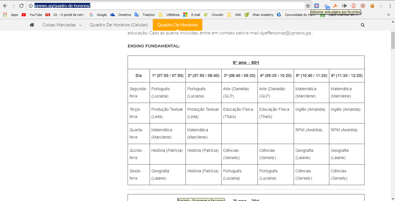
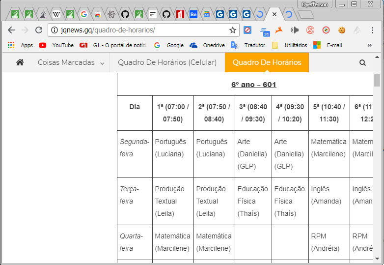
I am using Wordpress. On the computer, the following page: http://jqnews.gq/quadro-de-horarios/ , shows all tables in the correct way.
Already on mobile and devices with smaller screens, the tables are incomplete. By half, or something similar.
IMAGERY:
But this table is what html?
– LeAndrade
It is "cutting" simply because the table does not fit on the screen because it is too big. Also somewhere in your code should have an overflow:Hidden, which does not let scroll the page horizontally to see the whole table
– hugocsl
I have had problems in this sense and the solution is to put an overflow horizontal. There is no way to display a table of this size on a smaller screen. or create with div when the device is at a certain size
– Paulo Alexandre