You need to adjust the property grid-auto-flow for row dense, so every Grid element will try to fit into the "empty spaces"
Here you can read and see some practical examples of grid-auto-flow https://www.w3schools.com/cssref/pr_grid-auto-flow.asp
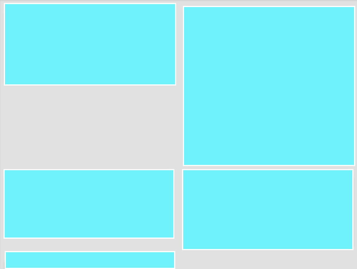
Follow an example. Note that n4 should stay after the n3, but it rises to the empty space that the n3 left, because the N3 starts in the second column and not in the first.
Example with the property grid-auto-flow: row dense; applied:
html, body {
width: 100%;
height: 100%;
margin: 0;
padding: 0;
}
.item3 { grid-column: 2 / 3; }
.grid-container {
display: grid;
 grid-template-columns: repeat(auto-fill, 50% );
 grid-auto-rows: minmax(120px, auto);
grid-auto-flow: row dense;
grid-gap: 10px;
background-color: #2196F3;
padding: 10px;
}
.grid-container>div {
background-color: rgba(255, 255, 255, 0.8);
text-align: center;
padding:20px 0;
font-size: 30px;
}
    <p>O valor "dense" no grid-auto-flow faz o efeito que vc precisa </p>
    <div class="grid-container">
      <div class="item1">1</div>
      <div class="item2">2</div>
      <div class="item3">3</div>
      <div class="item4">4</div>
    </div>
Example SEM the property applied:
html, body {
  width: 100%;
  height: 100%;
  margin: 0;
  padding: 0;
}
.item3 { grid-column: 2 / 3; }

.grid-container {
  display: grid;
  grid-template-columns: repeat(auto-fill, 50% );
 grid-auto-rows: minmax(120px, auto);
  /* grid-auto-flow: row dense; */
  grid-gap: 10px;
  background-color: #2196F3;
  padding: 10px;
}
.grid-container>div {
  background-color: rgba(255, 255, 255, 0.8);
  text-align: center;
  padding:20px 0;
  font-size: 30px;
}
    <p>SEM no grid-auto-flow</p>
    <div class="grid-container">
      <div class="item1">1</div>
      <div class="item2">2</div>
      <div class="item3">3</div>
      <div class="item4">4</div>
    </div>
More complex example with Dane made by Wes Bos
    .container {
      display: grid;
      grid-gap: 20px;
      grid-template-columns: repeat(10, 1fr);
      grid-auto-flow: dense;
    }
    .item:nth-child(6n) {
      background: cornflowerblue;
      grid-column: span 6;
    }
    .item:nth-child(8n) {
      background: tomato;
      grid-column: span 2;
    }
    .item:nth-child(9n) {
      grid-row: span 2;
    }
    .item18 {
      background: greenyellow !important;
      grid-column-end: -1 !important;
    }
    .item {
      background: silver;
    }
  <div class="container">
    <div class="item item1">1</div>
    <div class="item item2">2</div>
    <div class="item item3">3</div>
    <div class="item item4">4</div>
    <div class="item item5">5</div>
    <div class="item item6">6</div>
    <div class="item item7">7</div>
    <div class="item item8">8</div>
    <div class="item item9">9</div>
    <div class="item item10">10</div>
    <div class="item item11">11</div>
    <div class="item item12">12</div>
    <div class="item item13">13</div>
    <div class="item item14">14</div>
    <div class="item item15">15</div>
    <div class="item item16">16</div>
    <div class="item item17">17</div>
    <div class="item item18">18</div>
    <div class="item item19">19</div>
    <div class="item item20">20</div>
    <div class="item item21">21</div>
    <div class="item item22">22</div>
    <div class="item item23">23</div>
    <div class="item item24">24</div>
    <div class="item item25">25</div>
    <div class="item item26">26</div>
    <div class="item item27">27</div>
    <div class="item item28">28</div>
    <div class="item item29">29</div>
    <div class="item item30">30</div>
  </div>
More complex example, but without the Dane he uses grid-auto-flow:row;
.container {
  --gridgap:16px;
  --boxheight:100px;
  display:grid;
  grid-gap:var(--gridgap);
  grid-template-columns: repeat(auto-fill, minmax(150px, 1fr));
  grid-auto-rows: minmax(100px, auto);
  grid-auto-flow:row;
  max-width:600px;
}

.box {
  outline:1px solid black;
  padding:8px;
  height:var(--boxheight);
}

.box.tall2  {
  height:calc(var(--boxheight)*2 + 2*var(--gridgap));
  grid-row-end:span 2
}

.box.tall3  {
  height:calc(var(--boxheight)* + 4*var(--gridgap));
  grid-row-end:span 3
}

.box.tall4  {
  height:calc(var(--boxheight)*4 + 6*var(--gridgap));
  grid-row-end:span 4
}
<section class='container'>
  <section class='box'>Box 1</section>
  <section class='box'>Box 2</section>
  <section class='box tall2'>Box 3</section>
  <section class='box tall3'>Box 4</section>
  <section class='box tall4'>Box 5</section>
  <section class='box'>Box 6</section>
  <section class='box'>Box 7</section>
  <section class='box'>Box 8</section>
  <section class='box'>Box 9</section>
  <section class='box'>Box 10</section>
  <section class='box'>Box 11</section>
  <section class='box'>Box 12</section>
</section>
Source: https://codepen.io/fch/pen/vmqBpa
Cara edited the answer and put two practical examples, one with and the other without the grid-auto-flow I think it will get easier to visualize comu works, but qq thing tells me I help you.
– hugocsl
Perfect guy, thank you very much, I had seen this property but did not stop to study it in depth. Thank you very much for helping me to!
– Jean Carlos Da Campo
Cara Grid is very young and I’m also learning a little rss. I’m doing some tests here because I think when they have the height set wrong, it only works if the content inside the div is large. But if I see something I edit the answer and tell you
– hugocsl
Guy includes an example at the end of my answer that instead of Dan he uses
grid-auto-flow:row;in this model worked well, but the tb can be very useful! youtube has some material about it– hugocsl
I’m almost there. The problem is that I need you to keep the height relative to the content of the div. It seems to be relative to DIV next door, and ends up increasing all the line.
– Jean Carlos Da Campo
So I had noticed this, so I commented up there and put the other examples at the end of the answer. But edit your question, and put the html/css code of the grid that you have so far that I can give you strength. Try to replace
grid-auto-flow:row dense; pàragrid-auto-flow:Row;` and see the behavior it will display.– hugocsl
Dude, I ran some tests, and it looks like this is the default behavior of Grid Layout. When the content is greater than the height the other elements that are in Row accompany the height of the highest element. And the Lion is the most suitable to "fit" the pieces of the same grid... and if you decrease the height in the hand for example there the empty space comes back. The grid vc should interfere as little height and width as possible, vc should work at Row height and preference column width.
– hugocsl
But if you don’t need the display:grid, take a look here that you might be interested in https://answall.com/questions/316223/organizar-divs-em-blocos-uma-sobre-a-outra/316927#316927
– hugocsl
I was using CSS Columns, but he had a problem, and some people reported that CSS Grid was better. I used the example you posted to illustrate it correctly: https://codepen.io/jcdacampo/pen/qyjWzR. As we saw, the problem is at the height of box 2 and 3, which cannot follow the height of 1. I tried to change the grid-auto-flow attribute in every way, but it doesn’t work. Like you said, maybe this is really the default behavior of CSS Grid.
– Jean Carlos Da Campo
Complementing: when using CSS Columns with the property
column-count: 2The lower elements are like this: https://imgur.com/a/Tqcrw2V. They are even fluid, but seem to be "bugged" at the bottom. Note that the last square should be aligned on the right, because it is where has more space.– Jean Carlos Da Campo
Well, in the Grid the settings are more column/Line-oriented and you don’t use too many height variations between cells because they are tied by default. Already with column-Count it is difficult to control where the content will be broken, but with break-Inside to try to prevent a div is broken in two at least... I think only with CSS that’s as far as you can get from masonry unfortunately. If I see anything that will solve this perfectly I comment here for you
– hugocsl
Yeah, you’re right. Anyway, thank you so much for the help and time provided with the problem.
– Jean Carlos Da Campo
Good morning buddy, I’ll come back to say that I managed to solve the problem with CSS Columns. What was getting in the way was my Animate.css that set a height for the slideInUp animation and so bugged the Columns. It worked. Thank you very much!
– Jean Carlos Da Campo
Glad it worked out young! Success with the project, qq thing we are there!
– hugocsl