Problem with bootstrap responsiveness

Asked

Viewed 362 times

2

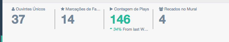
I’m having trouble aligning the responsiveness of my dashboard. Here’s an image of how it looks on large screens.

inserir a descrição da imagem aqui

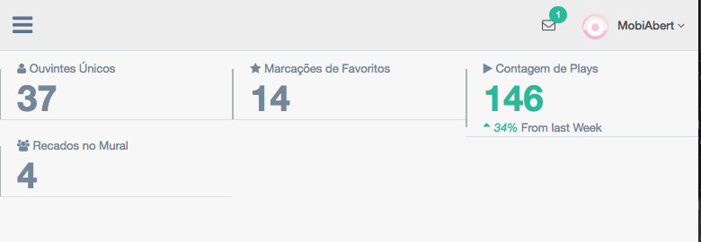
But if I lower the screen a little bit it shuffles like this:

inserir a descrição da imagem aqui

Below the code snippet HTML from the page where I quote this part. Am I doing something wrong? How can I fix this?

<div class="right_col" role="main">
        <!-- top tiles -->
        <div class="row tile_count">
          <div class="col-md-2 col-sm-4 col-xs-6 tile_stats_count">
            <span class="count_top">
              <i class="fa fa-user"></i> Ouvintes Únicos</span>
            <div class="count">37</div>
          </div>
          <div class="col-md-2 col-sm-4 col-xs-6 tile_stats_count">
            <span class="count_top">
              <i class="fa fa-star"></i> Marcações de Favoritos</span>
            <div class="count">14</div>
          </div>
          <div class="col-md-2 col-sm-4 col-xs-6 tile_stats_count">
            <span class="count_top">
              <i class="fa fa-play"></i> Contagem de Plays</span>
            <div class="count green">146</div>
            <span class="count_bottom">
              <i class="green">
                <i class="fa fa-sort-asc"></i>34% </i> From last Week</span>
          </div>
          <div class="col-md-2 col-sm-4 col-xs-6 tile_stats_count">
            <span class="count_top">
              <i class="fa fa-users"></i> Recados no Mural</span>
            <div class="count">4</div>
            <!-- <span class="count_bottom"><i class="red"><i class="fa fa-sort-desc"></i>12% </i> From last Week</span> -->
          </div>
        </div>
</div>
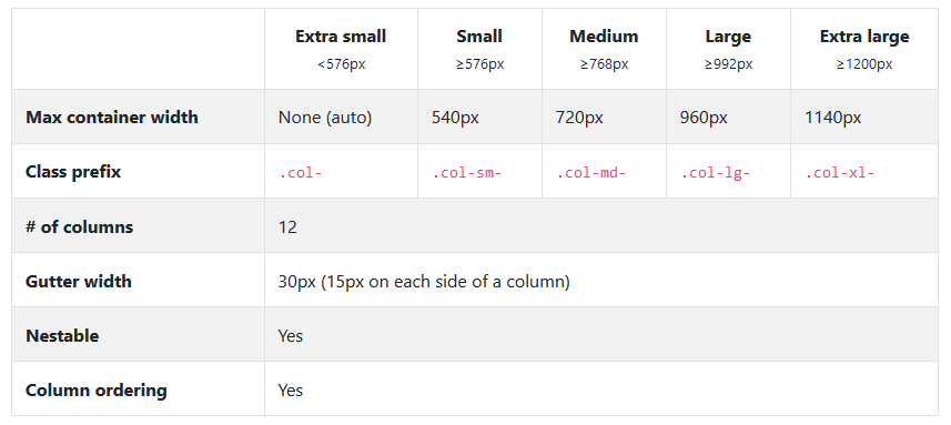
  • Modify the class "col-Sm-4" to col-Sm-6

  • Hunter if possible put the CSS you used to customize the bar, without it is impossible to simulate your error

  • 1

    If I remember correctly, Bootstrap works with 12 columns, but you defined 4 elements that occupy 4 columns each (this would give 16 columns).

2 answers

1


You need to understand the main idea of grids: inserir a descrição da imagem aqui

Let’s go with the acronyms:

-sm: Small(Small) - devices with a screen size greater than 576 pixels

-md: Medium(Medium) - devices with a screen size greater than 768 pixels

-lg: Large(Large) - devices with a screen size greater than 992 pixels

-xl: Extra large(Super Large) - devices with screen size greater than 1200 pixels

Whenever you insert a new column div, you use one of the size classes for example col-md-2 which says that the div will occupy 2 columns when the device is Medium(tablets or super small monitors), remember that the grid system can have up to 12 columns per row.

To solve your problem change the col-sm-4 for col-sm-6 so your div will occupy 6 columns on mobile devices or will have 2 Ivs per row if you want each div to be in a row just put col-sm-12 and so on.

  • His explanation opened my head about understanding the concept of Sm, Md and the like. But even changing remains the same thing. I may have set something wrong before it interferes with that stretch or not?

  • @hunterxhunter what is your goal? you want it to stay 4 in the same or 2 in each row?

0

The bootstrap has a grid of 12 columns, when reducing the resolution is applied to the class . col-em-4 which means it will occupy the space of 4 columns.

As you are using 4x will be equivalent 4x4 or be 16 columns so 4 more columns above the limit.

Try putting . col-Sm-3 3x4 = 12

Check the bootstrap Grid documentation

Browser other questions tagged

You are not signed in. Login or sign up in order to post.