You can use display:none / display:table along with a simple rule of @media screen and (max-width: 768px) { } to show and hide <tr> of the table depending on the width of the screen.
See the example below to better understand. Note that the last two <tr> gets diplay:none, they only appear when the screen is less than 768px, while I hide the first <tr> when the screen is smaller than 768pxe only show when it is larger than 768px.
EDIT
You need to put these classes inside the <head> of your document and within the tag <style> to work right. I don’t know how you’re doing there, but this CSS with classes has to be at the beginning of the document as in the example below. I left some comments in the code for you to understand what is each type of CSS use. OBS: all that is within the rule @media screen and (max-width: 768px) { seu css } should be the last part of your CSS, so scroll your . css to the end and put that part of the code there. Any doubt is just talk
Run the code to better understand and open with both the small screen and "Whole page" OBS: I left the edge just so you could see better.
<!DOCTYPE html>
<html lang="en">
<head>
<meta charset="utf-8" />
<meta http-equiv="X-UA-Compatible" content="IE=edge">
<title>Page Title</title>
<meta name="viewport" content="width=device-width, initial-scale=1">
<!-- link com css externo -->
<link rel="stylesheet" href="style.css">
<!--css interno contruido dento das tags style -->
<style>
.tr-min {
display:none;
}
@media screen and (max-width: 768px) {
.tr-max {
display:none;
}
.tr-min {
display:table;
}
}
</style>
</head>
<body>
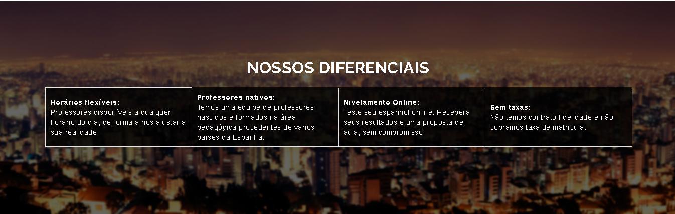
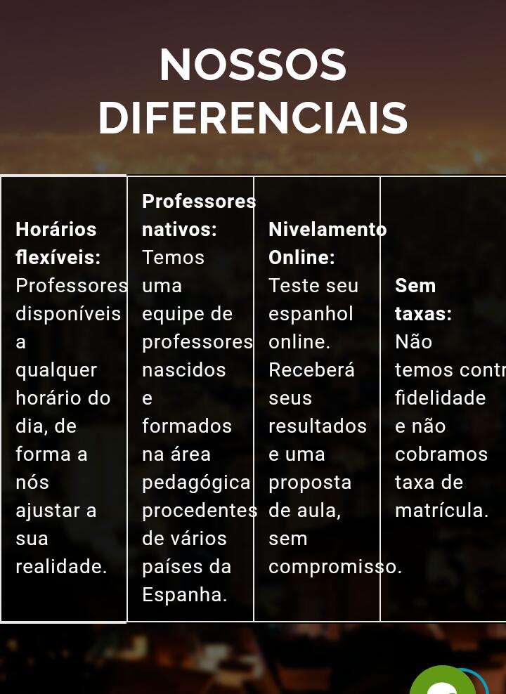
<h2 style="color: #ffffff; text-align: center;">NOSSOS DIFERENCIAIS</h2>
<!-- css "inline" escrito direto na tag html no atributo style="" -->
<div style="overflow-y: auto; width: auto;">
<table class="container" style="width: 810; background-color: rgba(0, 0, 0, 0.8);" border="1px" rules="0" cellspacing="0" cellpadding="0"
align="center">
<tbody>
<tr class="tr-max">
<td style="width: 180px; min-width: 70px;">
<strong>
<span style="color: #ffffff;"> Horários flexíveis: </span>
</strong>
<span style="color: #ffffff;"> Professores disponíveis a qualquer horário do dia, de forma a nós ajustar a sua realidade.</span>
</td>
<td style="width: 240px; min-width: 70px;">
<strong>
<span style="color: #ffffff;"> Professores nativos: </span>
</strong>
<span style="color: #ffffff;">Temos uma equipe de professores nascidos e formados na área pedagógica procedentes de vários países
da Espanha.</span>
</td>
<td style="width: 200px; min-width: 70px;">
<strong>
<span style="color: #ffffff;"> Nivelamento Online:</span>
</strong>
<span style="color: #ffffff;"> Teste seu espanhol online. Receberá seus resultados e uma proposta de aula, sem compromisso.</span>
</td>
<td style="width: 170px; min-width: 70px;">
<strong>
<span style="color: #ffffff;"> Sem taxas:</span>
</strong>
<span style="color: #ffffff;"> Não temos contrato fidelidade e não cobramos taxa de matrícula.</span>
</td>
</tr>
<tr class="tr-min">
<td style="width: 50%; min-width: 70px;">
<strong>
<span style="color: #ffffff;"> Horários flexíveis: </span>
</strong>
<span style="color: #ffffff;"> Professores disponíveis a qualquer horário do dia, de forma a nós ajustar a sua realidade.</span>
</td>
<td style="width: 50%; min-width: 70px;">
<strong>
<span style="color: #ffffff;"> Professores nativos: </span>
</strong>
<span style="color: #ffffff;">Temos uma equipe de professores nascidos e formados na área pedagógica procedentes de vários países
da Espanha.</span>
</td>
</tr>
<tr class="tr-min">
<td style="width: 50%; min-width: 70px;">
<strong>
<span style="color: #ffffff;"> Nivelamento Online:</span>
</strong>
<span style="color: #ffffff;"> Teste seu espanhol online. Receberá seus resultados e uma proposta de aula, sem compromisso.</span>
</td>
<td style="width: 50%; min-width: 70px;">
<strong>
<span style="color: #ffffff;"> Sem taxas:</span>
</strong>
<span style="color: #ffffff;"> Não temos contrato fidelidade e não cobramos taxa de matrícula.</span>
</td>
</tr>
</tbody>
</table>
</div>
</body>
</html>
You really need to use a table to build this element or can be done with Divs?
– hugocsl
Isabela I put one EDIT in my answer, take a look there and I’ll explain how you have to use CSS to work right. If you do this and still not working then I will ask you to edit your question and put your full code HTML and CSS, because there is no reason not to be working, I tested here and in other browsers and everything is 100%....
– hugocsl
Isabela Good that my answer helped you, if your question has already been answered consider marking an answer as accepted, in this icon next to the answer you used, so the question is not pending on the site as "Question without Answer Accepted". Good luck with the project qq another question is just post that always has someone to help.
– hugocsl