Scrollspy is not working

Asked

Viewed 407 times

1

Good morning, I am developing a site, and at first everything is working, but Scrollspy (Bootstrap 3.3) is not working, I followed several internet tutorials on how to apply it in a Website but I did not succeed even following them correctly. Here’s an excerpt from my code.

html, body { 
	font-family: 'Montserrat', sans-serif;
	width:100%;
	height:100%;
	padding:0px;
	margin:0px;
	text-shadow:none;
	background:#FFF !important;
	position: relative;
}

.links-navbar{
	text-align: center;
	margin: 10px;
}
.links-navbar a {
	padding: 25px 36px;
    font-size: 18px;
    font-weight: 600;
    color: #FFFFFF;
    text-transform: uppercase;
}
.navbar .links-navbar a:hover,
.navbar .links-navbar>.active>a,
.navbar .links-navbar a:focus {
	text-decoration: none;
	z-index: 20;
	color: var(--hoverLink);
	background-color: var(--hoverFundo);
}
<header>
  <nav id="navbar" class="navbar hidden-xs hidden-sm" style="background-color: transparent;">
    <div class="container">
      <div id="logos" class="col-md-12">
        <div class="col-md-2" style="margin-top:35px;">
          <a href="https://dalposso.com.br" target="_blank">
            <img src="images/dalposso-logo.png" class="img-responsive">
          </a>
        </div>
        <div class="col-md-2"></div>
        <div class="col-md-4" style="margin-top:35px;">
          <a href="index.php">
            <img src="images/murano-logo.png" style="width: 100%;">
          </a>
        </div>
        <div class="col-md-4 text-center" style="padding-top: 90px;">
          <a href="https://dalposso.com.br" class="link-dalposso">
            Voltar para o site
          </a>
        </div>
      </div>
    </div>
    <div id="navegacao" class="col-md-12" style="margin-top:50px; padding: 0; z-index: 20;">
        <div class="links-navbar nav">
          <a href="#emprendimento">o emprendimento</a>
          <a href="#areas">áreas comuns</a>
          <a href="#garagens">garagens</a>
          <a href="#apartamentos">apartamentos</a>
          <a href="#localizacao">localizacao</a>
          <a href="#contato">contato</a>
        </div>
    </div>
  </nav>
</header>

1 answer

1


Face for Scrollspy works you need to follow the rules established by the official documentation that you can consult here! https://getbootstrap.com/docs/3.3/javascript/#scrollspy

Point 1: I don’t know if you’re using position:relative in the <body>, but this is necessary for Scrollspy to work!

Point 2:

Requires Bootstrap Nav Scrollspy Core requires the use of a Bootstrap Nav Component for Proper Highlighting of active links.

In short: "You need to use the component Bootstrap Nav to enable link markup" ie you have to use the official Bootstrap Navbar and the one you put in the question is totally different from the original Navbar of the BS3 as you can see here: https://getbootstrap.com/docs/3.3/components/#Nav

inserir a descrição da imagem aqui

Here I leave a simple example working from Scrollspy for you to use as a reference, note the position:relative in Body, the link between the href from the menu and us id of sections and mainly in the construction of Navbar

<!DOCTYPE html>
<html>

<head>
    <title>Bootstrap Example</title>
    <meta charset="utf-8">
    <meta name="viewport" content="width=device-width, initial-scale=1">
    <link rel="stylesheet" href="https://maxcdn.bootstrapcdn.com/bootstrap/3.3.7/css/bootstrap.min.css">
    <script src="https://ajax.googleapis.com/ajax/libs/jquery/3.3.1/jquery.min.js"></script>
    <script src="https://maxcdn.bootstrapcdn.com/bootstrap/3.3.7/js/bootstrap.min.js"></script>
    <style>
        body {
            position: relative;
        }

        #section1, 
        #section2, 
        #section3  {
            padding-top: 50px;
            height: 500px;
            color: #fff;
            background-color: #1E88E5;
        }
        #section2 {
            background-color: #673ab7;
        }
        #section3 {
            background-color: #ff9800;
        }
        .navbar-inverse .navbar-nav>.active>a, 
        .navbar-inverse .navbar-nav>.active>a:focus, 
        .navbar-inverse .navbar-nav>.active>a:hover {
            color: #fff;
            background-color: red;
        }
    </style>
</head>

<body data-spy="scroll" data-target=".navbar" data-offset="50">

    <nav class="navbar navbar-inverse navbar-fixed-top">
        <div class="container-fluid">
            <div class="navbar-header">
                <button type="button" class="navbar-toggle" data-toggle="collapse" data-target="#myNavbar">
                    <span class="icon-bar"></span>
                    <span class="icon-bar"></span>
                    <span class="icon-bar"></span>
                </button>
                <a class="navbar-brand" href="#">WebSiteName</a>
            </div>
            <div>
                <div class="collapse navbar-collapse" id="myNavbar">
                    <ul class="nav navbar-nav">
                        <li>
                            <a href="#section1">Section 1</a>
                        </li>
                        <li>
                            <a href="#section2">Section 2</a>
                        </li>
                        <li>
                            <a href="#section3">Section 3</a>
                        </li>
                    </ul>
                </div>
            </div>
        </div>
    </nav>

    <div id="section1" class="container-fluid">
        <h1>Section 1</h1>
        <p>Try to scroll this section and look at the navigation bar while scrolling! Try to scroll this section and look at
            the navigation bar while scrolling!</p>
        <p>Try to scroll this section and look at the navigation bar while scrolling! Try to scroll this section and look at
            the navigation bar while scrolling!</p>
    </div>
    <div id="section2" class="container-fluid">
        <h1>Section 2</h1>
        <p>Try to scroll this section and look at the navigation bar while scrolling! Try to scroll this section and look at
            the navigation bar while scrolling!</p>
        <p>Try to scroll this section and look at the navigation bar while scrolling! Try to scroll this section and look at
            the navigation bar while scrolling!</p>
    </div>
    <div id="section3" class="container-fluid">
        <h1>Section 3</h1>
        <p>Try to scroll this section and look at the navigation bar while scrolling! Try to scroll this section and look at
            the navigation bar while scrolling!</p>
        <p>Try to scroll this section and look at the navigation bar while scrolling! Try to scroll this section and look at
            the navigation bar while scrolling!</p>
    </div>

</body>

</html>

OBS: I left in CSS the styles you need to customize for when the Navbar item is .active

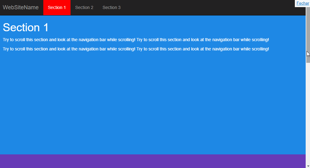
  • He is in position relative no body, I followed all the instructions you mentioned as the bootstrap Nav but I was unsuccessful. Was something missing? Just like I tried to trade that div of . links-navbar for a <ul>, with each link being a <li>.

  • @aleque_b face re-edits your question and puts the full code of your page, the same way I did in my answer, puts everything you have between the HTML tags and your CSS as well. 'Cause if you look at the example you’ll see that it works, then it’s probably something you did, or failed to do in the structure that’s bugging Spy

  • Yes I edited and HTML is as posted now, I did not post the whole code because it is merging HTML, CSS and PHP. But so, all anchors are configured, just like Divs with Id. There’s nothing wrong with it. But still not working.

  • @aleque_b Face your Navbar still remains completely different from the standard Bootstrap model.... Look at my response as is mine <nav></nav> You’re building your Navbar inside that div <div class="links-navbar nav"> This is totally different from what the documentation says.... Guy picks up the model I posted and "rebuilt" your page inside it, I think it’s an option for you since it’s not rolling with your code.

  • I redid the heading of 0 and it seems that now it worked. Sorry for the delay in answering, I had to reform all the CSS to be stylized as it was in the previous header. Thank you very much!

  • 1

    @aleque_b quiet young these components are boring to even fiddle, have to follow the documentation to work right, any different order in html tags, or a css class unless the component already stops working, but I’m glad it worked out, Good luck there with the project and... "read documentation" rss. [] s

Show 1 more comment

Browser other questions tagged

You are not signed in. Login or sign up in order to post.