Edit with more modern form (more limited browser support)
There is a more modern way to make this image blend with the background color and the technique is using CSS Masks
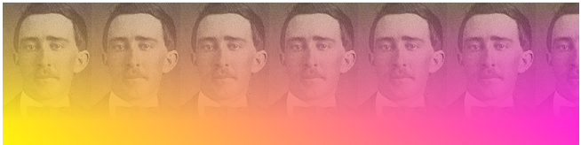
With the property -webkit-mask-image You’ll put a mask on the picture. The idea is that the gradient over the image is actually making a mask of opacity over the image, so where the black pixel is, it’s transparent. See the code below to better understand how the above effect was done.
html, body {
	width: 100%;
	height: 100%;
	margin: 0;
	padding: 0;
}
body {
	background-image: linear-gradient(45deg, #ff0 0%, #f0f 100%);
}
.imgx {
	width: 100%;
	height: 180px;
	-webkit-mask-image: linear-gradient(to top, transparent 25%, black 100%);
	background-image: url(https://placecage.com/100/180);
}
<div class="imgx"></div>
"Older" version with more comprehensive support
Yes it works see the example, note that in background-image I used a linear-gradiente and an image with the Pattern
html, body {
    height: 100%;
    width: 100px;
    margin: 0;
    padding: 0;
}
body {
    background-image: linear-gradient(to bottom, transparent 0%, #fff 50%), url(https://static.vecteezy.com/system/resources/thumbnails/000/103/376/small/crosshatch-style-background-pattern.jpg);
}

You have to post the code you already developed to pass some references to the answers.
– LeAndrade
There is not much to post. In the image I am using a background-image. I want something like - background-image: linear-gradient(url("IMAGE_URL") 50%, #d13531 50%); But this does not work
– Gabriel Marinho