Centralize div de class="Row" with bootstrap

Asked

Viewed 3,985 times

2

Does anyone have any idea how to center these buttons that are inside a div with class="row", how is centered the above container saying "Permissions", with Bootstrap and so that they are responsive?

Imagem com row a centrar

This is the code:

<div class="row container-fluid text-center">
  <div class="btn-group">
    <button onclick="mostrar_form_alunos()" class="btn btn-info btnSpace" type="button">Permissões de alunos </button>
    <button onclick="mostrar_form_professores()" class="btn btn-info btnSpace" type="button">Permissões de professores </button>
    <button onclick="mostrar_form_funcionarios()" class="btn btn-info btnSpace" type="button">Permissões de funcionários </button>
    <button onclick="mostrar_form_curso()" class="btn btn-info btnSpace" type="button">Permissões de curso </button>
    <button onclick="mostrar_form_geral_de_professores()" class="btn btn-info btnSpace" type="button">Permissões geral de professores </button>
    <button onclick="mostrar_form_geral_de_funcionarios()" class="btn btn-info btnSpace" type="button">Permissões geral de funcionarios </button>
  </div>
</div>

[UPDATE]

I’ve already been able to align now the text comes out of the buttons and I can’t put all the text inside. It looks like this:

inserir a descrição da imagem aqui

  • Which version of Bootstrap?

  • 1

    Dude why repeat "Permissions on all bikes? If you are already in Session Permissions you can group all these btns inside a box for example and remove the word "Permission" from all btns. I know it doesn’t solve the problem, but it’s a tip

  • The text exits the buttons because the buttons have a defined width that is less than the width needed for the text to fit. You can create a custom class in CSS to force text break: *.btn-wrap-text {&#xA; white-space: normal !important;&#xA; word-wrap: break-word !important;&#xA;}

  • Cara notices that I edited my answer and put the solution to the BS3, Note there that I changed from 'container-Fluid' to just 'container' for you to see how responsive it was etc...

3 answers

3

Bootstrap 3

In BS3 as the flex is not native you can build the styles in hand. See how it looks in the example below.

.permissoes {
    display: flex;
    justify-content: center;
    flex-wrap: wrap;
}
.permissoes button {
    flex: 1;
    margin: 6px;
}
<link rel="stylesheet" type="text/css" media="screen" href="https://maxcdn.bootstrapcdn.com/bootstrap/3.3.7/css/bootstrap.min.css" />

<div class="container">
    <div class="row">
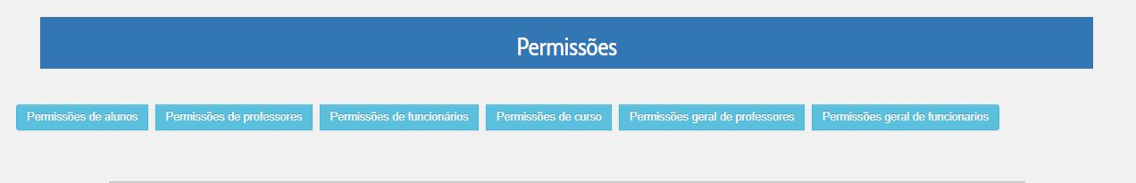
        <div class="permissoes col-xs-12 ">
            <button onclick="mostrar_form_alunos()" class="btn btn-info btnSpace m-1 " type="button">Permissões de alunos </button>
            <button onclick="mostrar_form_professores()" class="btn btn-info btnSpace m-1" type="button">Permissões de professores </button>
            <button onclick="mostrar_form_funcionarios()" class="btn btn-info btnSpace m-1" type="button">Permissões de funcionários </button>
            <button onclick="mostrar_form_curso()" class="btn btn-info btnSpace m-1" type="button">Permissões de curso </button>
            <button onclick="mostrar_form_geral_de_professores()" class="btn btn-info btnSpace m-1" type="button">Permissões geral de professores </button>
            <button onclick="mostrar_form_geral_de_funcionarios()" class="btn btn-info btnSpace m-1" type="button">Permissões geral de funcionarios </button>
        </div>
    </div>
</div>


Bootstrap 4

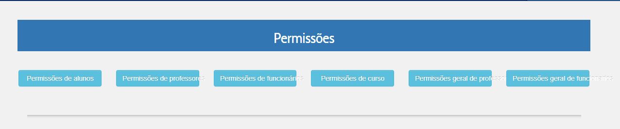
You do not necessarily need to put the buttons inside the Grid, the fact of placing them inside the Grid is what is making your text pop the btn box, because who determines the width of your btn is the width of the Grid column.

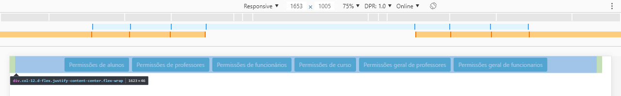
Since Bootstrap 4 has native flex you can only use some original BS4 classes to adjust these buttons etc. In the parent div I put the classes: d-flex justify-content-center flex-wrap and in btns to do the margins I used the class m-1

Note that there is no CSS in the code below only the native BS4 classes I mentioned above. Note also that as the screen decreases the buttons will "fall" to the bottom line, but when the screen is wide enough everyone will be on the same line!

OBS: You can use a class for example .permissoes button { flex: 1; } to make btn that break down to bottom line occupy 100% of the screen width.

.permissoes button {
    flex: 1;
}
<link rel="stylesheet" type="text/css" media="screen" href="https://maxcdn.bootstrapcdn.com/bootstrap/4.0.0/css/bootstrap.min.css" />
    
<div class="container-fluid">
    <div class="row">
        <div class="permissoes col-12 d-flex justify-content-center flex-wrap">
            <button onclick="mostrar_form_alunos()" class="btn btn-info btnSpace m-1 " type="button">Permissões de alunos </button>
            <button onclick="mostrar_form_professores()" class="btn btn-info btnSpace m-1" type="button">Permissões de professores </button>
            <button onclick="mostrar_form_funcionarios()" class="btn btn-info btnSpace m-1" type="button">Permissões de funcionários </button>
            <button onclick="mostrar_form_curso()" class="btn btn-info btnSpace m-1" type="button">Permissões de curso </button>
            <button onclick="mostrar_form_geral_de_professores()" class="btn btn-info btnSpace m-1" type="button">Permissões geral de professores </button>
            <button onclick="mostrar_form_geral_de_funcionarios()" class="btn btn-info btnSpace m-1" type="button">Permissões geral de funcionarios </button>
        </div>
    </div>
</div>


See that the screen has to be wide enough to fit all btns in the same line

inserir a descrição da imagem aqui

  • 1

    I had never seen to be applied the flex of BS4, quite interesting! You can make it below a certain size (for example col-md) they have a fixed width? That way when they did "line break" they were aligned.

  • 2

    @Tiagoleite yes I edited my answer, notice that now I put a css line to setar flex-1 in btns, see in OBS that I have put in response now.

  • @hugocsl Can do the same with BS3?

  • 1

    Yes, the HTML structure will not change almost anything. It will continue . container > . Row > . col-Xs-12 and in <div class="permissoes col-xs-12> you define the class .permissoes {display:flex; flex:wrap; justify-content:center } any doubt speaks there. I believe it will work! Remember also to put a margin to separate the btnt and they do not stick together.

  • @hugocslcom col-Xs-12? Or col-12?

  • 2

    @py_9 in Bootstrap 3 does not exist col-12, the correct would be col-Xs-12, it means that the column will always have the maximum width, you can consult the documentation here https://getbootstrap.com/docs/3.css/#grid. Face always be careful not to mix the classes of a vesion in the other. BS3 does not have flex by default as BS4 has for example...

  • @hugocsl was fine, it was not Responsive, if you zoom only the buttons in the center, that is, the line of the buttons does not shrink when I zoom. And the first button gets bigger than the others.

Show 3 more comments

3


Using the grid and properties of Bootstrap components correctly the behavior you want would be achieved as follows:

<!doctype html>
<html lang="pt">

<head>
    <title>Exemplo</title>
    <!-- Required meta tags -->
    <meta charset="utf-8">
    <meta name="viewport" content="width=device-width, initial-scale=1, shrink-to-fit=no">

    <!-- Bootstrap CSS -->
    <link rel="stylesheet" href="https://stackpath.bootstrapcdn.com/bootstrap/4.1.0/css/bootstrap.min.css" integrity="sha384-9gVQ4dYFwwWSjIDZnLEWnxCjeSWFphJiwGPXr1jddIhOegiu1FwO5qRGvFXOdJZ4"
        crossorigin="anonymous">

</head>

<body>
    <div class="container-fluid">

        <div class="row text-center">
            <div class="col">
                <div class="alert alert-primary" role="header">
                    <h4 class="alert-heading">Permissões</h4>
                </div>
            </div>
        </div>

        <div class="row text-center">
            <div class="col-2">
                <button class="btn btn-block btn-info btnSpace" type="button">Botão</button>
            </div>
            <div class="col-2">
                <button class="btn btn-block btn-info btnSpace" type="button">Botão</button>
            </div>
            <div class="col-2">
                <button class="btn btn-block btn-info btnSpace" type="button">Botão</button>
            </div>
            <div class="col-2">
                <button class="btn btn-block btn-info btnSpace" type="button">Botão</button>
            </div>
            <div class="col-2">
                <button class="btn btn-block btn-info btnSpace" type="button">Botão</button>
            </div>
            <div class="col-2">
                <button class="btn btn-block btn-info btnSpace" type="button">Botão</button>
            </div>
        </div>

    </div>
</body>

</html>


Either way I think there are some concepts of Bootstrap that you must understand to be able to work better and well with the framework:

  • A .container contains .row, that is to say, the elements .row must be inside the .container, should not use both classes for the same div;
  • One div .row may be composed of div .col a total of 12 units wide;
  • As .col may contain components;
  • The .button-group are for when we want the buttons together, almost as "glued".

I’d recommend taking a look at summary of layout and how the grille works. You can also read about the behavior of buttons.

  • I’ve tried it, it’s just the buttons are underneath each other and the same length as the top container. I wanted to put them as in the image I put up, only aligned with the top container, the buttons would be that size and next to each other as they are, but centered just like the container above them.

  • 1

    The buttons are only underneath each other if there is no space to stand next to each other, is an expected behavior of the Bootstrap flex grid. As for the width of the permissions header, some .row must be wrong. I updated the example with the implementation of the permissions header using a .alert. See if it helps.

1

Place each button on a col-2/col-Sm-2/col-Md-2/col-lg-2/col-Xl-2, and dps apply a "width: 100%;" to its css

  • 2

    Use width:100% is not good practice when it is possible to achieve the desired effect with native Boostrap classes. Try applying the .btn-block.

  • btn-block on each button ? or one of the Divs? @Tiagoleite

  • 1

    In the <button> as explained in the official documentation https://getbootstrap.com/docs/4.0/components/buttons/#Sizes . Note that this makes the buttons occupy the whole of the div in which they are, so you must do the same Divs as indicated by @Ultradev

  • Okay, what about the other Ivs I leave? btn-group and div Row? @Tiagoleite

  • 1

    @py_9 See the response/motion for a resolution I just posted. If you have any questions about this approach please leave a comment there.

Browser other questions tagged

You are not signed in. Login or sign up in order to post.