Animations with css

Asked

Viewed 42 times

1

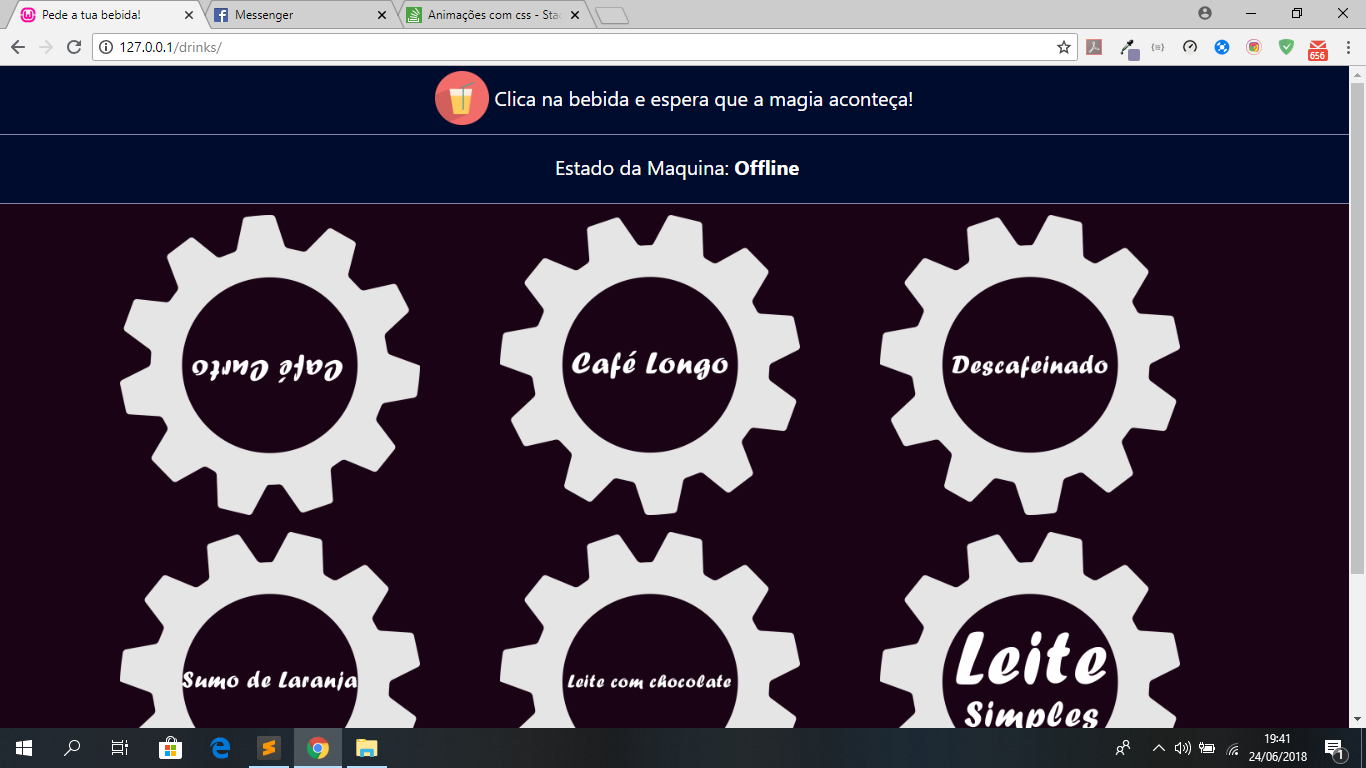
Hello, I have a question regarding animations with css, I have a page made in HTML for an Internet of Things system, that when the user clicks on the drink the system sends a request to a server that in turn sends to an Arduino, but beyond that I create a system that puts the icon of the drink to spin while the Aryan "made the drink", but I don’t know how to do?

PS: I on each icon have an id that with jquery when clicked I can put and remove classes!

PS: The first image this turn because it was of some tests that I was doing, but without success!

Pagina da Maquina

1 answer

2


Create a class with animation linked to @keyframes which will rotate the element 360 degrees. When clicked, add the class to the element to activate the effect:

var wraps = document.querySelectorAll(".wrapper");
for(var x=0; x<wraps.length; x++){
   wraps[x].onclick = function(){
      this.classList.add("ativo");
   }
}
.wrapper{
   width: 50px;
   height: 50px;
   background-image: url(https://image.freepik.com/free-icon/gear_318-56262.jpg);
   background-size: cover;
   float: left;
}

.wrapper img{
   width: 100%;
   height: 100%;
}

.wrapper.ativo{
  animation: spin 1s infinite linear; /*velocidade de 1 segundo. Quanto maior, mais lento*/
}

@keyframes spin {
  0% {
    transform: rotate(0deg);
  }
  100% {
    transform: rotate(360deg);
  }
}
Clique nas imagens:
<br>
<div class="wrapper"></div>

Browser other questions tagged

You are not signed in. Login or sign up in order to post.