Scroll overlaying the navigation header (navbar) in HTML/CSS

Asked

Viewed 1,106 times

0

I’m doing some tests and I wanted to take the scroll off the navbar, but leave in the rest of the main content of the page or below the navbar, but I’m not getting. Something like what happens on this page:

https://getmdl.io/templates/portfolio/index.html
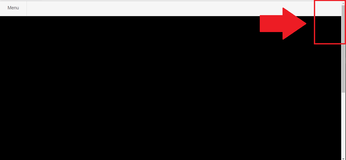
This is my page:

Minha página

I want to leave it like this:

Quero deixar assim

My code is:

    <html>

    <head>
    <meta charset="UTF-8">
    <meta name="viewport" content="width=device-width,initial-scale=1,maximum-scale = 1.0">
    <style>
    html {
        height:100%;
    }
    body {
        height: auto;
        font-size:14px;
        background: black;
        -webkit-background-size: cover;
        -moz-background-size: cover;
        -o-background-size: cover;
        background-size: cover; 
        font-family: 'Roboto', sans-serif;  
    }

    html.cursor {
        cursor: pointer;
    }

    nav {
        font-family: 'Roboto', sans-serif;
        width: 100%;
        height: 59px;
        border-bottom:1px solid #ddd;
        position: fixed;
        top:0;
        left:0;
        z-index:20;
        background-color:#F6F6F6;
    }

    nav ul,
    #sideNav ul,
    #sideNav ul ul  {
        margin:0;
        padding:0;
        list-style:none;
    }

    nav li {
        margin:0;
        float:left;
        border-right:1px solid #ddd;
        font-size:18px;
    }

    nav a,
    #sideNav a {
        color:#5b6064;
        text-decoration:none;
        display:block;
        padding:10px 30px;
        height:59px;
        -webkit-box-sizing: border-box;
        -moz-box-sizing: border-box;
        -o-box-sizing: border-box;
        line-height:35px;
    }
    </style>    
    </head>

   <body>
   <nav>
    <ul>
        <li><a href="#" class="icon icon-menu" id="btn-menu">Menu</a></li>
    </ul>
    </nav>

    <div id="sideNav">
    <ul>
    </ul>   
    </div>  

    <div class="container"> 
    <br><br><br><br><br><br><br><br><br><br><br><br><br><br><br><br><br><br><br><br><br><br><br><br><br><br><br><br><br><br><br><br><br><br><br><br><br><br><br><br><br><br><br><br><br><br><br><br><br><br><br><br><br><br><br><br><br><br><br><br><br><br><br><br><br><br><br><br>
    </div>
    </body>
    </html>

2 answers

1


I did it this way:

.container{
    overflow-y: auto;
    height: calc(100% - 60px);
    margin-top: 60px;
    box-sizing: border-box;
}

overflow-y: auto; putting the scroll on the y-axis of div container

height: Calc(100% - 60px); with that to div will pick up the entire page area and take the difference from the 60px menu.

margin-top: 60px; as the div this taking the whole area of the page, this will count with the menu as well.

I made a small modification to the body also, the body has a default margin, then I removed it, so as not to have borders on the part of container:

body {
    margin: 0;
}

Follow the full code:

<html>

    <head>
        <meta charset="UTF-8">
        <meta name="viewport" content="width=device-width,initial-scale=1,maximum-scale = 1.0">
        <style>
            html {
                height:100%;
            }
            body {
                height: auto;
                font-size:14px;
                background: black;
                -webkit-background-size: cover;
                -moz-background-size: cover;
                -o-background-size: cover;
                background-size: cover; 
                font-family: 'Roboto', sans-serif;  
                margin: 0;
            }

            html.cursor {
                cursor: pointer;
            }

            nav {
                font-family: 'Roboto', sans-serif;
                width: 100%;
                height: 59px;
                border-bottom:1px solid #ddd;
                position: fixed;
                top:0;
                left:0;
                z-index:20;
                background-color:#F6F6F6;
            }

            nav ul,
            #sideNav ul,
            #sideNav ul ul  {
                margin:0;
                padding:0;
                list-style:none;
            }

            nav li {
                margin:0;
                float:left;
                border-right:1px solid #ddd;
                font-size:18px;
            }

            nav a,
            #sideNav a {
                color:#5b6064;
                text-decoration:none;
                display:block;
                padding:10px 30px;
                height:59px;
                -webkit-box-sizing: border-box;
                -moz-box-sizing: border-box;
                -o-box-sizing: border-box;
                line-height:35px;
            }
            .container{
                overflow-y: auto;
                height: calc(100% - 60px);
                margin-top: 60px;
            }
        </style>    
    </head>

    <body>
        <nav>
            <ul>
                <li><a href="#" class="icon icon-menu" id="btn-menu">Menu</a></li>
            </ul>
        </nav>

        <div id="sideNav">
            <ul>
            </ul>   
        </div>  

        <div class="container"> 
            <br><br><br><br><br><br><br><br><br><br><br><br><br><br><br><br><br><br><br><br><br><br><br><br><br><br><br><br><br><br><br><br><br><br><br><br><br><br><br><br><br><br><br><br><br><br><br><br><br><br><br><br><br><br><br><br><br><br><br><br><br><br><br><br><br><br><br><br>
        </div>
    </body>
</html>
  • That’s right. Thanks for the tips.

  • Wictor only one thing, in his solution did not appear the arrow from the top of the scroll bar, only the arrow from the bottom, it seems that is going beyond where the header starts, in the back. Can you tell me how to fix it?

  • 1

    I was able to solve it here, based on your solution. It stayed like this: . container{ overflow-y: auto; box-Sizing: border-box; margin-top: 60px; height: Calc(100% - 60px);}. Thank you!!!

  • I will edit the question according to your comment.

-1

If you take footer and the other parts of the site from inside the main div, your site will be normal. As you are encompassing your entire site within the main div, so the y axis is being created within it, not in the body. Anyway, every time you build a site, do not cover everything in a single main div, divide the site into Section. And never specify the height with fixed values for the div that will encompass and yes for the elements that go inside it, because if you specify a size, when the height of the elements is may, it will create auto the y axis, which would be the scroll bar.

Browser other questions tagged

You are not signed in. Login or sign up in order to post.