2
I’m trying to create a responsive layout. Some elements he’s applying css as quoted in media queries, some others are picking up web css. How can I fix it to get the corresponding css of what I want? Because this occurs?
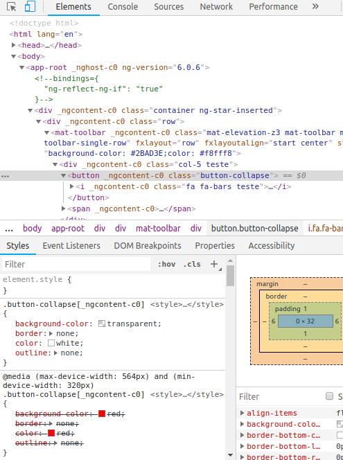
Following example:
.scss:
@media (min-device-width: 320px)
and (max-device-width: 564px){
.button-collapse{
    background-color: red;
    border: none;
    color: red;
    outline: none;
  }
}

.button-collapse{
  background-color: transparent;
  border: none;
  color: white;
  outline: none;
}
In this case, using a 320px width device it is picking up properties outside the media querie, why is this? Follow image with more details.
Your media query specifies a minimum and a maximum. It means that it will only be applicable for devices of width that are between the two values, doesn’t it? Screens larger than minimum 320px and smaller than 564px apply CSS within the media query. Anything else (smaller than 320 or larger than 564) is left out...
– nunks
Yes, but I’m testing on a 320width device... it should pick up the red color, but it’s picking up the white color
– veroneseComS
ops, truth, I realized right after I sent the comment but did not have time to delete before you clarify, now it is recorded my lack of complete reading of the question, sorry ae, hahah... the answer of the dvd resolves: media queries should be mutually exclusive and always after global rules, not to give headache ^^'
– nunks