1
On the page
http://funerariasaopedro.net.br/
I make use of the plugin to the immature https://michalsnik.github.io/aos/
Then the disposition of divs is thus by default
<div class="aos-item" data-aos="fade-down">
  <div class="aos-item__inner">
      <img src="_img/bemVindo.png" />
  </div>
</div>
As the website is in screen great beauty.
But when you’re on the phone divs, I can’t identify which one it is, stick to the height (height) very extensive.
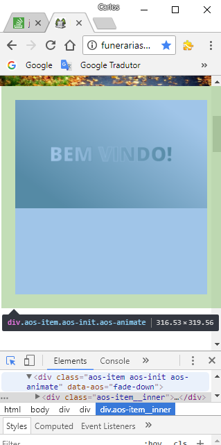
I would like to make the div had the height of its interior!
How to do this for smaller screens?
But the problem is I couldn’t identify where to change!
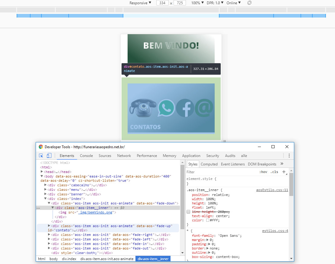
was the blessed line-height. I withdrew, everything ok. The quarrel!
– Carlos Rocha