Problems working with Flexbox

Asked

Viewed 50 times

0

Hello... guys I’m starting work with flexbox only I’m having a problem when making a menu, follow the css code:

.header{
width:  100%;
height: 100vh;
background-image: url(../img/backgrounds/bg1.jpg);
background-position: center center;
background-repeat: no-repeat;
background-attachment: fixed;
background-size: cover;
}

.header .header_content{
    max-width: 1366px;
    margin: 0 auto;
    display: flex;
    /*justify-content: space-between;*/
}
.header .header_content .logo{
    flex-basis: 247px;
    padding: 20px;
    width: 207px;
}

.header .header_content .header_content_nav{
    flex-basis: calc(100% - 247px);
    display: flex;
    justify-content: flex-end;
}
.header_content_nav .menu{
    display: flex;
    align-items: stretch;
}
.header_content_nav .menu li{
    list-style: none;
    display: flex;
    align-items: center; 
    margin: 0 15px;

}
.header_content_nav .menu li a{
    color: #ffffff;
    height: 100%;
    display: flex;
    align-items: center;
    text-transform: uppercase;
    font-weight: 700;
    text-decoration:  none;
    font-size: 0.9em;
}


.header_content_nav .social_telefone{
    display: flex;
    align-items: stretch;
 }

HTML:

<header class="header">
            <div class="header_content">

                <div class="logo">
                    <a>
                        <img src="logo_med.png" width="207"/>
                    </a>
                </div>
                <!--FECHA DIV LOGO-->
                <nav class="header_content_nav">
                       <ul class="social_telefone">
                           <li><a href="./">link</a></li>
                           <li><a href="./">link</a></li>
                           <li><a href="./">link</a></li>
                        </ul>-->
                        <ul class="menu">
                           <li><a href="./">link</a></li>
                           <li><a href="./">link</a></li>
                           <li><a href="./">link</a></li>
                           <li><a href="./">link</a></li>
                           <li><a href="./">link</a></li>
                        </ul>
                </nav>
            </div>
        </header>

Only it’s wrong, the social is left and not on the menu! wanted something like this:
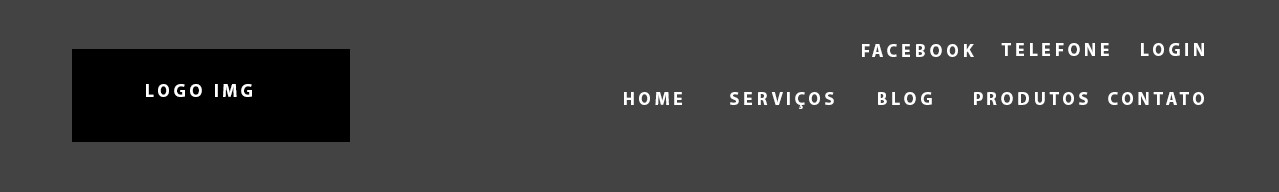
 inserir a descrição da imagem aqui

Thanks!

  • With the CSS and HTML of the question could not reproduce the problem.

  • Yes, the problem I posed the question, is the left of the menu, the social_phone, wanted it on top.

  • JASL what he meant is that the CSS you put in the question is not the complete CSS we need to simulate the error equal to the image you posted. Please check if you have put the correct CSS question, and put it in full!

  • Friend this that you are proposing with Flexbox is practically impossible to do, he works with Row or colums Anyone you choose won’t get the expected result like the photo. You won’t be able to put two Ivs on top of each other, like the social and menu with Flexbox.

  • @hugocsl the full css is this same one I started today the development and already fall into this problem.

  • @Leandro the flexbox is so limited? suggests something to reverse it?

  • Cara is not that he is limited, he is very good mainly in terms of responsiveness, but in this case I wouldn’t use it, I would use pure CSS, with float, or CSS frameworks, I don’t know what your project is like there, and whether you can use frameworks or not. But the frameworks have menus like this their very easy to be implemented.

  • @Leandro blz, I’ll see how it looks with the float. I don’t use frameworks!

Show 3 more comments

2 answers

1

The code you put in is not enough to reproduce the problem, I’ll leave a code for you to base

This site explains well the use of flexbox

header, header * {
  display: flex;
  flex: 1 1 auto;
  margin: 0;
  padding: 0;
}

header {
  padding: 10px;
  line-height: 50px;
  background: #000;
}

header img {
  height: 50px;
}

header nav ul {
  list-style: none;
}

header nav ul li a {
  text-decoration: none;
  color: #FFF
}
<header>
  <img src="http://www.cubejs.org/docs/images/placeholder_200x100.svg">

  <nav>
    <ul>
      <li><a href="./">link</a></li>
      <li><a href="./">link</a></li>
      <li><a href="./">link</a></li>
    </ul>
  </nav>
  
  <nav>
    <ul>
      <li><a href="./">link</a></li>
      <li><a href="./">link</a></li>
      <li><a href="./">link</a></li>
      <li><a href="./">link</a></li>
      <li><a href="./">link</a></li>
    </ul>
  </nav>
</header>

  • I had already searched this site before asking the question, unfortunately I could not find the solution!

  • It was the best site I could find when I started learning flexbox

  • Yes, it’s very good. is that actually I was wanting to use flex at all and not the need, I solved the problem by taking the flex from the Nav and put a display: inline-flex; on the children.

1


The best way is always the flexbox and/or grids, unless the end user of your system needs something compatible with older browsers... I don’t quite understand the purpose of the question, if you want to reproduce the result of the image can do so...

body {
  margin: 0;
}
.header_content {
  display: flex;
  justify-content: space-between;
  padding: 20px;
  background: #555;
}
.header_content_nav {
  display: flex;
  flex-direction:column;
  align-items: flex-end;
}
.header_content_nav ul {
  list-style: none;
  margin:0;
  padding:0;
}
.header_content_nav ul li a {
  text-decoration: none;
  color: white;
  font-size: 10px;
}
.social_telefone {
  display: flex;
  justify-content: space-between;
  width: 170px;
}
.menu {
  display: flex;
  justify-content: space-between;
  height: 20px;
  align-items: flex-end;
  width: 250px;
}
<header class="header">
            <div class="header_content">

                <div class="logo">
                    <a>
                        <img src="https://fakeimg.pl/185x60/"/>
                    </a>
                </div>
                <!--FECHA DIV LOGO-->
                <nav class="header_content_nav">
                       <ul class="social_telefone">
                           <li><a href="./">FACEBOOK</a></li>
                           <li><a href="./">TELEFONE</a></li>
                           <li><a href="./">LOGIN</a></li>
                        </ul>
                        <ul class="menu">
                           <li><a href="./">HOME</a></li>
                           <li><a href="./">SERVIÇOS</a></li>
                           <li><a href="./">BLOG</a></li>
                           <li><a href="./">PRODUTOS</a></li>
                           <li><a href="./">CONTATO</a></li>
                        </ul>
                </nav>
            </div>
        </header>

  • Wow, ball show paid off!

Browser other questions tagged

You are not signed in. Login or sign up in order to post.